A daily walk on Duxbury Beach should mean that I have the scene commited to memory, but Mother Nature ensures that every day looks different. I hated statistics in school, but I do remember that there are a lot of permutations and combinations when you have as many Duxbury Beach variables as in the following list:
 |
| Duxbury Beach Crossover Set Up |
High or Low Tides
Condition of the Beach (rocky, sandy, sloped, tidal pools)
Skies that are clear or cloudy,
Sky Color (blue, pink, yellow, white and all the variations that humidity brings)
Windiness (raging white caps to reflective glass)
Time of day (color temperature, shadows)
Season of the year (angle of the sun, color of flora)
 |
| Duxbury Beach Crossover Facing West Stage One |
That makes for a lot of combinations, but beyond that, it can change within an hour from the variables that are established at the start of a painting. I like the challenge of getting the primary things in place and then locking in at a point that has good flow, especially for shadows, etc. At the lock in point, I'm usually about halfway done and I try to get a representative photo for later reference.
I drove over Powder Point Bridge and parked on the Duxbury Beach Reservation side. I bundled up and carried the gear to the closest sandy crossover. It was the high point from which I could view either the bay or the ocean. Life is good!
 |
| Duxbury Beach Crossover Facing West Stage Two |
Remember the bad yellow rose painting from back in May? Well it is goodbye to one of them; it was the underpainting for this day's first painting.
I loved the fact that my subject, my canvas and my palette were sunlit. Because of that, the painting colors were very close to the scene, such that the canvas almost disappears in this photo. That almost never happens to me!
I knew the painting was close to done, so I popped it off the easel before I ruined it and set up for another painting.
 |
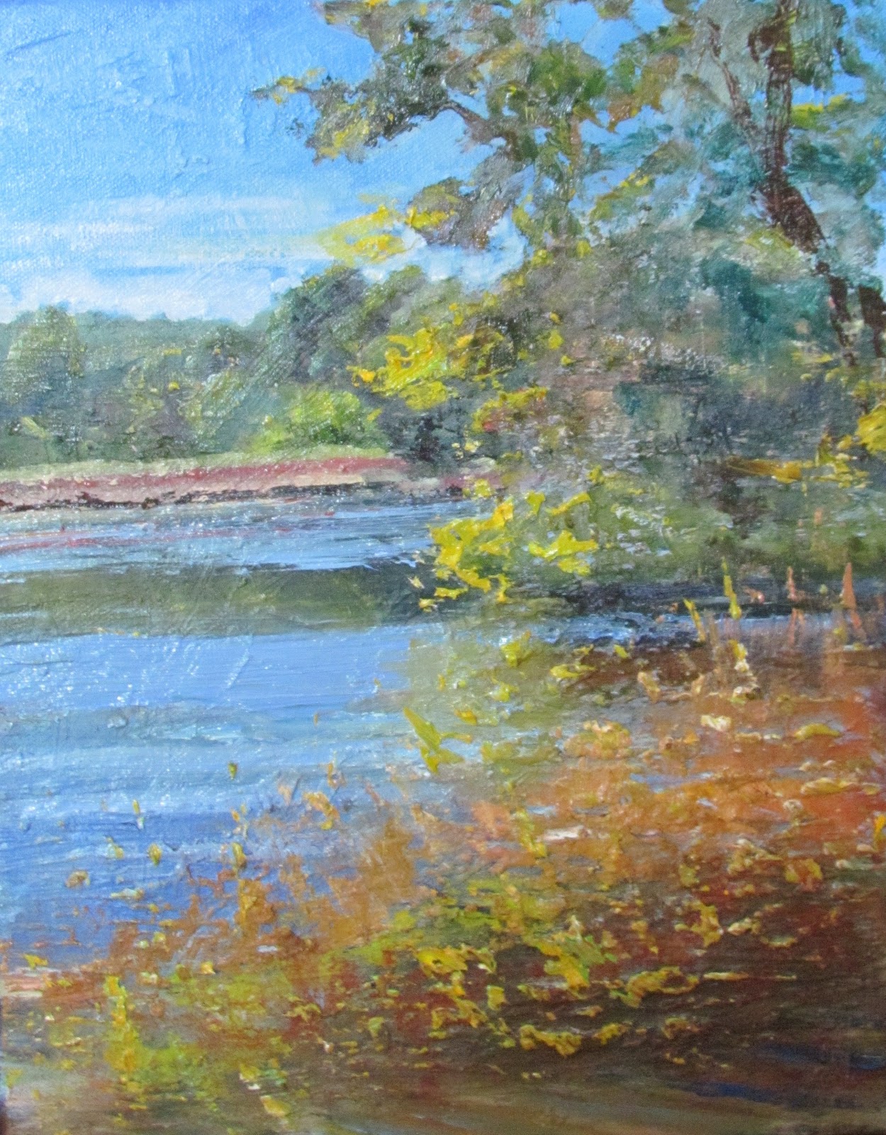
| Duxbury Beach Crossover Facing East |
I turned in the opposite direction. The sunlight was more from the south such that its glare off the ocean was over my right shoulder, rather than facing me. This canvas was a naples yellow and yellow ochre underpainting. I was able to leave some of this showing through the sand, which I painted with Buff Titanium. I did the sky using a bit of prussian blue, cobalt and white. Next was the water, ultramarine, viridian green and transparent oxide brown. I next painted all the blue-gray shadows. The shadows of the snow fence slats made a nice angled pattern up the slope of the dune followed by all of the greens of the scrubby grasses and leaves. I decided to paint the bright yellow flowering goldenrods after the fence.
 |
| Duxbury Beach Crossover Facing East |
The thing about painting every day is that caution is thrown to the wind. If this painting doesn't work out, the next one may. I mixed a warm gray color for the fence slats. Using a size 6 flat and bracing my painting hand on my other arm, I started on the slats. From the right and one by one, each bold slat was made with one single stroke. It was a little scary, given that these strokes would cross over all the nice dune painting I had just painted. What started happening is that the brush began picking up all the colors from the shrubs and pulling those colors into the fence slats, an effect I hadn't planned but looked beautiful.
 |
| Duxbury Beach Crossover Facing West |
 |
| Duxbury Beach Crossover Facing East |
I didn't add the golden rod flowers and fence wire until the next day. I had too much paint on the canvas and didn't want to contaminate the yellow color with the thick paint.
Here are the two finished paintings side-by-side. Now I should get north and south facing too, shouldn't I?