Tuesday, November 22, 2011

Cranberry Worker

 I have been working on a series of cranberry bog paintings.  Cranberries are native to our Southeastern Massachusetts area and the bogs are one of North America's most distinctive types of wetlands.  Bogs are strange ecosystems characterized by thick sphagnum moss, acidic waters, peat deposits and a spongy, mat-like substance on the water's surface. Cranberries thrive best in beds within the bog, which consist of alternating layers of sand, peat, gravel and clay.  
Few nature lovers with a camera can resist pulling over to take pictures of the brilliant magenta of a flooded bog in the Fall.  Likewise, I can't resist painting them.  For those who aren't familiar with the cranberry harvest, here is a summary.  Each cranberry has a pocket of air inside of it, and back in the 1960's someone came up with the idea to flood the bogs with water to float the berries to the surface. The wet harvest has become the predominant method of cranberry harvesting used today.  The dry bogs are flooded with up to 18 inches (45.7 centimeters) of water the night before the harvest. The following day, the farmers use water reels nicknamed egg beaters to dislodge the berries from the vines so they'll float to the water's surface. The farmers then wade through the bog and round up the fruit with large wooden or plastic brooms. This process is called corralling. Once the bobbing berries are gathered together, they're transferred to a loading area where they're lifted by conveyor belts. (Sometimes, a pump truck will suck the berries right off the bog.) The berries are then cleaned before processing. More than 85 percent of the crop is harvested in this manner; however, the use of the water reel to beat the berries off the vines is relatively harsh on the delicate fruit. Therefore, wet harvested cranberries are used mostly for juice drinks, sauces, or as ingredients in other products.  
 
Although I have worked on several cranberry landscape paintings recently, I have been wanting to work on some that include the cranberry farmers at work.   I selected a photo that I took in Wareham a few weeks ago of a cranberry farmer waist deep in amid a bright pink flood of cranberries.   I placed my small plein air cranberry landscapes in view around this canvas so that I could accurately match the cranberry flood colors to my reference paintings rather than the photo.  I know my photo is more washed out than the cranberries are in person.

I have been "preparing" this canvas for a few weeks now.  I think that this underpainting will provide an interesting ghost because of the texture of the cranberries and the variation of the streaks of white, pink, red, and crimson berries.   

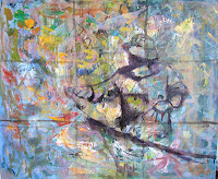
I drew my grid of thirds and sketched in the farmer so that his face was at the northeast sweetspot and his brightly lit hand was on the southeast sweet spot.   The worker is corralling the cranberries by pulling the rope with his right hand while detangling weeds with his left.  Next I fill in his overalls and made drawing corrections.  
I usually use a wildly colorful canvas like this and when I get to this point, I often look at the painting and think that I like it just like it is and that I ought to stop.  I like the darkest dark silhouetted against the colorful ground.   Of course if I was radical enough to do it, I would get rid of the grid lines, then call it done!
I press ahead by grabbing a big brush and filling in the background, letting some of the undercolor show through.   I started at the top using a mixture of permanent rose and naples yellow, gradually converting the pink to cad red and the naples yellow to cad yellow for the foreground.  I mixed flesh tones for his face, arms and hands.


I returned to the background because I wanted to make sure that the distant cranberries were receding.   I think it looks too whitish, so I'll come back to it another day - after Thanksgiving.   I'll be serving up cranberry sauce and a story about the cranberry wet harvest for my guests.

Thursday, November 17, 2011

Reflections to the Nth

In a recent painting class, Jody Regan challenged us to explore reflections.   What happens to lines, colors and light when reflected by a mirror, water or some other surface with glass type properties.   I just happen to be working on several cranberry bog paintings, all of which contain water of some sort.    What I learned from the class exercise is that water reflections are a bit more forgiving than a mirror and shiny object.  

I selected a silver creamer and a flashy striped fabric.   As if the reflections on the creamer weren't challenging enough, I hiked up the difficulty by setting the creamer on a square mirror.    So now, the creamer reflected the stripes, and the mirror reflected the creamer with the reflected stripes. Picture it? 

One other challenge was that this fabric had a myriad of multicolored stripes.  I didn't want to paint every stripe for sure.  I designed a new fabric in the painting - which then had to be reflected correctly in the silver.

Remember yesterday's hommage to subtlety?  Subtle this is not.  It's fun to blast out straight tube color once in a while, especially after the grey painting day yesterday.

I have a new technique for optical blending.   I think I invented it, but it's probably been around for centuries.  Instead of placing colors next to each other with a brush (that the viewer's eye will mix), I put narrow skim-coat stripes of the blending colors on my palette, then scrape up perpendicularly with a palette knife, then draw the strips of color out with one slow and steady stroke.  That's how I did my red-yellow-red stripes (after having done it the hard way first).   It does skip in places, but I like the painterly effect that has.   I think the fact that the creamer is not so painterly, but more realistic is a style I like.         I learned quite a bit about reflections in the last couple of weeks.  I  learned that a silver creamer is not silver.  It's a muted version of every color around it with a touch of white at the end for the illusion of shine.                                                                           
Noone is going to want to hang this in their house being as garish as it is.   That's okay.  I really like it for what it is. 

************

Thank you to my teacher, Jody Regan for sending me this picture. She took it at the beginning of class.  It is my brush drawing of this painting.  I was recycling an old canvas that had been a color exercise.

It's Raining, I'm Outside Painting

I just finished reading "Richard Schmid Paints Landscapes."   He is such a master.  Not only are his paintings stunning, but as a teacher he also has a flair for keeping the message simple.   The book is rich with information and examples.  Fresh in my mind are two segments that were most meaningful at this point in my art.

The three basic compositional qualities that Schmid thinks are evident in his work are simplicity, harmony and subtlety.  He says that regardless of the size or complexity of his paintings, he strives for simplicity.  Easy to say, but so hard to do.  By harmony, he refers to the presence of a single pictorial element that unifies the painting, such as lighting, colors, edges, etc..  I had never heard anyone state that subtlety was desireable.  If anything, I have learned to emphasize the focal point using as many compositional elements as possible, providing a dramatic center of interest.   I'd like to consider what Schmid is saying.  A pictorial composition that is obvious defeats is purpose.  Schmid's paintings have an understated beauty that transforms it to another level.

The second topic that I found interesting relates to the benefits of painting overcast weather.  Schmid prefers a high, bright overcast stating that he finds it the most stable.  This kind of diffused daytime lighting is slow to change and is predictable providing a longer stretch of painting time.  Schmid states that a painting done in overcast will look "right" under most indoor lighting conditions. 

I was up for testing these principles today, given it was cloudy and a mild 55 degrees with no wind.   The weather radar indicated that I had a couple of hours before the rain really started.  I returned to the Jones River site in Kingston and set up under the open wooden shelter that covers the picnic tables.  Did I say before that I love this spot?

It's mid-November so the oak trees have their burnt, reddish leaves, but the rest of the deciduous trees are bare.   This photo looks pretty barren, but it really was a subtle beauty. 

I mixed up some pinkish and yellowish soft grays for the sky.   After the sky, I worked the dark pier pilings, progressing then from darks to lights.  The oaks were burnt sienna.  Grasses were raw sienna with some cad yellow deep. 

Initial block in was fun and the colors seemed good.   The tide was coming in, so the shiny, silver mud in the foreground quickly transformed into a mirror reflection of the pier.  What had been dark river water started moving and became white ripples.  So maybe the sky and shadows were not changing but, as usual, the water was.  

Below is the point at which I stopped.  The question is, did I hit the Schmid takeaways? Somewhat.  It's hard to be objective this late.

Simplicity- fair, the far horizon is accurate with cedars, but does it pull to much because they are dark?  Harmony? Yes, I think - through color palette. As for subtlety - yes, I think because the overall greyness of the day comes through.  What do you think?

Oh, and it was overcast and even raining by the end.


Jones River Rainy Day


Tuesday, November 8, 2011

Painting What You Love

It is natural to want to paint those people, places and things that you love.   If you know the person, place or thing intimately, this knowledge helps immensely as you get into the painting process itself.   You could argue that this knowledge makes the painting easier and more true.  You can also argue that if you paint what you see with a true artist's eye, you can paint anything.

What if you don't love the subject?

I found out first hand that I didn't need to love the two stars of a recent painting class in order to enjoy the experience and have a decent outcome.   Enter "Dolly" and "Pretty Boy," Solomon Island parrots.   For my whole life it was reinforced that birds inside a dwelling are a sign of an impending death (source...Irish superstition). Not only that, but I was nervous about having to paint these two birds because at any minute they might lunge off their perches and claw at me.  Well, there was no drama whatsoever. 

Why by the end of the 2 hours, I was thinking they were actually pretty cute.   In fact, they started saying words - unintelligible to me - but I started repeating to them what I thought they had said.   My lesson learned was to not have such a closed mind on painting subject matter. 

Paint what you love - or don't love.  Just paint.

Saturday, November 5, 2011

One Painting Day in November

 Jones River Kingston

I discovered a beautiful painting location today in Kingston at the Jones River.   This picture shows the gorgeous spot I spent the morning.  I arrived at 8:00 and set up facing south to take advantage of the morning sun on the South Duxbury shore that could be seen in the distance.   

My first painting was to feature old sailboat which you can see in the middle of this photo.  It was the focal point, with the embankment on the right as a counterbalance.    The temperature was about 45 at first, warming to around 60 by 1:00.   It felt like a real treat to enjoy a November morning capturing the shimmery light.   Analyzing the color in the shoreline, I saw reddish, greenish gold, gradually changing to pinkish, blueish green from left to right, as that was a receding shoreline.   The right riverbank was entirely in shadow at first.   Once the sun started rising, there were stripes of light cast on the grasses which was when I intended to "snap" the light as my finished light on that side.  However, as you can see, I fell into the trap of continuing to repaint and lighten the right side grasses as the sun came up.   I don't like how this ended up so light and will go back and darken the right riverbank, restoring it to shadow.   The water still needs work.   The rapid current made for interesting shades of lighter and darker areas of ultramarine.   I will be using my photo as the definitive pattern, once I finish it up in the studio.  What a treat this morning was!

For my second painting, I turned to the east.   By now the sun was more to the south, which was my right. I saw a little blue sunsplashed sailboat that looked just stunning against the dark shadows on the far shore.


In a long painting session like today, the first painting really feels like the warm up.   I think it has to to with already having brushes commited to light and dark, a variety of local colors mixed and ready to go, and that a personal painting rhythm established.   This painting took very little time.   The reflections of the shaded trees in the background looked violet in the river.   A strip of river mud, revealed itself on my side of the river which was reflecting the deep blue November sky overhead. I really like this composition.   In the studio, my plan is to fix the blue reflections in the mud and gradually darken the downriver and underside of the boat, as it was further away from the light.


There are several compositions just waiting to be painted at this spot on future dates....really nice light, and so convenient.  I shall return!


After dropping off wet paintings at the house, I set up again...a location shift...

Atlantic Ave Rexhame

In the afternoon, I painted at the end of Atlantic Ave in the Rexhame section of Marshfield.   The ocean is always a challenge.   Since the Nor'easter last weekend, the surf has been pretty high.   I estimate that the waves are about eight feet.   Large swells with uniform patterns may seem easier to paint than choppiness.  However, I find that trying to capture the uniformity makes the painting look too stiff and contrived.   I must paint what I see, so I dive in.  The colors are fascinating.  It is about 2:20 and the horizon line looks purplish, and the mid-distance somewhat pink which obviously is a reflection of the colors in the sky.  The large waves are so greenish before they break... I think that I let green take over and believe this first painting overall looks way too greenish.


I turned the easel 45 degrees to the south and painted the following...

I like the values in this one as well as the portrait aspect for the vertical flag.   I'm thinking the flagpole is too close to the center...comments??

I saw some beautiful vistas today.   I felt lucky to be able to enjoy and I think that November with its deep blue sky and long golden shadows may be my favorite.  

I got to paint all day...what a gift.