Monday, April 29, 2013

Moored Erin Lynn

Green Harbor River from Brant Rock Side Stage One
It's late April and with each passing week, there is more activity at the docks here in Green Harbor.   I returned to the same dock from which I painted the "Three Boats" a couple of weeks ago.   There were lobster boats being loaded up with bright yellow traps, large boats being launched off their trailers and towed to their moorings.   It wasn't crowded, but there was a steady stream of activity.     After a rainy morning, the clouds were giving way to sunshine.   The luxury boats in their slips across the river in the Green Harbor Marina were reflecting the bright sunrays, making the water look even darker and bluer.    I decided on capturing a scene facing the 30 foot commercial fishing boat called the Erin Lynn.


Green Harbor River from Brant Rock - Stage Two
I began with the sky, which was patches of blue and breaking clouds.   Using my palette knife, I partially blended cobalt, cerulean, rose and white on the palette.   I then scraped up the mound of paint and spread it onto the canvas.   Each of the colors were distinguishable up close but from a distance the marbling blended nicely.


I decided to continue with the knife, mixing the treeline color next and spreading it so that it sat right below the sky. Next was the strip of gold seagrasses that border the river.   Matching the next color would be important, that being the furthest water.   It seemed dark blue, but the first mix of ultramarine with some white was too intense.  I added my transparent brown (asphaltum) to the blue mixture along with a little dioxine purple.   The slate blue that resulted was just right when I held up the sample color to the water to compare, even though I was sure it was going to be too gray.   Comparing to the real thing is the best verification on color.

Moored Erin Lynn
I continued to mix and match mounds of paint and layered it on very thickly.   I tried to make the more distant stroked be smaller and straighter horizontally.   As I worked down the canvas, the palette strokes were stronger, wider more varied.   The foreground water was golden green as is often the case at the docks.  

Commercial fishing boat Erin Lynn swayed left, then right with the strong wind and high tide.   At the point when the boat was positioned as I wanted it in the painting, I snapped a couple of reference photos.   The vessel is actually almost 30 feet long yet in the angle in the painting, where the rear view of the cabin in almost straight on, makes it look much smaller.  Perhaps a few stronger hints of orange would add a little more excitement.   

Thursday, April 25, 2013

Portrait: Light Hair and Complexion


Olivia
Olivia Stage One

My academic realism portrait class has been challenging my painting vision, skills, technique and most of all, my patience.    The model at class was stunningly beautiful, which added more pressure.   I almost felt like apologizing in advance for the rendition that I felt would surely not measure up to her gorgeous reality.   That reality being her flawless hair, skin, and features.

I think what I found the most difficult was the fairness of our model's hair and complexion.  Contours couldn't be too dark and I worked at implying plane changes with temperature rather than drastic value changes.  The model's skin was so fair that her skin seemed translucsent.  I used Flake White Replacement, a transparent white by Gamblin to build up a glowing pinkish white for her skin in the bright light.    I amended my classwork using a photo after the actual live class session.   I corrected several edges especially in the jaw area and got to a better likeness.


Monday, April 22, 2013

CVS Parking Lot

PLNAIR Set Up
There is never a need to drive around looking for that perfect scenic vista.  ( Truth be told, we did drive the long way around looking for a magnolia in bloom and didn't see one.)    Our destination became the CVS Pharmacy in town which has a parking lot that abuts the South River and Dandelion Park in Marshfield.

I was attracted to the row of purple azaleas along the edge of the parking lot.   I took liberties with the painting's design transforming the blacktopped parking lot into a field of spring green in my painting.  The cloudless cobalt sky bathed the greenery and shed roof with a cool reflective blue.   The shadows and mulched areas were rich warm reds and brown oxide.


Azalea Trio Parking Lot View

The three azaleas were the stars of the scene.    I had used my palette knife for about ninety percent of the painting.  I mixed up the warm purple for the blooms in shadow, and a bright, cool pink for the blooms in sunlight.   The paint for the azaleas is the thickest, lightest and most intensely in colored, since they are the center of interest.


Azalea Trio and Shed
Back in the studio, I contemplated the result from the day before.  The thick, juicy impasto paint would be very easy to wreck so I tried to stay disciplined   I fixed a couple of things (the tree shadows, their surrounding grass, and the shadow side of shed.  Below is the finished (?) painting.


Sunday, April 21, 2013

Armature, Form and Color

Artist Diane Rappisi is known for her exciting, vibrant figure paintings.  I was lucky enough to take a workshop with her this week and it was a terrific experience.    It was efficiently run, fast paced and highly productive.   Ironically, "productive" does not mean I have even one completed painting to show for it as I did not attend all the days, but I came away with much, albeit intangible.


Color Study I
The first segment focussed on sharpening our powers of observation and quick draw skills.   With a stick of charcoal in one hand and a Viva paper towel in the other, we stood in front of our easels facing a large sheet of charcoal paper.  The live nude model was instructed to change her pose every 30 seconds for a stretch of about 10-15 minutes at a time.    Our challenge was to capture the pose with accurate angles and a minimal number of lines.  Each time the model changed position, we wiped off the sheet with the paper towel, getting back to a blank sheet.    With each subsequent session of this drill, it became easier and - I believe - more accurate.  Once in the groove of repeatedly and boldly covering the large sheet with long limb lines, the thirty seconds actually seemed too long.  I loved it and felt absolutely energized by the exercise.

Color Study II

The second segment didn't come quite as easily.   The goal was to build upon armature lines with charcoal as in the first segment, and then to build shapes around the armature giving it a three dimensional volume.   The model's poses were longer so that we could apply volume to the armature via boxes and cylinders.  With large simple shapes and shading, the form started to look like a human form.   I have no in-progress photos for the first two exercises - no time!


Color Study III

The next workshop segment and the last one that I was able to attend, was all about color.   Diane designed a scene by erecting swatches of colorful fabric so that they surrounded the live model.   The challenge was to paint a series of color splotches on the canvas that accurately represented the dominant colors, their shadow colors and in particular, the fleshones of the model.    We were to nudge the colors back and forth so that the relationships were accurate with respect to color and value, without worrying about an accurate drawing.   Playing with just the color was liberating and took away the over-thinking that can get me bogged down.  It almost felt like cheating not to work toward a representational outcome, but it was a very enlightening drill. 

I look forward to the next time I can take instruction with this wonderful artist and teacher.

Tuesday, April 16, 2013

Boston Marathon

Race Staff Early Morning
I am sick to my stomach over the horrible events at the Boston Marathon.    I had found the perfect spot to view the event at Mile 16 in Wellesley at River Street which overlooks the Charles River.     I thoroughly enjoyed the day, alternating between painting and viewing the amazing competitors who participated.
                                      BUY NOW
 Runners Crossing Over the Charles

The runners crossed over the beautiful old stone bridge depicted in my paintings.   Each aspect of the day, this scenic view, perfectly sunny but cool weather, friendly people of all ages, dedicated marathon volunteers, and two paintings that I was happy with - all these things made me feel practically euphoric.   I have always loved Patriot's Day.  It is so New England, so patriotic, and it celebrates America.

Maybe having personally enjoyed the day only ten miles from the finish and knowing that I had seen runners that were probably reaching Boston just about when the explosions happened was/is gut wrenching.     The idyllic start and horrific end is just unbelievable.   I couldn't even look at my paintings yesterday.  

Today, as I become less shocked and more outraged, I'm posting them as I usually would.    These represent America the Beautiful - strong, free and brave.
                                                          BUY NOW

Saturday, April 13, 2013

Decaf

Decaf
Figure painting has become my favorite genre.    I am not as advanced as I would like to be, but there is a lot of satisfaction in capturing a human likeness.  

On this day, our model made the suggestion that we use a comfy, overstuffed armchair.  Evidently she had a terrible night, having been in a hospital emergency room with her daughter, and was exhausted.     Her fatigue was evident as she relaxed into the chair, nursing her Dunkin' Donuts coffee. 

At first I painted her glancing off to the left.  I then decided that having her eyes closed better captured the mood.  I used really large brushes for everything except for the face and hands.  It was tempting to fine tune the chair but I resisted.  I tried to make the blue/orange harmony consistent throughout.

Monday, April 8, 2013

The Concert Reproduction - Post 5 and Final

Have you seen this painting?   If you spot the original in your grandmother's attic or a flea market, and, it is in good condition - and - you can point the authorities to it, you may be able to collect the reward money - a mere $5 million.   You can read much more about the famous heist at the following website.

http://www.gardnermuseum.org/resources/theft

Meanwhile, if you have been following my blog posts on "The Concert", you have seen the development of my copy of the painting.   Its dimensions are just about the same as the original, an odd 28.5 X 25.5 inches.   The "almost" square size was the one that Vermeer liked, but of course, with his mastery of composition, he could make any size work.

My version of the painting is now mounted on the stretcher frame that my husband made (see Post 4).   It literally sounds like a bass drum when tapped.   Once it was mounted on this final support, I finished up by cleaning up the edges, downplaying the paintings on the wall, and adding some scumbling to the wall to hopefully bring the brightness from the left windows to life.

PHOTO: Empty frames
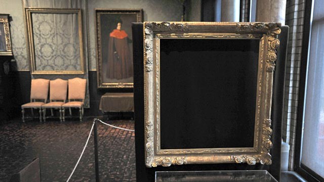
Empty Frame at Gardner Museum "The Concert"
I scoped out the framing options and discovered that a frame that the original's frame, the one that sits empty in the Gardner Museum would cost at least $3,000.   Not bloody likely!   I ordered an ornate gold frame that has some similarities to the empty one in the photo to the left.

So what did I learn from this experience?

Vezina Reproduction of Vermeer's "The Concert"
There was significant planning done by Vermeer in creating the composition.   The painting depicts the three music enthusiasts, but the interpretations of their relationships, given the paintings on the wall, have created multiple theories.   Interesting paintings don't spell everything out.

From a technical perspective, the geometric interest and alignment that Vermeer created by way of the linear elements such as the square pictures on the walls, the marble floor tiles and the placement of the subjects squared to the walls is a way to introduce complexity and even control how the viewer scans the painting.

As for colors and pigments, I learned that mimicking the painting from a modern day image is hardly an accurate representation of the painting from back in the 1600's.    Vermeer's favorite pigment, ultramarine blue, is almost absent from his works, including "The Concert."   One expert theorizes that the expensive blue was used in the painting, but has deteriorated to the point of barely seeming blue.   The flesh tones that look greenish in the digital images are also thought to be the result of deteriorated vernillion and yellow lake pigments.

The lessons do not end here, but the blog posts do as this is the final post on this painting.  If you paint, try a reproduction.   I guarantee you will be glad you did.


Saturday, April 6, 2013

Green Harbor Boats

Green Harbor Boats in March - Stage 1


The mouth of the Green Harbor River is lined with marshland, yacht clubs and piers.   The Brant Rock side has a nice dock with benches which is where I set up to paint today.     I was facing south, looking toward Green Harbor (the neighborhood) and the brightest part of the cloudy sky.  


Green Harbor Boats in March - Stage 2
A cluster of fishing boats were ebb tide aligned to their moorings.  I am not a huge fan of painting boats. They are difficult because they move constantly - not only radially on their lines, but the tide changes up and down.   Boats that may break the horizon at the start if it's high tide and two hours later they may be much lower, riding the level of the water. No complaints, just a statement. I loved being out there enjoying 40 degrees and a pier that is starting to come to life after a long tough winter.
.


Green Harbor - Three Boats

Friday, April 5, 2013

Figure Painting - Nude Standing

Nude Model from Back - Standing
This painting was done in two sessions.   The light used had a cool bluish cast to it so the right shoulder and hip were the lightest, coolest tone.   In contrast, the model's complexion was warm so I played up that feature along with red in the hands.   I worked to diminish the edges on the shadowed left leg and shoulder.   I liked the accent of light on the left elbow as it leaned on the pedestal so I added it, trying not to have it be too important.  I' m working on staying loose, so in that respect, I think this painting shows movement in that direction.


Monday, April 1, 2013

Quick Capture of Brant Rock

Brant Rock March Afternoon
It was a quick painting session on this March afternoon, so this is a quick blog to match.   The blustery wind had whipped up the surf.   This is an east facing shore so the water tends to be darker in the afternoon.   The waves closer to the beach were lighter green.   The clouds over the distant horizon were purple-hued, but those overhead were white and whispy.