Thursday, September 25, 2014

Wine and Oysters


This painting still life features the classic table - wine, oysters and flowers.

Wine and Oysters
Preparing for the still life was a fun adventure.   I paid a visit to Island Creek Oysters in Duxbury so that I could handpick oysters that had good visual appeal.   The fellow was more than gracious, showing me which oysters had more color or variation in their shells and invited me to choose exactly the oysters I wanted.  He was knowledgeable on taste as well and since I would be eating this still life at some point, I made my selections based on both criteria!   I got a half dozen Duxbury Bay Oysters (one knot on the bag) and a half dozen Sandwich oysters (two knots on the bag).

I made the same speech at the wine store; the wine bottle would be depicted in a still life painting highlighting the delight of food.  The fellow suggested Le Grand Caillou from Southern France where an abundance of seafood would call for such a Sauvignon Blanc.  A whorl adorns the label, a not-so-subtle hint that this wine would pair well with seafood.

For the set-up I included outer shells, inner shells and lots of lemon wedges.   A speckled blue vase with yellow daisies repeated the blue and yellow scheme, and a wooden handled corkscrew on the bottom right was the painting lead in.  

One interesting aspect of this painting is that it provided a good example of adjacent item influence.  Not only do items cast shadows, but depending on the reflective characteristics of the element, they throw their color around as well.   The lemons were throwing strong yellow light on the shells as well as the cloth.  I played around with it a little bit to decide how strong or diluted to make this cast color.   The photo may not pick it up, but if you get a chance to see the painting, the reflective color is there.

Tuesday, September 23, 2014

South River View - Studio

South River Color Study
It was time to work on the large canvas version of the South River View.   In the previous blog post, I described the color study done "en plein air" for my color reference.  The large canvas was 24 x 36 inches which I underpainted with a warm cadmium red light, raw sienna and a sky undertone of Naples Yellow.   I knew that using these warm tones as a base would help give the painting a warm golden glow.


South River Underpainting - Stage One
The 9x12 color study came in handy back in the studio for color reference, although the key of the painting was one value darker since it was painted outside.   Photographs do not register color as well as the human eye.  I took photographs too, but mostly for composition purposes - cropping, drawing and element placement.

The elongated horizontal nature of the scene would make a nice addition to a large wall.  As for the color, this was probably the perfect time to paint the salt marsh.   The "extreme greens" of summer were being slowly replaced with hints of autumn red and gold.  


South River - Stage Two
I began by carefully sketching in my scene with dark transparent oxide brown.   A good likeness to the scene was very important so I took relative measurements - several times.   The composition had a pleasing variety of elements that helped balance the overall lights and darks.   For example the dark trees on the far shore were balanced by the darks of the foreground underbrush.
The larger canvas required mixing large piles of pigment. I began with a pthalo blue and white sky knowing that I would be building up the layers of sky prior to adding the summery clouds.   Next I mixed the distant marsh greens which were cool pale yellowish green, gradually getting warmer and greener as they got closer to the foreground.   The long rustic dock out to the tidal river was an iconic element adding angularity amid the surrounding soft marsh grasses.


South River
I took liberties with the foreground shrubbery, introducing some vivid green and red sumac, and I pumped up the grey-blue of windblown Juneberries.   And no September landscape would be complete without bright yellow goldenrod.

Finally I added the summer afternoon cloud pattern echoing the lines of the river and drawing their lights down into the river. 

This large painting was created for Catherine with happy birthday wishes from her daughter Leslie.   This spectacular view is special to Catherine and certainly it is looking its best on a sunny, pristine September day.   Happy Birthday to Catherine!

Friday, September 19, 2014

South River View - Color Study

South River View - Color Study Paint Out
Color studies are sometimes used by painters to create a record of a scene when the ultimate goal is to paint a large scale or particularly complicated scene back in the studio.   This great reference tool is far superior to a photograph, supplying more accurate hues and other memorable aspects of the scene.   The goal is to match the fresh direct color from the plein air experience and then apply it to the large canvas. 

When I arrived at the painting location I was very pleasantly surprised!  Sometimes the suggestion of a particular view may or may not make a nice painting, but in this case, the view was just stunning! The vantage from the nicely elevated deck revealed an 180 degree expanse of the South River and surrounding marshes in Marshfield.    By looking east, (the direction of the painting), the southernmost section of Humarock, the northerly parts of Rexhame, and Rexhame Beach sandwiched in between, were visible.
South River View - Color Study in Progress
As for the color, this was probably the perfect time of year to paint the salt marsh.   The "extreme greens" of summer were now supplemented with the toned-down hints of red and gold that signaled September.   I wished it was sunnier, but the sun was occasionally peaking through enough to allow a good study.


South River Color Study
The paint mixing was done exclusively with a palette knife, as was the paint application.   I wanted to be sure that the color study had a generous amount of paint so that back in the studio, it would be clear which colors I was going after for the larger work.  After all it was not necessarily to come up with an accurate drawing for the color study.   The accuracy of drawing and placement would be important for the larger work though, and for that, a photograph would make a perfect reference.

The color study has its own (very loose) feel and was not only ready to serve its purpose, but a nice enough painting in its own right.  

Coming up soon, the large scale painting...


Tuesday, September 16, 2014

Out of the Box 2014

Out of the Box Entry 2014
It was the beginning of June and I had just finished my North River Arts Society "Out of the Box" (OTB) entry for 2014.  Of course, you aren't reading this until August or September because the artwork had to be submitted anonymously, and I could not post this blog until the event bidding was complete.

For those not familiar with this bi-annual event, (which happens to be one of my favorites), participants received a uniquely numbered panel that measured 8" x 8".  The challenge was to create a work of art in any media, preferably a creation that isn't typical for the artist.   The artworks were put on display at NRAS at the OTB party and a silent auction sheet accompanied each 8x8 inch square.   It was fun to try to guess which artist produced which piece. Even though the media or subject may be intentionally atypical, painters tend to have a signature style that is all their own, (whether they admit/realize it or not.)

Did I really shake it up and get "outside the box?"  Not really.   The difference was that it was an outdoor floral still life, not my usual genre.  Oh, but it was oil, so no anonymity there.

The subject was my neighbor Rita's purple iris.   At the time I painting this, it was the tallest element in her side garden which borders my garden.   It kept catching my eye in the midday sun.   The petals that were lit by the sun had a pinkish yellow tinge, but the petals that were shaded by other petals were pretty shades of bluish purple.   The bud for the next blossom sat just the full bloom on the same thick stem, ready to take its turn.

I don't know who won the bidding, but I'm told that it was bid upon, and thus it has a new owner.   As many an OTB painter knows, it's a relief to see that your entry has at least one bid!  Haha.

Thursday, September 11, 2014

Paige Street View

Paige Street - Stage One
A quaint old Hingham neighborhood called "Crow Point" is situated just 10 miles south of Boston and can boast both ocean and bay views - even a distant view of the Boston skyline.     Modern builders could benefit from studying the lines and grace of many of these old houses.  Cupolas, gazebos and ornate weathervanes made each home a little different and more interesting than the next.   I likes the hints of (just enough) age and stress that give them character.   The "too pristine" look of "new development" wouldn't fit in well here.    Many large. centuries old shade trees accented the pretty but narrow streets.


Paige Street
One of my favorite homes was at the end of Paige Street.   I could only guess how many old fireplaces may have been serviced by that big old brick chimney.    The multiple, elegant rounded bows and white window trim picked up the warm light nicely.     I painted the scene somewhat realistically, although if you look closely, the pinks and yellows in the asphalt are certainly prettier than the real thing!


Wednesday, September 10, 2014

Crow Point

Crow Point Paint Out Stage One
Early on a Sunday morning, I drove Route 3A to the Hingham Yacht Club which is located on Crow Point.   This unique peninsula location is isolated from the "through" traffic and congestion of the South Shore and yet Crow Point has the feel of a quaint old fashioned neighborhood.  I could see why the properties in this amazing location are so desirable.  

This section of Hingham is only ten linear miles (i.e.. as the crow flies) from downtown Boston.   The drive by car is probably twice that because the primary roads loop inland and snake through Weymouth and Quincy, then up through Dorchester. The Boston skyline was plainly visible from where I stood, and a regular stream of jets were using the approach corridor overhead to land at Logan International Airport.


Crow Point Paint Out Stage Two
I studied the options for my painting.   I wanted to include the city skyline, although the light was hitting it straight on.   That meant less shadows and less contrast.   The southeastern sun was behind me so everything was brightly illuminated, including my canvas.   I decided on a big summery August sky to emphasize that wide open expanse and the compressed horizontal lines of the land masses at the bottom.

To accomplish that I positioned the canvas portrait style.  Situated between the spot I painted from and the city, there were various Boston Harbor Islands (Peddocks, Long, Spectacle and Thompson's).   Toward the foreground, a private dock was built out into the bay, entering the scene from the left.  A neat, dazzling white speedboat was tied up to its dock at the end.


Crow Point Looking Northwest
During the course of the paint out, several beautiful boats sailed or motored by.   Selecting one to include was a difficult decision - because then they were quickly gone.   How did the old masters do it without photography?   In the end, I elected to omit the extra boats because they never did enter the framing of my scene, but rather were off to my right.  Instead,  I added a strong trio of seagulls to balance the composition which had been heavily weighted toward the bottom.


Friday, September 5, 2014

Hawthorne Vista

Chatham, Massachusetts is located at the elbow of Cape Cod and given its maritime location, the views are spectacular every which way you look.   The Hawthorne motel is situated up on a slope overlooking Chatham Harbor only a quarter mile south of the Fish Pier on Shore Road.    There was no need to look any further than outside the door of our modest room when deciding on a painting spot for the next morning.

Before going to sleep, I set up my field easel with a canvas panel and prepared some sunrise sky colors.  I wanted to be all ready to record the Chatham Harbor dawn.   Honestly, I wasn't out there at dawn, but I was painting by 7 AM - not too bad for a vacation day.


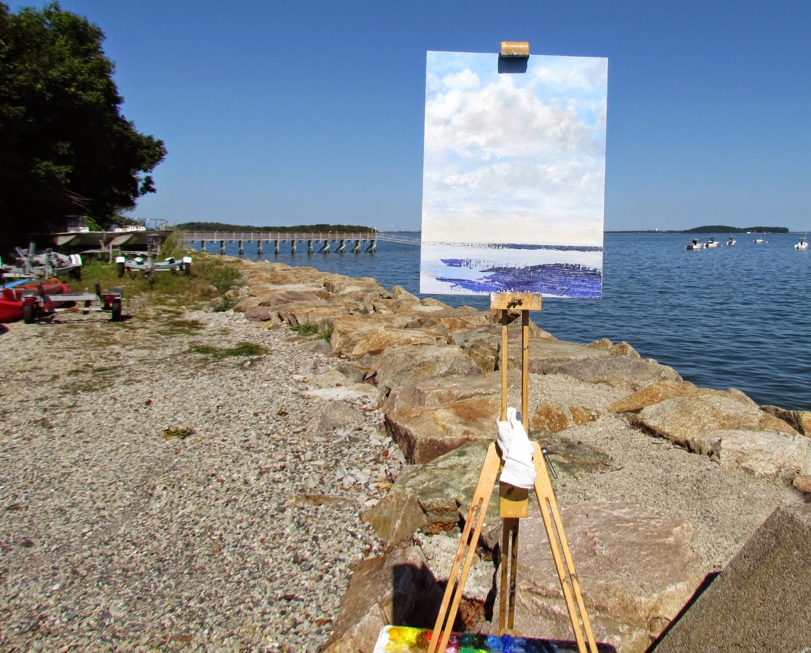
Hawthorne Vista - Stage One
I was trying to be quiet while pulling my gear out to the grass outside our door, so as not to disturb other vacationing guests.  I was maneuvering the fully extended easel out the storm door and was in the process of not making a racket that I threw out my back.  

At first I denied to myself that I had done it, and continued to paint.   It started to become a struggle to step back and I became more and more stooped to one side.  Had it not have been for being determined to paint this gorgeous spot, I probably would have given in and stopped.   to it and have gotten.  Trying to work through the discomfort only made it worse.  Unfortunately I finally conceded defeat and reclined into a back stabilizing position.  The painting was about 90% complete, only missing the tops of the evergreens down in the sand dunes.  I would have to finish those in the studio.

What I hadn't noticed was that several of the other guests were taking a keen interest, not only in the painting, but in my worsening back.   Evidently my S-shaped posture and wincing was more noticeable that I realized.   One nice woman even offered me a frozen ice pack she had brought with her for her bad back.   (A reminder not to lose faith in humanity!)   A fellow from Canton periodically checked on the painting's progress and asked if I was doing anything for my back.   Another nice couple from Canada had lots of questions about the painting process, and what about the gnat that had plopped down in middle the sky.  Would I be getting rid of that?  And how was my back doing?  Yes, there are many more good people in this world than bad.

Hawthorne Vista
Now, let me make this long blog longer.   The painting itself?  The main thrust of it was to capture the warm, early morning light on the cottage on the left, and record the memorable elements of the iconic Chatham landscape - Tern Island, the Chatham Fish Pier and the boat filled harbor.   I used mostly palette knife so there is quite a bit of thick paint on this one.   By 9AM, the water was no longer pink, but a deepening blue, so it took concentration to stay locked into the dawn color scheme.

Toward the end of the paint out, our lodging hostess took a picture of the paint-out and posted it in the Hawthorne Facebook page if you want to take a look.  Here is the finished painting and as I look at it, I'm thinking the September golden grasses are really starting to show through.   I'll be sending this one over to the shop next week.

ps.   My back is much better!

Tuesday, September 2, 2014

Fullmoon

Earlier in the month, the full moon was extra luminous because of its proximity to the earth, a "supermoon."   At the shore, all full moons are amazing, as they rise over the horizon, especially if the timing has it rising after dark.     The reflections on the water are brilliant and the cool bluish light bounces around effectively lighting the entire beach.  


Full Moon Fishing Trip
I had been wanting to try a moonlight painting, but could a moonscape actually be done en plein air?  I suppose, but before I tried painting in the dark, I began with a photograph.  I used a blue underpainting, purposely using a somewhat lighter blue than what may constitute a nighttime blue.   For the featured element - the moon - I coated a penny with a light value of titanium white and ochre and placed it paint-side-down on my canvas.   I carefully pried the penny up off the canvas leaving a small, clean, but scumbled, impression of the full moon.   I then used the same moon color to brush on the horizon line reflecting the moonlight. 

Finally I added a red fishing boat that was slowly heading out from the channel leaving a few ripples in its wake.  The boat needed little detail because the gear was mostly in shadow and darkness, and the red I mixed was hardly red at all because of the dark.