Tuesday, April 28, 2015

Cardinal in Gold

Cardinal in Gold
My birdfeeder was quite popular this winter.  Although I had been keeping it full through November and December, the traffic didn't pick up until the first 30 inches of snow fell.    I have seen finches, chickadees, warblers and sparrows.   I've supplemented the seed with bread thrown on the snow under the feeder.  The bread seems to attract seagulls more than the "desired" birds.  Although cardinals usually show up at dusk and feed on the ground, this female cardinal actually perched on the feeder and munched for quite a while.

As for the painting, I thought the light/dark pattern against the fence made an interesting abstract.  As I view the painting now, I'm thinking I need to warm up the light values because they look too cool and white.

Sunday, April 26, 2015

Portrait Workshop

I was very happy that I decided to take the workshop this week offered with phenomenal painter, Johanna Harmon.   Not only was she giving this New England workshop, but she was the juror for North River Arts (NRAS) Annual "Focus on Figures" show - and - she was in Boston for her own opening at the Newbury Street Gallery called, 'Exploring the Poetic Figure' - One Woman Show.  I plan to get in to see this display in the very near future and would not hesitate to recommend it after seeing Johanna's work in person and on her website.

As for the workshop, there is always something new to learn, especially when enjoying a different teacher's perspective.   This is a very special instructor who seemed to be keenly attuned and sensitive to participants' needs and abilities.  Although my favorite genre is plein air landscapes, painting portraits and figures is quickly rising to the top.

Our model in Day One of the workshop had a dark complexion with strong features that were a delight to paint.   I used the limited palette (Zorn inspired), much different than my usual "expansive" palette.   Within the workshop each painter was randomly assigned their painting position. The profile perspective is not my favorite and sure enough, this was the spot I ended up with - but I love a challenge and enjoyed it nonetheless.


On Day Two, we had a lovely, young fifteen year old who had a very fair complexion and, of course no wrinkles or other useful facial landmarks! :)   I observed more of a pink/green harmony in her skin tones.   Her blue headscarf and top made me want to pump up the orange/blue harmony.  You will not see this painting show up in the shop as I was not happy with the outcome, probably from a poor initial sketch and from mixing strategies midstream, but in the spirit of full disclosure, here it is!


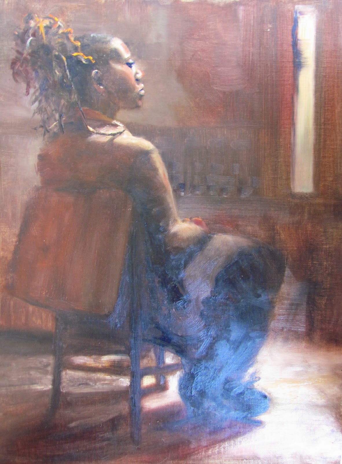
On Day Three our model had a dark complexion with beautiful red undertones and bluish highlights.  Again I had the profile view, but I decided to include the whole figure.   I also placed more focus on designing the space (light and dark patterns) within the painting, something I want to work on.   The primary center of interest was her face and shoulder (also most clearly in focus).   Secondary interest was the light on the floor, especially around the chair legs.  Finally, the third area of interest was the light coming from the narrow window.


On Day Four, we had a nude model, so the figure and physique were the focus.   Within the painting workshop, the skin tones were quite muted.   The value determinations made in muted light were more accurate than the color, and of course value is the more important of the two.  I was quite surprised to see how colorful this painting was in daylight.


These photos are a little shiny and they are still very wet, but, as always, good images of the paintings will show up in the shop sometime in the future.


Friday, April 10, 2015

Traveling With the Brand New Set Up

Six Vieques Paintings
I've already shared my six tropical paintings from Vieques, but I didn't talk about the challenge of painting with a complete change in my usual painting parameters. You'll take one look at the ultra-gorgeous scene I painted that first day and most likely have zero sympathy when I state that it was difficult to get started.  Okay, yes, I'm thinking of that old saying,  "a bad day of fishing beats a great day at the office."

So in the context of being fortunate and grateful to even be on this trip, I'll say that there were challenges. Among them:

  • A new lightweight easel (disassembled for flight) 
  • A new palette board (no familiar color spots marking my usual placements)
  • Unfamiliar hardware used to attach the palette to new easel
    Not Exactly Travelling Light
  • Stark white, non-toned substrates (usually I use toned surfaces).
  • No turpentine (not allowed by security)
  • Tropical colors! No recipes on the brain  (especially for that dazzling turquoise ocean)

Yes I suffered through it :)  item by item...

  • Once the new easel was put together on Day One, it didn't need to be disassembled again until it was time to fly home.   The assembled easel stowed easily in the back of the rented Jeep for the duration of the trip. 
  • The newly cut (and lightweight) 12x16x.25 inch birchwood panel travelled well and though it took some time initially, it felt no different than my heavyweight palette at home once populated with the oil colors.
  • Modified Aluminum Easel
  • The new aluminum easel had "L" brackets attached with couplings that slid up and down on its respective tripod leg.   Three matching drilled holes in the birch palette lined up with three "L's" on easel legs.  See the three red arrows in photo that shows modified easel that allows palette panel to sit in between tripod.
  • I typically apply a neutral undertone over the white canvas and let it dry at least overnight.  All the canvases I brought on this trip were stark white and I discovered that because everything here was so brightly lit, the white surface helped me maintain a high, clear color key.
  • Oil painting without turpentine was tough.   I wiped my brushes often and used my walnut oil to clean them as well.   This wasn't an acceptable workaround though, and we located the local hardware store where we purchased a small can for $7.
  • Color matching was a matter of trial and error.    I had brought the right ingredients (Cerulean blue, pthalo blue, emerald green).  It was a matter of blending these in the right amounts and combinations.    By Day Two - the required rework was reduced somewhat.
So that is the story.  What I didn't cover here about traveling with the oils is the packing and flying, which I'll share in a future post.  If anyone has questions about the customizations to the easel, the palette or color combinations, let me know and I'll be happy to share more.


Friday, April 3, 2015

Vieques - Mouth of Media Luna Beach

Mouth of Media Luna - Stage One
This post describes the last plein air painting of our trip to beautiful Vieques, PR - and the second painting of the day.   Although I was a little wary of travelling home with wet paintings, using up the rest of the paint on my palette trumped the aforementioned concern.   Not wasting any paint resulted in a very thick and juicy rendering!


This lovely little beach, like all the others, was almost deserted and just as picturesque.    Media Luna's opening to the Caribbean Sea is depicted in this scene.  There were rock formations on each side, natural breakers for the large surf beyond, so it was very nice for swimming and snorkeling.    Although I'm always happy to get home, the warm, tropical look and feel already seems like ages ago!  

Here's hoping for some Massachusetts "local color" very soon, beyond black, white, grey and tan!


Thursday, April 2, 2015

Vieques - Under the Sea Grape Trees at Media Luna

Media Luna - Setting Up
Media Luna - Mid Stage
This was the final paint-out day of our vacation.   The beach was called Media Luna - just as pretty as all the rest of the beaches, and no surprise, a beautiful Vieques day.   There were - maybe - a dozen other people scattered along the medium sized, white beach.   I faced southwest and began with the gorgeous cerulean sky and treeline.   A few larger palm trees towered over the uniform scrubby trees.  Closer to our spot, there were several mature sea grape trees.   The sea grape seemed to be the most predominant tree/shrub along the sandy beaches. Having observed their habit and painting them in earlier paintings, I felt more daring laying in some circular impasto strokes.  The thick impressionistic swirls of color included bright gold green with red (representing veins and stems).  

Just as I was getting ready to add the pale turquoise water, a person settled into a shady spot under one of the trees in the painting.   Good timing!  Their shaded form complete with a large wide-brimmed black hat created a distinct silhouette against the bright white sand beyond.   They stayed put long enough for me to rough in their shape. 
Under the Sea Grape