Monday, March 26, 2012

Garden Center Paint Out

Picture the last time you walked through a nice garden center in full bloom.   Mass groupings of colorful flowers and shrubs are everywhere you look.  Remember how good it smelled?

Crazy for Color
Our Friday painting class delighted in such a sensory experience at Kennedy's Garden Center in Scituate, thanks to theiraccomodating owners.  There were lots of scenes worth capturing - every direction.

I immediately gravitated to the front of the garden shop, where crocks of pansies, daffodils and hyacinths were clustered.   The archways and rustic shingles along with decorative garden ornaments were an irresistable backdrop.

Dilemma.   The class lesson was on the subtle, more muted attributes of Spring, such as leafless deciduous trees, the cool, bluish reflections of the sky on shiny evergreen leaves and warm shadows.   Color junky that I am, I knew that if I set up at the front of the Garden Shop, I would let the flowers dominate, and forget about the subject of the class - the pre-growing season look of March.  So I shake off the color delerium and come to terms with learning the subdued Spring landscape lesson.

Homemade view-finder taped
between canvas and umbrella
I would like to go back and paint that bright, color-splashed scene on another day.

I set up on a brick garden path under a wire arch between two of the buildings.   I had forgotten my view finder so I ripped a piece of paper out of my sketchbook.   Using my palette knife like a razor, I cut a out rectangle.  I used masking tape to position the paper frame between the pole of my umbrella my canvas.   This resulted in a "hands-free" way to frame my scene.  The only drawback was that I had to lean so far forward to see through it, that I couldn't see my canvas and view at the same time.   Once I had the scene sketched in
according to my gridlines, that was no longer an issue.
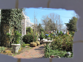
Looking through impromtu viewfinder
The picture to the left gives you an idea of what looking through my viewfinder was like...not exactly what I painted, but you get the idea.
It started as an overcast day and I liked the grey effect.  The major elements of my composition were the two young trees with burlap wrapped root balls on the left, the brick path that led out to the parking lot with a concrete bench, and a painter with canvas and easel further away to the right. 
Once the clouds gave way to full sunshine, the painter in view, my friend Colleen, switched from a plain, mid-value visor to a white straw hat.  All of a sudden, the bright sun on her hat commanded more attention and actually completed the composition for me, balancing the large burlaped root balls on the left.  Plastic ribbon tags dangled from the young saplings.  They seemed to balance the cool white hat and gloves. If there was an imaginary fulcrum in my painting, equalizing its elements, the fulcrum would be at the end of the brick path on the line that connects the young trees and Colleen.

Painting the Garden Center
In previous blogs I've lamented about temperature schemes.   Cool light and warm shadow seems logical to me.   The sun is warm and bright, and shadows are dark and cool, right?   Not always!  In this scene, the light is cool and the shadows are warm.   The cobalt blue sky is heavily influencing the lit surfaces. This translates to making the interior shadows of the bushes warm with burnt sienna, in contrast with the sky blue tipped bush tops. The planes of the root balls range from the warmest darkest shadow side, gradually cooled and lightened toward the brightest top right of the burlap balls.  

This is one of those paintings that I like better than the actual scene.    Let me know what you think.

Thursday, March 22, 2012

Spring!

I did something crazy today.   I used a white canvas.
What led to this unusual event?
Hyacinth, freesia and lemons set up
  1. I observed that my daffodil bulbs were within days of opening,
  2. I splurged on some bright yellow freesias and fragrant purple hyacinths at the greenhouse,
  3. A nice, new stack of lily white canvases arrived in the mail,
  4. I watched Daniel Keyes transform a blank canvas into a stunningly colorful fruit and floral still life on Youtube.
Spring!   A fresh new start.  A snow white canvas.  A great day to mix up a spectrum of yellows and purples on my palette.

I arranged the flowers in a mid-sized clear glass vase.   I pressed a bright white cotton linen cloth and grabbed two lemons.   I liked where this was going.   I enlisted my very willing composition expert - my husband - to help me create the set up.  To the right is a photo of the set up.    In reality, the shadows were not this blue, but rather they were lavender.

Stage 1- Sketch and shadows
After sketching in a grid of thirds and the outline of the flowers in diluted raw sienna, I studied the big shapes.  One of the things I liked best about this set up is the pattern of shadows - big fuzzy circles, triangles and quadrilaterals.   There also were some nice feathery stem shadows that overlapped other shadows.   In the places that there was overlap, the shadow was darker - but just slightly.  

The darkest dark was the shaded side of the purple hyacinths.   The freesia stems were also dark, but I decide to wait until I have at least a couple of coats of paint on the background so as to not start dragging green through my nice white linen....so unlike me.  The white-on-white stripes on the linens were so striking that I wanted them to play a role instead of just blocking in a background of light and shadow.  This was a bit scary, because the stripes were standing out and were a bit distracting throughout the painting process.    My plan was to continue to glaze over the stripes until they sat back properly.
Stage 2 -
Linen Stripes and Block in

Stage 3 -
 Tablecloth and background glaze

Stage 4 -
Stems with Buds
The linen stripes continue to show through the layers of glaze.  The end result should be an understated hint of stripes, not the pronounced look of Stages 4, 5 and 6.  I want the lightest yellow of the freesias to be painted last with thick buttery yellow.  

Stage 5 -
Lemons and Freesia Petals
The front lemon was brightly lit except for a slight shadow cast from the linen at the bottom.  The rear lemon was quite dark and as you can see, as of Stage 6, it was still too light compared to the photo at top.
Stage 6 -
Hyacinth highlights
Each of these stages were done on consecutive days.

Stage 7 -
Freesia Petals and Lemons


This last picture, Stage 8, is close enough to complete that I will put it aside, and revisit in a week or two.  Comments and suggestions welcome.

Spring Blooms with Lemons

Sunday, March 18, 2012

Tablescape and More

In my oil class, our instructor, Jody Regan challenged us to prepare for outside painting next week with an expansive interior landscape.   There were two six foot tables in the middle of the painting space covered with an assortment of linens, objects, fruit and flowers.   The idea was that by confronting this confusing array of still life objects, we would get some preparation for the even more confusing outside landscape.     

Thumbnails
I stepped back to a south facing wall and framed a scene that would include a fellow student (thank you Gail.)   To the right are a couple of thumbnail sketches that helped me decide on the second one looking straight across the still life set up toward the student on the other end of the table.   I liked this angle because it included the left and right doorways which I foumd appealing for some reason.  

My starting canvas was especially wild and colorful which worked out well when it came time to work on the table covered with objects.  I painted only the "negative space" of the tablecloth around the brightly colored objects.  In other words, I left the multi-colored dots of underpainting color as the strawberries or flowers, then painted a warm white tablecloth around them and added the vases and object shadows.

The figure was the challenge since am not experienced enough on figure painting.   My first rough-in of the figure was probably okay.   I did not leave well enough alone and began to muddy the skin tones; the hair grew bigger before my eyes.  Adding the painter's reading glasses smeared her profile and ear.  I impulsively rubbed off the head.   What? Purple paint smudged everywhere, the source of which was unknown.  I don't remember having used any purple so it must have been churned up from under a paintskin of the underpainting!   I'm sharing this mini-disaster because I know it happens to everyone sometimes.   What I have learned to do (gotta love oil) is to take a picture of the scene and call it a day.   A fresh, rested mind and a canvas with 24 hours of drying usually reduces my painting calamities to minor rework.


Gail Painting Tablescape

Here is the completed painting.  Even though the lesson was about good cropping decisions on the composition's inclusive and exclusive elements, mine turned out to be more about the figure and recovering from a mistake.   All good learning ... I can't wait for Friday when we tackle the outside landscape - and, my plan is to include a figure or two.

Thursday, March 15, 2012

Windy Day Beach Walkers

Windy Day Beach Walkers - Stage 1
Warm temperatures along with furious waves at low tide brings out walkers and wind surfers alike.   I liked this scene, a typical weekend morning in Marshfield and Duxbury.   Although the center of interest is this very fit couple,  There is a wind surfer out in the distance that I very much wanted to include in my painting to support "windy."

I'm happy with the 8x8 inch square format; it suits the subject.  The shadows of the figures lead my eye into the painting from the right, first to the woman's shoe, then to the man's figure.  The man's dark hair and right shoulder have the sharpest contrast against the white, wind whipped surf.  The fuzzy brown, windblown hair on the woman deemphasizes her in comparison to the man, but her bright red suit asks for attention too.  


In the initial rough in above,  I had kept the swirling surf somewhat blurred.  Once I added the windsurfer, I felt that I needed to make the surf details more distinct, or at least as distinct as the surfer.   There is not much color variation in the water or the sand as it was  a blindingly bright day.  The morning sun is over the water to the left - just off the canvas - giving the figures a backlit look.   My reference photo depicts the couple much darker than they were in person against the super bright beach.   For my painting, I don't want to lose the concept of a blinding sun,  but I want to keep the shadow side of the figures distinguishable.  For my first try, I mixed skin color that was darker than I would normally use, but not as dark as my reference photo.    The result a bizarre looking couple with orange legs and glowing hands.  


Windy Day Beach Walk

Squinting made me realize that I had to darken their legs to at least the same value as their sneakers.    I mixed the orangy flesh tone with burnt sienna and viridian green.   I wanted to retain the backlit look on their limbs and did this by only overpainting the majority of the limbs, and leaving the mid-tone orange as a sliver of light toward the sun. 

Here is my painting.   There are still a few corrections to be made (like the woman's muddy left hand) but much better.   Anyone have any comments for me?

Does the windsurfer look like a seagull?

Saturday, March 10, 2012

Spring Snow at the Audubon

In Marshfield, there are two Massachusetts Audubon areas.   The one closest to me is the Daniel Webster Wildlife Sanctuary, a 475 acre parcel of grasslands, woodlands, and wetlands.  For birders, there are observation blinds overlooking a shallow wetland that attracts herons, egrets, and shorebirds, and -allegedly - muskrats and mink.   For landscape painters, there are many picturesque scenes, that can include distant, mid-range, and closer terrain.

Whenever I have painted at the Audubon, I usually set up right at the car, because even from this small unpaved lot, there are plenty of scenic vistas.   This is both for convenience and personal safety, although I have observed many women walking the trails alone.  You are in for a treat if you have never been there; the varied trails can be walked in less than an hour.   If you do venture out onto the trails, wear some water resistant boots because there are many water saturated dips in the trails. 

Audubon Tree at Secret Path
The painting to the left is from the junction of the Pond Loop and the Secret Trail, a south facing path.   The areas shaded by last year's tall swamp grass are the last to melt after the moderate snow squalls that blew through.   On the tree, the branches on the far side are bluer and almost transparent against the late winter sky.   The branches that are brightly lit on this side are dappled with the shade of other branches.     For the foreground grasses, I used a shabby old brush with sideways bristles, dragged it through my Naples yellow/Cad Red piles, then applied scumbled wisps of dry grass that aligned with the bright snowy areas. 

I'll pay a return visit to this one.   As I post this photo of the painting I realize that the shadow of the main tree is not dark enough across the far end of the path. 

The March sun has already melted the snow here at home.   This snowscape will go dormant for Spring and Summer with the other recent snowscapes.   I'll critique and revise in September with fresh eyes.

Thursday, March 8, 2012

Wet Sand That Glows

They say that in order to be real, to be convincing,  paint what you know best.  First of all, who is "they" anyway?  Nevermind; we know who they are.

If there is one thing I know, it is "my" beach.   I am fortunate enough to be able to walk out my door and there across the road lies three miles of uninterrupted Atlantic shoreline.       I am addicted to my daily beach walk, the sound of the waves, the smell of the salty air and the feel of the cold east wind.  The length of the walk may get impacted by the weather, but unless there is a full fledged Nor'easter in progress, I walk.

Wet Sand Glowing Stage 1
Until I lived here, I never realized how volatile the coast can be.  One day the water is calmly lapping a sandy shore.  The next day a raging surf has scrubbed away five vertical feet of sand, leaving a rocky, lunar like wasteland.   And although tranquility can quickly be whipped up into a stormy surf, the modulating force of the tide provides a cyclic effect that gradually stirs things up or helps things wind down.   The variation is amazing, and over time it has provided many different scenes for me to capture on canvas.

The beach scene that I think is the prettiest occurs at extra low tide when the beach is good and sandy.   The wide strip of wet sand reflects all the seaside subjects, a dawn or dusky sky, dramatic purple clouds, and beach houses all in a row.   In developing my reflections, I roughed in a mirror image of the subject above.  Working vertically, I pulled the dark reflections down over the sand with a big fat house painting brush.   I then cleaned my big brush and pulled the cloud reflections down all the way to the bottom of the canvas.  

Wet Sand Glowing Stage 2
The sand closest to me should be a lot darker than shown in Stage 1.    I worked the ripply sand patterns and drier sand with a mixture of burnt umber, burnt sienna and cobalt blue.  With my palette knife I scraped over the closest sand with this same mixture, leaving behind random bumps and shadows, giving the illusion of seaweed and rocks encroaching on the glowing sand.   

Finally, I sketched in my action figures - three fiesty seagulls, squabbling over a quohog that they can't pick up to crack open anyway.

Overall, I like the concept of this painting.   I'm thinking I may paint it again ... afterall, I made the mistakes once and maybe I'll avoid them the second time around.

Painting at Castle Island

It is another warmer than usual day.  My Aunt Theresa is expecting me today, and what that usually means is lunch and errands.   Since she has been using a walker, we are little more limited in our adventures.   I decide to pack up my painting gear and paint for a couple of hours in Boston before my visit.
I drove straight to Castle Island hoping that the predicted high winds would not be a problem.   I figured that the fort has so many angular walls that I would be able to find a warm spot that was also sheltered from the wind.    I was thinking that perhaps Sullivan's would be opening for the season soon, but I was relying on a vague memory of a handwritten piece of paper that would be taped up on the concession's front door each winter.   "See you in the Spring," followed by the date - always sometime in March.

I parked in the front row and stacked my gear onto a luggage cart.   I didn't have to walk very far to realize I would have to be on the upper sidewalk to find a windfree spot.  There are five major sides to Fort Independence, and I set up facing southeast.    Here is a photo of my vantage point and my set up.

Just beyond the wall in my painting a major runway for Logan International Airport juts out into Boston Harbor.  Every two or three minutes a jet would descend gradually and land at Logan, out of sight from where I was located.   I added a nice white jumbo jet just above the skyline of densely populated Winthrop with its assorted waterfront houses.  Several people stopped to watch the planes from the benches on this sunny sheltered side.   The grass slopes down from the upper sidewalk down to the outer perimeter sidewalk of Castle Island.   In case you haven't seen any of the Boston Harbor Island forts, and were wondering, that is grass on top of the fort.

I am sort of perplexed about the blue colors of the sky and water.   As I stood there, the light blue color of my painted sky was exactly the same as the real sky.   Now, in looking at this photo, the canvas is very light blue, yet the "real" sky in the photo is deep blue.  Similar issue with the water.   I know that photos make things bluer, but it is interesting that it seems to only make distant things bluer - not the blues on my canvas.  Maybe someone has some information they can share on this?

Although there was a steady stream of walkers, few stopped to talk or ask questions.  One woman was interested in having her dog painted.   I haven't ever done a pet portrait, nor am I particularly interested in doing one, but I gave her a card anyway.   She was a very cute dog.  It was also very nice to see a friend from back in the 80's whom I had not seen in decades.    This demonstrates that you cannot accurately depict Castle Island unless you put in the walkers.   That's what is missing from this painting right now; I'll let it dry a bit and then insert the walkers in the sweet spot where the path turns left around the corner.

Watching the Planes at Castle Island

Thursday, March 1, 2012

More Red Roses - along with White Wedding Shoes

White Wedding Shoes I, 14 x 18 inches
Today is "leap day" and my Valentine's Day roses are finally going into the compost pile.   I thoroughly enjoyed these red roses for many reasons and the fact that they lasted so long meant they were available for painting several still lives!  Today's post shares two more paintings done using the roses.  The focal point for each of the two paintings is not actually the roses but the white wedding shoes.   Also included in the set up is my pearl pendant, a wedding gift from my husband.  In each painting the shoes are placed atop an old style box suitcase with an antique looking clasp.  

Painting the roses were easier than expected;  I used my palette knife to apply concentric petals.  I then came back to apply highlights and dark shadows onto the box.  These photos came out pretty dark, a result of trying to minimize the shine from the fresh paint.

White Wedding Shoes II, 12 x 16 inches
The white shoes proved to be more manageable than expected too.   I found that painting the negative space around them first made it easy to come back in with shades of dark lavender and white to actually paint the postitive space in.  The remaining challenge with the shoes is that they may look too white and too cool.   I topped off the shoe highlights with a mixture of titanium white, cadmium red light, and cadmium yellow deep, in an attempt to warm them up.   I'm thinking that the shoes are still too white.

Biggest challenge for me were the leaves of the roses.  In my first rough in, the leaves looked terrible; in these photos they look better now than they did - but maybe not much better.   Since they are not a featured item but simply a supporting element, I talked myself into "roughing up the edges" such that they appear somewhat blurred, and becoming subordinate to everything else. 


I'm sure I'll do more on these but for now here are the initial, in-progress paintings, White Wedding Shoes I and II.   As always, comments welcome!