Showing posts with label abstract. Show all posts

Tuesday, April 7, 2020

Angelic Statue

Angelic Statue
Cherubs and angels are plentiful in fine art, especially in the Rennaisance era and they always attract my attention.   I remember on one visit to the Boston Museum of Fine Art, I took pictures of as many angels and cherubs (both obvious and obscure) within many paintings that I could find    They were more common than you would imagine.  In addition to 2D paintings, they are often depicted in sculpture, an ethereal addition to gardens and arbors.   My inspiration for this painting began with a photo of a beautiful angel statue in a Florida butterfly garden.

I've been particularly moved recently by the sacrifices made by the many medical professionals who are treating victims of the current pandemic.   Nurses in particular play a special role in healing patients, a role that has always had my greatest admiration.  

I dedicate this painting to the many nurses - pillars of healing - who despite fires all around, remain calm, tend to every basic need, and even convince their patient without a hint of visible doubt that they would be okay.

Thursday, April 18, 2019

The Empty Tomb

The Empty Tomb
In our increasingly secular world, religious themed art appeals to fewer and fewer people.   I happen to like it and was relieved to hear initial reports that priceless artwork in Paris's Notre Dame Cathedral fire was not ruined.  Works like these could never be replaced!
This week's post is my humble rendition of Jesus's tomb as discovered after the Resurrection.   (His face is in the rocks.)

Wednesday, March 13, 2019

Watercolors in Barbados

People on the Beach - Watercolor
I am an oil painter, and oil paint is a very forgiving medium. If I make a mistake or don't like my result, I can easily paint over the mess and mostly salvage the painting.  

Waterlilies in Watercolor
Watercolor on the other hand is, to me, the most difficult medium.   I have the utmost respect for water-colorists that can produce clean, lovely gems that look effortless.   I say all this because I brought my watercolors on vacation and  I don't have much to show for it.   

I tried hibiscus, beach people and a couple of subjects from photos I brought with me.  Shown are the "best" ones.  It was a great trip and although it was hard to face winter again, at least my oil paints are waiting for me!


Wednesday, February 20, 2019

Hearts

All Heart


It was St. Valentine's Day, a day for wearing pink and red, and/or novelty accessories to mark the occasion.   After all, they wait in the dresser drawer all year for their turn.  Maybe some years, they don't get selected, but this year, these happy socks got the nod and their annual showing.  

Although this painting is realistically rendered, the abstract placement of the subject and neon blue shadows on the square surface is what I liked best about it.  Plus there are lots of hearts here, and not just on the socks.

Wednesday, May 9, 2018

Under, At & Over Water (Aka - The Span of Angels)

Folded Sections of 7 foot canvas
This piece is a fairly ambitious undertaking at 84 by 36 inches.   I plan to hang vertically, envisioning a wall with a cathedral ceiling.   I was breaking my own norms and truly making it up as I went.   (What?  Not the usual formula?)

I'll be in a much larger studio soon and it will be a real treat.   In my current studio I worked on sections of the canvas, unfurling each section and clipping up the folded parts.  I worked the elements in succession, the sky, the far distant mountains, the mid-ground meadow, the shrubs on the shoreline, a sandy beach, the chop, and finally, the underwater world.  

The Span of Angels
The angelic cherub in the clouds is fishing (of course :)) and the fishing line spans all the elevations down into the tropical reef, where an angel fish is deciding whether to bite.     Well I've told you too much already, but there is much left to do on this one - mainly making the elements more harmonious with one another.  

Stay tuned for the final product in a few weeks.

Wednesday, February 22, 2017

Honey Bee

Honeybee
Last winter I attended "Bee School."   The Plymouth County Beekeepers Association runs the eight session course during the long, cold days of winter.   I had always been a beekeeper "wannabee" and decided that I ought to learn what was involved from the experts.   The bottom line was that I decided that beekeeping probably wasn't for me, at least living where I do right now.    The relentless winds from all directions and lack of space were the deciding factors.     However, I enjoyed learning about these docile bees, and I was absolutely fascinated with the sophisticated, organized and hierarchical structure of a thriving hive.    The benefits of beekeeping are numerous with the obvious payback of being able to harvest your own local honey.  

I learned that the term "beekeeping" is a bit antiquated.    Back in the days prior to routine and widespread use of pesticides and lawn chemicals, the hive equipment could be set up, bees installed and then the bees did the rest.      Today, successful beekeepers play a more active role as they try to minimize the common stressors on the hives, particularly mosquito spraying.

This painting started out as a warm abstract play of colors then added a honey bee amid the colorful chaos.   Chunks of pollen stick to the bee in various places.  This splashy and colorful February painting was obviously not done en plein air, but from a couple of reference photographs.

Monday, May 23, 2016

Weir Farm Paint Out

Bug Stuck in Thick Paint

Weir Farm Paint Out - Stage One

Weir Farm in Hingham, MA boasts a countryside feel, ocean vistas and a breathtaking view of the Boston Skyline.   I loved this spot and took a nice walk to explore my options before getting into painting.  I saw a pair of hawks swooping around and being engaged by yet another smaller hawk.   Two baby calves were trotting around in the grass and playing together.    It was just gorgeous out there and it got brighter and sunnier as time went by.


I painted the cows right away, both because they were to be the center of interest, and because they happened to have arranged themselves in an nice abstraction of black and white spots.  They got up and moved several times during the course of my time there so I'm glad I captured them when I did. After painting the cows I started at the top of the canvas and worked from the sky on down, mostly using a palette knife.   The tops of the trees in the valley below the meadow had new spring growth with pale green and pink hues.  The colors got warmer and greener as they got closer to the foreground.
Weir Farm

I loved being at this beautiful spot and it probably is the primary reason the result was decent, especially the color match.  Early on, there was another good omen.   A bug landed in the freshly painted sky, a badge of honor to a plein air painter.

Translation, we were out there in the elements, and we - well, at least one of us - survived!

BUY NOW

Sunday, February 28, 2016

Ocular Migraine

I was driving on the highway on my way to Boston when I noticed a small blurry spot in my field of vision.   The spot was slightly to the left and just below my eyes' focal point.   As I drove the spot grew into a portrait shaped rectangle with prism-like edges.    If I tried to look straight at it, the shape would just move and stay to the lower left of my visual center.  

Now I was getting nervous.  I couldn't really see with this kaleidoscope area blocking a portion of my vision.   I took the next exit and pulled into a gas station.   When I closed my eyes, I could still see the confetti colored pattern, but now it had sprouted an arc up and to the left of the original rectangle.   There were skinny black triangles and bright white triangles, but there were also slivers of color as well, red, green, blue.    I tried blocking one eye at a time and still the pattern was there, and blocking my vision.    With both eyes closed the background was black but the colorful prism pattern remained.

Fast forward six hours, I'll spare you the details on that!   Something called an ocular migraine was floated as the likely diagnosis.   It is known to present itself with exactly this visual phenomenon.    Just twenty minutes after it had started, the aura moved to the outer edges of my vision and eventually disappeared.   


Thee Phases of Ocular Migraine
The doctor, upon discovering that I was a painter, asked me if I could draw what I had experienced (obviously, no one is able to capture it with a camera).   I drew a (poor) rendition of it for him with a black pen.   He pulled out his iPhone and showed me another artist's rendering of the condition - almost identical!  It has an interesting abstract flare to it.

Here is a painting of the three phases of what I remember seeing in full color.  Perhaps this can serve as a reference for future victims of this scary phenomenon, which by the way, is not a serious health issue.   And, as for the word "migraine" in the title, the condition can occur without a big headache, which was the case with me.


Wednesday, November 11, 2015

Universal Remedy

Tea and Honey
The low November sun was pouring into my south facing windows, illuminating this little stool with the nice crackle finish.   Such a little stool, but casting such a dramatic design!   There was a strong contrast between the bright light and deep shadows while the sunlight was passing through the honey jar, casting golden abstract shapes of its own.   A varied pattern of shapes like this generally improves the composition for any painting whether it is landscape, still life or figurative.

As for the subject, tea and honey ... a universal healing elixir, no matter where in the world or what in the world the issue is.  This particular honey is special because it was given to me by a friend who is a fairly new at  beekeeping but has been successful in pulling lots of honey this year.     It's tone is very pale and clear in appearance and it has a deliciously floral taste. :)

Tea with honey can make you feel better - and maybe a painting of it could make someone feel better too.


Tuesday, April 28, 2015

Cardinal in Gold

Cardinal in Gold
My birdfeeder was quite popular this winter.  Although I had been keeping it full through November and December, the traffic didn't pick up until the first 30 inches of snow fell.    I have seen finches, chickadees, warblers and sparrows.   I've supplemented the seed with bread thrown on the snow under the feeder.  The bread seems to attract seagulls more than the "desired" birds.  Although cardinals usually show up at dusk and feed on the ground, this female cardinal actually perched on the feeder and munched for quite a while.

As for the painting, I thought the light/dark pattern against the fence made an interesting abstract.  As I view the painting now, I'm thinking I need to warm up the light values because they look too cool and white.

Thursday, March 5, 2015

Stream Down by the Barn

Stream by the Barn Underpainting
Another snowscape!?   But see?  There is melting going on here ... a sign of inevitable Spring. :)

The barn in this painting is located in Lee, MA next to the Devonfield Inn.   I was picturing how the barn may have looked when it was originally built.   It was probably red oxide (the cheapest and most available paint back then), certainly not white.    The mid-winter setting and frozen stream probably didn't look much different though - pristine!

The modernized barn was white so that was the way I painted it.  The strong dark shadow from the eaves was perfectly parallel with the roof line - all was well with the world.   I loved that there was a stark contrast of values in the scene.    Whether viewed sideways or up-side-down, the abstract value pattern worked - independent of the subject.


Stream by the Barn
The stream in the foreground was done with a very dark combination of transparent darks: alizarin, ultramarine, transparent oxide brown, viridian and purple.  I didn't mix them thoroughly, but rather scraped up a bit of each onto my palette knife and spread it horizontally, which resulted in a dark area where the various colors can still be distinguished.   If I had mixed all those darks, it would have resulted in a nice dark blackish color which would have been okay.  A better result came from minimal mixing of the colors, adding another dimension to the darkest dark.

Let the melting begin!


Friday, February 27, 2015

Blanketed Snowy Path

Blanket on the Purplish Path - Stage One
It's been snowing just about every day for a month.   Take today for example.   It started out sunny this morning and then, all of a sudden - or so it seemed - it was as if another blizzard had hit.  The whiteout eventually gave way to more sun, and even though I'm sick of the hassle of getting around, I have to admit, it was absolutely beautiful.   Everything got coated again with clean white snow accenting the cobalt blue shadows.   Transparent areas of snow can look green, yellow, lavender, pink and teal, not to mention the sparkle of sunlit snow.  So pretty!

Blanket on the Purplish Path
So capturing the layers and layers of snowpack from multiple storms was the goal for this snowscape.  Subtle washed-out background values sat back, while the crisp maximum contrast evergreens came forward, as well as the wet, shaded tree bark.   The light/dark pattern created an abstract pattern that I liked and I thought it looked sufficiently balanced.   Although the painting composition was an imaginary location, the very real snowy ripples were from life - out the window.    This painting would make a nice addition to a contemporary realist collection.

BUY NOW

Wednesday, November 5, 2014

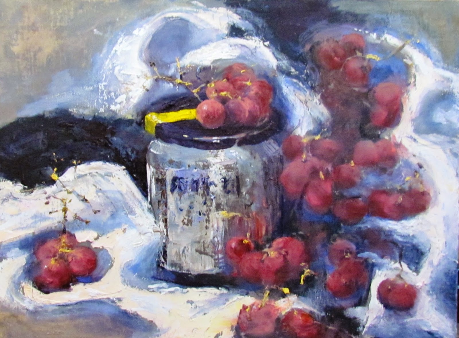
A Jar and Grapes

Red Grapes and Jar Still Life
I was in Session One of a workshop with one of my favorite artists from the New England region, Eli Cedrone.   She had sent out a lesson plan in advance of the class which included some interesting YouTube links for reference. 

Abstracted Thumbnail
American Artist Richard Diebenkorn was influenced by the work of Paul Cezanne and Henri Matisse.   He was drawn to their bold palette, the flattening of the picture plane and the minimal blending of color. He was interested in the geometry of a space – be it a still life, a field seen from above or an interior with figure. It is that convergence of lines and angles, forms distilled to their primary shapes, that connects his figurative paintings to his abstractions.

Eli challenged us to incorporate our twist on Diebenkorn's simplification and abstraction.  The mission was to render a non-representational depiction of our chosen still life set ups and to come up with a more striking and interesting composition. 


A Jar and Grapes - In Progress
As always, I love an art challenge and Eli's creative lesson plan challenged my status quo. With a 12x16 canvas staring at me, I started thinking that a few red grapes and a jar of Ikea pickled herring (my lunch) would be a weak and less-than-thrilling painting.   However, the objective of designing the painting instead of painting the subject exactly as designed, saved the day.

I decided to "split" the canvas into three zones.  Using the viewfinder I made three independent views of the grapes and jar set up.   I was trying to make a black and white abstract that had nice variation, without yet thinking about how this would become a red grape and jar still life.   (Important:  The composition makes or breaks the painting)   We next did a flat line drawing of the design.  By the time paint was applied, the three vertical zones were interleaved.   At this point, the actual set up in front of me was only for color and shadow reference, because my black and white thumbnail was my composition blueprint.


A Jar and Grapes - Loud and Loose
Here is the end product;  more loud and loose than usual.

BUY NOW