Monday, January 28, 2013

Presidential Portraits

George Washington Study
Over the holidays I began an intense stretch of oil color portraits.   I had finished a short course in academic drawing as described in my previous post and this portrait work builds upon it.


Realistic portraiture was one of the first classes I took many years ago.   It was a struggle mostly because my drawing experience was lacking.   Since that time, my experience has grown, and especially in drawing it is greatly expanded; it still is hard work nevertheless.

Abraham Lincoln Study
I have moved from charcoal drawings to oil color, but the baseline drawing in a monotone is still the most important stage.  I am constantly checking the placement of my brushstrokes with respect to established landmarks.  I have been spending as much time making adjustments with a paper towel as with a brush. 

My first few portraits were not good.   Yes, they looked like human beings, just not the people I was painting! I learned that a good baseline drawing with a carefully measured likeness is just as vital to success in the outcome of the oil portrait as with the charcoal drawings. If the monochrome underpainting did not look like the person, what made me think that adding flesh color would transform it to look like the person?

George W. Bush Study
Shared in this post are three presidential portraits done recently.   There was a noticable progression from poor to decent, but because I couldn't tolerate the poor portraits, I have since gone back and reworked them all.   Obviously not done from life!   It is said that even in Lincoln's day, true to his humble self, he never sat for a portrait. Any portraits or busts that exist today were done from photographs which was a new technology in the mid-1800's.

These portraits were done using the John Howard Sanden portrait palette from his book "Portraits from Life in 29 Steps."  The prescribed pre-mixing of colors was a switch for me as I usually mix color as I need it.   I came to appreciate having the fleshtones ready and believe it provided good harmony overall.

Sunday, January 20, 2013

WRT: WRT

Academic Drawing from the Flat
There is no more demanding genre than realistic portraiture.   One of the first classes I took many years ago was a portrait class.   It was a struggle then, and hundreds of paintings later, it still is a struggle.   It requires careful measurement and constant checking of placement of brushstrokes with respect to established landmarks.   The biggest favor I did for myself is to give myself permission to measure with reckless abandon - almost at every stroke. 


Academic Drawing from the Flat
 At first I thought this was squelching creativity.   Then I surrendered to the reality that a human likeness is not as open to interpretation as I might have thought.    Slowing down and carefully placing marks with respect to other marks is crucial for success.   Shown in this post is sampling of (some not-so-great) drawings that I have worked on over the last several weeks.  


Academic Drawing from Bust
I used the standard methods for dividing the face and/or figure as described by my academic drawing class teacher.   A grid works well and similar methods are available in any good portrait or figure book.  From my own intensive period of portrait and figure practice, I can add my best advice toward success in achieving a likeness with two steps. 


Academic Drawing Live Model

1) Decide on a unit of measure for the portrait or figure and use that consistently throughout.  A unit of measure can be a nose length, an eye width - or - for a figure, a head length etc..   For me this made sense because if a mistake is made in a secondary measurement,even if it is slight, then I use that thing to measure the next, the errors can get larger.  Always measuring from the primary unit at least guarantees accuracy with respect to it.

2) Choose a primary pivot point and place landmarks on the face or figure using the unit of measure with respect to that pivot point.      For portraits, I have been using the base spot at the top of the nose exactly between the eyes.     By using that relatively immobile spot, (and the measuring unit in step 1, it was possible to get a consistent measurement on some angle to any other landmark.

Academic Drawing Live Model


After measuring and placing the shapes and shadows, its good to measure again.   The carpenter's mantra works here, "measure twice, cut once." Although it is somewhat tedious, without it, the chances of having an acceptable likeness are slim.  Unlike a landscape, measurements that are close are not good enough for a portrait.


Wednesday, January 16, 2013

Snow on the Marshside

Viewfinder Taped to Slider
It was snowing today and with a low morning tide, the marsh turned white quickly.  I set up an easel at my studio slider which overlooks this beautiful scene.   It was a nice study in receding distances because the far side of the marsh is about a half mile away, the two cedar trees in the middle are about a third of a mile away, and the dark evergreens on the right are literally right around the corner, about a block away.  I recycled a summertime sailboat painting that had quite a bit of blue which would fit the bill for a snowy underpainting.  

See the photo for my hands-free viewfinder taped to the slider door.   I framed the scene with the viewfinder so that distant marsh shore was pointing in from the right with a slight angle up.   The darkest trees and dock on the left came in on a diagonally, also slightly, upward angle.   The two mid-distance cedars were exactly in the middle.
Snowy scene, easel, viewfinder

I mixed a few pretty light and mid value grays for the sky and far treeline and applied with a large bristle brush.  I used my palette knife to place in the snowy rooftops.  I never realized that the old Ranchhouse was visible from here, but its large roof was a noticable wedge shape against the darker trees.

I worked from furthest to closest, darkening my mixtures as they got near.   The evergreens on the left looked almost black against the snow so I used chromium green and ivory black to get a dark, dull green-black.
Nearly final Snow on the Marshside

After putting in some hints of the Cut River that zigzags through the marsh, I mixed a few shades of white, pink white, blue white, lavender white and yellow white.   I scraped the subtle shades up onto my palette knife and spread it onto the marsh with about three strokes.   The colors blended like food coloring and some ridges got left behind, which looked like what can happen with snow.


I was happy with it and I actually stopped.   Hah.  That is not always easy.   It also had started to rain and the snow on the marsh was melting, which made it less tempting to continue.

Final version will be posted to my website in a couple of days (Mid distance trees should be taller)

BUY NOW

Saturday, January 12, 2013

Bay Ave Back Lot

Girl on Bicycle - Take Two
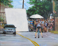
The movie fun and excitment that began last summer in Green Harbor continues.   I'm referring to the movie that was filmed on our street last summer.   In a previous blog entry I described a painting I did depicting a long view of the street while a scene was being filmed.   A young girl on a bike was queued up to ride away from me toward the house that was used as a primary set for the movie.   That painting, "Girl on Bicycle - Take Two" was sold for me by the Jeanie Madsen Gallery in Santa Monica.    That first painting is on the left and its description is in a blog post from last summer. (Search this blog for label "movie")

Even since the filming of the movie, The Way, Way Back was completed last August, we have been wondering if and when this independently-made movie would be released.   We learned this week that the movie is slated to be part of the Sundance Film Festival at the end of this month (January 2013).  Yaay!  Here is the listing from the film festival program.
Stage One - Disappearing Lilies

http://filmguide.sundance.org/film/13111/the_way_way_back

With this extra good news, I began another movie related painting.   Photography had not been allowed during filming, but on the non-filming days, the neighbors were free to look around the set.  I had taken a few pictures with the permission from the security detail.

Stage Two
I recycled a subpar white lily painting, which provided a nice under-texture (see Stage One - Disappearing Lilies).   In stage one of the painting, one lily is still plainly visible.  The house that was used for filming was the backdrop of the painting.   Two blue pop-up tents that the filming crew used to shelter the equipment and cast from the elements are shown.   A large piece of lighting equipment was placed on the left in front of the barn.   Two members of the cast/crew members were sitting under the tent, fully immersed in a discussion of the next scene.  The question is who were they?  And, were they rehearsing the next scene, or interpreting lines?


Stage Three
As for the painting composition, I liked the geometric elements of the house (rooflines, windows, steps, movie equipment, etc)   The weathered cedar shingles weren't difficult, but they were time consuming in that I applied several layers of semi-dry brush color on sequential days to get a rough, rustic look.   The branches of the old cedars that were overhead soften the top of the house's roofline.   I used my green oxide (a grayish green used for flesh shadows), mixed with some ivory black to get the right shade of green for this purpose.

The biggest challenge was painting the two figures under the tent.   I created this behind the scenes picture from two unrelated photos and memory.   I knew that if I was going to put the figures under the tent their flesh would be would be in deep shadow and the sunlit flesh colors in my mismatched photo would not be accurate.  In the Stage Two photo above, the figures are too light.   This is despite the fact that I brightly back-lit the figures, hoping they would be more distinguishable and dark (by contrast).    In the final photo Bay Ave Back Lot, I did darken the figures, especially the man.   Since the woman was fair I made a conscious decision to leave her a little brighter, as though she was getting more reflective light where she was sitting than the man.

I'm thinking this painting makes a nice remembrance of the summer of 2012 - the year that "The Way, Way Back" was filmed in Green Harbor, Massachusetts.
Bay Ave Back Lot

Thursday, January 3, 2013

Winter Hike - Putney Mountain Road

Last winter I did two huge (for me) paintings of winter scenes up in Newfane, Vermont.  I was working from photographs and I posted several times in this blog on their progress.  I was having difficulty trying to determine what the true colors were - especially of the snow and its shadows.   I worked on the compositions and got the structural aspects done, then I waited for it to snow.   My plan was to adjust the snow color when I had a live winter scene here, the best reference of all.  Amazingly, it never did snow last winter (2012) - at least not enough to constitute a wintery scene.  The two paintings have been stacked in a corner for months.

At the Boston International Art Show, I saw two stunning snow scenes done by Walter Launt Palmer (1854-1932).   The snow in his paintings actually seemed to glisten.  Further searches online revealed that Palmer was well known for his snowscenes, many of which were done in Albany, New York in the mid-1880's.  I haven't painted much snow, but I have seen a lot of snow, enough to know when someone depicts it effectively.  Newly inspired by the beauty of Palmer's snowscapes, I thought about my big canvases in the corner (turned inward and not visible).

I pulled out the first canvas, a walk up Mount Putney Road in Vermont.   Although I didn't have a good reference for color, my impression of the dormant painting was encouraging.  I thought the values were good, the composition was interesting and it really brought back the memory of being out there on that sparkling, clear winter day.   I was glad I picked the subject matter.

Armed with new information about painting snow, I launched a new round of changes to the snow colors.   I had learned that the color temperature guideline was binary - either warm light/cool shadow or cool light/warm shadow.    What I have learned since then is that one aspect of light can create an exception to the rule....transluscence.   For example, a brightly lit flower in a standard warm light/cool shadow scheme can emit a warm chroma from within the shaded throat of the flower if the petals are translucent.  

Similarly, snow has translucence and the light's refraction can disrupt the typical cool light/warm shadow scheme.    Shadows may have warm and cool hues (greens, blues, pinks) within the dominant shadow value. 

And then - it snowed!   With a snowy scene outside for reference and some tips on painting snow from the Stapleton Kearns blog, I reapplied my snow.   Here it is - finally - for your review and comment.


Winter Hike - Putney Mountain Road