Showing posts with label drawing. Show all posts

Wednesday, April 3, 2019

Open Studio Figure Drawings in Charcoal


Open Studio 1
Open Studio 2
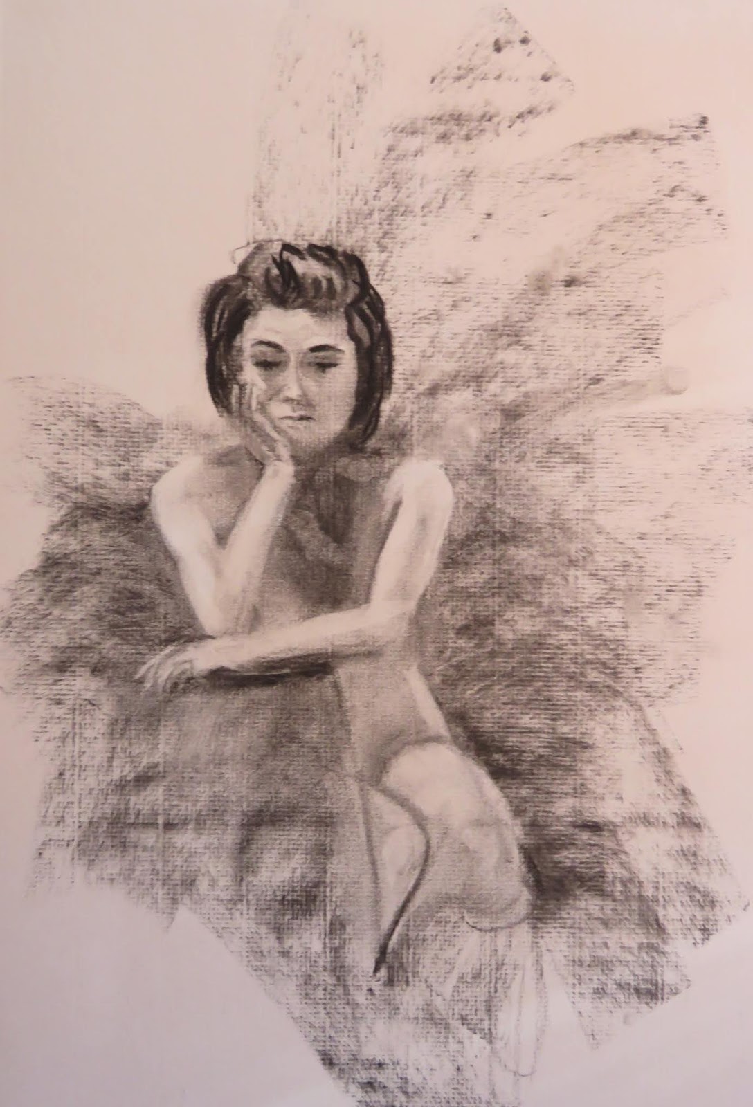
Have you ever been curious about open studio painting sessions?  This is how it works.   The organizer of the open studio typically contracts with a professional model to pose for a group of painters.   Painters all contribute to the "sitting" fee.    Sometimes the model is clothed, but more often they pose nude.   The organizer and/or group decides on a pose and adjusts lighting to both accomodate the comfort of the model and create interesting angles for the painters.   Many models ask that no photos be taken, but I've also had models allow it and just ask for a promise of discretion and use only in finishing the painting.    A timer is set for a particular duration and when it goes off, the model puts on her robe and gets a break.  The total session is usually three hours.

Open Studio 3
There isn't a huge market for nude paintings, but these sessions are great practice for painters.  It helps to know how the human figure is constructed when inserting figures (with clothing) into a painting.

I was happy with the likeness and the angles of these sketches, although not so much with the way the charcoal sat on the paper (bumps, lines etc.)   On this evening, whenever the model took a break, I moved my easel to a new spot, thus the different angles.  These aren't meant to be finished works, but for me reinforcement of figure basics for use in landscape and otherwise.


Wednesday, May 30, 2018

Six Boats and a House That Floats - Revisited

This was painted from the roof deck of the Long Wharf Marriott in Newport, RI.    It is part of the Copley Society of Art Exhibition entitled " Anchors Aweigh."

Six Boats and a House That Float
The drawing itself was challenging.  Sight-sizing wasn't possible because in order to see my scene, I had to lean over the railing and look down, versus having the canvas and scene side-by-side.    I guess that made it more of a memory exercise.    The top down angle adds an interesting twist.

Other than the occasional gusty wind and constant rumble of the ventilation system, it was very pleasant!

Wednesday, June 21, 2017

Six Boats and a House That Floats

Six Boats and a House That Floats - Phase One
Our accomodations in Newport, RI had a rooftop deck that offered spectacular views of Newport Harbor.   It was the first full day and my plan was to paint a harbor scene.  I knew about the roofdeck.  I fought off the urge to be lazy and not lug my painting gear from the carport level - to the elevator - to the fifth floor down the hall - through the fire door - to the last flight of stairs to the roof.     I would be glad I went after this unique vantage;  top down views are among the most dynamic compositions because of the sharp angles.


Six Boats and a House That Float
The drawing itself was challenging.  Sight-sizing wasn't possible because in order to see my scene, I had to lean over the railing and look down, versus having the canvas and scene side-by-side.    I guess that made it more of a memory exercise.    Other than the occasional gusty wind and constant rumble of the ventilation system, it was very pleasant!

Sunday, March 20, 2016

Self Portrait

Black and White Start
I enjoy painting humans and would paint them more if I had the resources and a model readily available.   I've painted people from photos, but just as with landscapes, the camera tends to distort color and lose subtle details, thus, a live model is best.   The most available live model I have is me, so I once again this winter, I painted myself.  :)


First Pass at Color
I spent considerable time experimenting with the setup for this self portrait.   I have always loved the chiaroscuro style in which light dramatically contrasts with the shadows/darks.   I attempted to achieve this strong contrast by setting up a spotlight and turning off all the other light sources.    I stood in front of the large mirror in my studio and trained the spotlight on my face so that one side of my face was illuminated and the other side only had partial light.   Two full spectrum lights illuminated my palette and the canvas.    During the painting process, I alternated between two kinds of lighting in order to get the true facial shadows, 1) just the spotlight and 2) all three lights: the palette, the canvas, and facial spotlight.


Lighting at Easel
I started with a charcoal likeness and spent a lot of time placing facial landmarks, measuring and re-measuring.  If this stage is wrong, it can only get worse from here.   Once I was satisfied with the drawing, I used a spray fixative to seal the charcoal.  After an initial underpainting, I began the layering process.


I used the glazing technique for the flesh tones building up many layers of transparent color.    My tendency is to make my people too red, thinking ruddy Irish complexions.    Careful color comparisons reveal that we often have more greenish, grayish undertones, especially on flesh planes that are perpendicular to the light source.

Vezina Self Portrait
And I thought I knew what I looked like!  After all, I see this face in the mirror everyday (well at least most days:)).  So why does it seem difficult to objectively assess if the likeness on my canvas hits the mark?    If you know what I look like, you will quickly realize that the painted image is the reverse, since I used one mirror, not two mirrors.  Perhaps years from now when - or should I say if? - this is hanging in one of my children's houses, they will know to wedge it in a hall corner next to a mirror!


Tuesday, June 24, 2014

Aihlbe with Lace Neckline

Aihlbe with Lace Neckline
Remember Ailhbe, my alabaster white bust?   She set up for a pose again and this time it was a downward angle done in charcoal.   Highlights were done with white conte.  

Of course I improvised on the neckline since the bust ends at the neck.   Between Artist Dan Thompson's workshop and the upcoming Rob Liberace workshop, I know I need to practice the portrait as much as I can.

Thursday, April 3, 2014

Dad 1945

Dad 1945
The handsome strapping young sailor in this pencil/charcoal drawing is my Dad.  Dozens of vintage photographs were with his things.  He had taken the time to label each photo with names of those in the pictures.  That is, except for this one photo - of himself.  

I began with a two value drawing with pencil.  I expanded my value range to five, but was not satisfied with my darkest value until I introduced soft vine charcoal over the pencil for the darkest dark.  I used a stump to soften each value.

The familiar features (literally) common to the clan include the high arching eyebrows, straight full nose and prominent lower lip.  I see these features in myself and my boys.   I think it helped the flow of the drawing to know that these were the features that needed to be right.


Friday, February 7, 2014

Self Portrait

If a painter would like to work on a live portrait - and there is no model available, self-portrait work is the only option.   Staring for hours into a mirror with the goal of creating a good likeness has always been a challenge.   The task has become less daunting with the realization that it is no different than producing a realistic still life or landscape.    Highlights, shadows, and lines (many lines) all arranged in a precise order magically become an image.   True to most self-portraits, the facial expression in this charcoal sketch seems serious and even scary.

Saturday, January 11, 2014

Ailbhe Profile in Charcoal

Ailbhe in Profile
Model Ailbhe is shown in this drawing in profile.  The light source was directly in front of her, shining straight toward her face.  I used a soft vine charcoal on Strathmore 500 charcoal paper.

After sketching in the overall head and neck, I probably spent an equal amount of time remeasuring and lifting out charcoal with an eraser.   After I finished my major first pass, I colored in the background placing darker values behind the lighter highlights on her head, and lightening the background behind her shadow side.     The squiggles in the background were done with my eraser; I thought it would be a bit more interesting and echo the wave in her hair as well.

I'm debating on whether to add clothing, maybe a scoop neck or a necklace because I'm not all that happy with the neck and shoulders.  I really enjoy translating people from their 3D selves to the 2D surface.  And she is a great model; she never moves a muscle.  :)


Monday, November 4, 2013

Basket of Apples

Basket of Apples
I dropped into a painting group a couple of days ago and there were multiple still lifes set up.   I should have worked on the still life that would have been more difficult for me.    It was a high key collection of objects in blues and oranges.  I elected to have more fun and do the big basked of apples; they were mac's afterall :).     I used a smooth clayboard substrate and a relatively small brush to rough in the drawing.   I used a paper towel to wipe out and fine tune the placement and size of the apples.   Although the spotlight on the setup was warm in tone, I like my cool lights these days, so I used my naples yellow for the lit portions of the basket and I used warm burnt sienna for the basket shadows.   I recently added some of Gamblin's Radiant Magenta to my palette (until I can get some more Permanent Rose).   The Radiant Magenta is nothing like Permanent Rose since it is lighter in value and opaque.   I mixed it with my Cad Red to apply the lit tops of the red apples.

As I look at the photo now, I realize that the red apple in shadow is too red.   I will pull some of the shadow color behind it to subdue it somewhat.   Let me know your comments!

BUY NOW

Monday, October 7, 2013

Sketching (A Little) in Ireland

Castletownbere Harbor


I did not bring painting materials to Ireland.   There would be no room in my luggage for the gear and wet paintings.   This trip was about visiting ancestral locales and covering as much of the country as we could.   The itinerary did not lend itself to the concept of a paint-out. I wouldn't change a thing about this, our inaugural trip, but I did occasionally long to paint. Mark my words, the next trip to Ireland will include painting!


Castletownbere and Bere Island Satellite Map
One morning, while in Castletownbere on the Beara Penninsula (all the way to the Southwest tip of Ireland), I sketched a scene of the gorgeous view looking out toward Bere Island.   See the satellite view for an aerial shot.  The green marker is where I was and the island to the southeast is Bere Island (the hill in the sketch.)  The vine charcoal was sorely lacking as a recording method.  I'm sharing a photo that is similar...it didn't capture the color either since it was twilight in that shot.


Sketching at Kilkenny Castle
Whilst (heehee) at Kilkenny Castle, I marginally satisfied the painting itch again and did some more sketching.   I sat inside the back gate, the location of some impressive statues.  I used vine charcoal and a drawing pad.  I didn't get far, and I didn't record who this was a statue of, but it was a woman with majestic layers of folds in her garb.  I liked the shapes against the low and dramatic light.

My husband came away with the more successful rendering with the cool photo of me measuring, showing his flare for composition.


Tuesday, August 13, 2013

Under the Yellow Umbrella

Yellow Umbrella Girl - Stage 1
Yellow Umbrella Girl - Stage 2
An indoor painting session with our live model resulted in a sweet pose with a predominantly yellow and purple harmony.    The cool light on the yellow umbrella was painted with lemon yellow.   The darker yellow in shadow was painted with a mix of cadmium yellow deep and purple.  

After having painted this same young lady two weeks ago and using her photograph to make adjustments to that first painting, I was quite familiar with her features.   The initial drawing of the face in paint went more smoothly because of it.  

The umbrella pigment was spread on with the palette knife, giving it a broken chunky look that I like.   The figure in my painting was chunky as well and that I did not like.   The model was trim and fit so in my pursuit to get a likeness I slimmed her out significantly.  Within the purple yellow harmony, the darks of her hair were purple and the lights were yellowish-lavender.

The hands are still a little to rough for my liking, so before I call it completely done, I will smooth them out a bit.   Comments are welcome.


Tuesday, August 6, 2013

Another Courtroom Sketch

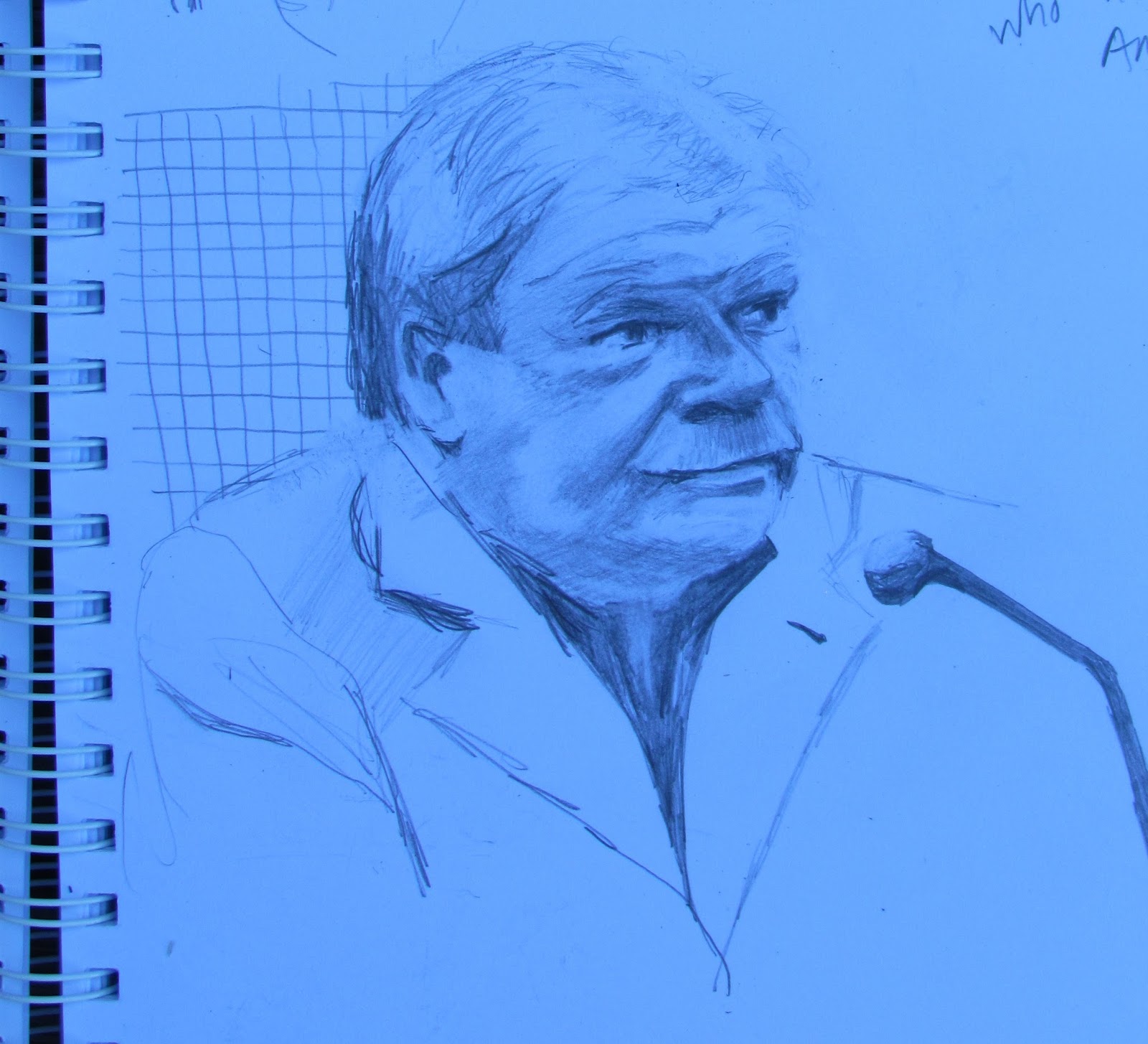
In the Boston Federal Courthouse today, the closing arguments were presented in the trial of James "Whitey" Bulger.   Fred Wyshak Jr., US Attorney, presented for over three hours, summarizing the government's case against Bulger.   The scene depicted in the sketch is Wyshak who stood at the podium while Defense Attorney Jay Carney and Bulger sat at a table behind him.

Friday, August 2, 2013

Courtroom Sketches

Bulger Hunched Over
One of the country's most infamous criminals, James "Whitey" Bulger is currently on trial in the Federal Courthouse in Boston.    Last week the prosecution wrapped up its case and this week, the defense began presenting their witnesses.   This news got me thinking that if I was going to get into Boston to see any of the trial, I had better do it soon.


Bulger & Carney
Only ten courtroom spots are available to ordinary citizens like myself.   The security guard at the door of the courtroom showed me the ten signatures that were taking up those ten spots on this particular day.   He noted that typically the list was filled by 5:30 AM.   The bottom line was that there was no chance of me getting into the main courtroom.


FBI Fitzgerald Ink 1+2
I was directed to the "overflow" courtroom.   In these courtrooms (there were actually two) large video monitors were set up on either side of the room allowing the viewing public to witness the trial.  

It was a dual purpose that prompted my visit to the courthouse.     It is a historic and fascinating trial spanning forty years of Boston history.   While listening and viewing the trial, I would also be able to work on portraits of the witnesses. 
FBI Fitzgerald Ink 3+4

Before the jury came in, Judge Casper ruled on various motions that had been put before her, including the issue of sequestration of the jury during deliberations.    Bulger struck a pose during these proceedings that I have heard has been his daily position (eyes down, chin resting on his left hand) and his lawyer, Jay Carney was seated to his right.


On this, the first day for the defense, they put Robert Fitzgerald, a former FBI Supervisor, on the stand.    For three hours he recounted everything from his schooling, to his involvement in organized crime cases, political scandals (ABSCAM), and his job as supervisor of a group of FBI Agents in Boston.  

FBI Fitzgerald Ink 5
FBI Fitzgerald Ink 6
His seventy-three year old face was full of character lines.   His hair was somewhat red, his cheeks fleshy and rudy, and his moustache was gray.    I had my sketchbook, but had left my pencil on the passenger seat of the car.   So I sketched with a Bic pen until the first break, when I could retrieve my pencil.   I have included all of my scribblings in this post.

The progression of the sketches probably demonstrates the learning that went on as I became more familiar with the facial features.   The only drawback was that I was copying from a 2D monitor, not the person in full 3D.  All the practice is good however.


FBI Fitzgerald Ink 7

Robert Fitzgerald Pencil Sketch

Tuesday, June 25, 2013

Daniel Keys Demo at Regis College

With another year of phenomenal success behind him, Daniel Keys just wrapped up two weeks on the East Coast, culminating in a painting demonstration held at Regis College in Weston, MA.   I was particularly psyched to learn of this venue because I graduated from the school, oh so many years ago.   If you have ever been to Regis, you know that the main building is College Hall, a grand stone building with pillars and archways that no doubt had attendees marveling at the beauty of the place.   The building may have been the first beautiful observation, but after just three hours, Daniel had created his own beautiful creation.   The crowd numbered roughly fifty, men and women ranging in age from twenty to eighty.   We learned that an instructional DVD was to be filmed as we observed the demo.   We were asked to hold questions or record the question to be addressed at appropriate points in the demo, so that the filming would go more smoothly.

It was no less enjoyable watching Daniel paint this year, even though I saw him paint a year  Like all of us who paint, a continuous evolution occurs.    He is trying different colors (like King's Blue), techniques (dry brush), mediums (walnut oil) and planning new subject matter.   

The two aspects of Daniel's painting that I find the most fascinating are:

The loose initial strokes made with large wide brushes approximate the color and shadows and look almost messy and haphazard.  Section by section this looseness is transformed with precise and economical strokes that bring laser focus to each element;

Keys Set-up, Palette & Painting
Secondly, the care taken to mix pristine, unpolluted color.   This includes the discipline of rinsing brushes in between strokes.    The photo doesn't lie.   Look how fresh and clean the palette pools of color are!   No wonder the painting is also bright and fresh.


.

Saturday, June 8, 2013

Auntie

Auntie - Stage One
I continue to work on developing my portraiture skills, and the human figure and portraits have become my favorite painting subjects.   People are so much more interesting than even the most strikingly beautiful landscape (in my opinion).

I used a photograph to develop this painting of my Aunt Theresa.   She is turning 87 in a couple of weeks, now the matriarch of the family, outliving all of her family of the same generation.   When asked for her longevity secret, she said, "Eat good food, and do what you are supposed to do."  Of course she means "healthy" food, and the other part sounds pretty simple, right?

I worked this portrait from a recent photo.   I undertoned the canvas with a pale, Irish fleshtone.   Transparent brown oxide was used to sketch in the features.  I set the dots for the pupils first.   Once I established the spot between the eyes, all other features were measured from that spot.   This method gave me a consistent way to measure from that dot to other landmarks,  and observe the angle between the two to build the facial structure more accurately. 

Once the whole face was sketched, I re-measured, and per my usual mistake, the tip of the nose was too long.  It is critically important to the success of the likeness to go back and make a second pass in measuring, tweaking the drawing until it looks just like the person.   Aunt Theresa's trademark white blouse and pastel colored mock neck makes it authentic and personal.   I felt that the typical dark portrait background would be too drastic a contrast, so I stayed with the pastel theme.

I positioned Auntie's head to the left because I was considering adding her hands somehow.   Elderly hands have so much character and perhaps she is reaching for her visor or diamond studded pink sunglasses.   Or perhaps someone has another interesting suggestion.   If so, don't hesitate to let me know.  I still may add them, as this is still in-progress.

Monday, January 28, 2013

Presidential Portraits

George Washington Study
Over the holidays I began an intense stretch of oil color portraits.   I had finished a short course in academic drawing as described in my previous post and this portrait work builds upon it.


Realistic portraiture was one of the first classes I took many years ago.   It was a struggle mostly because my drawing experience was lacking.   Since that time, my experience has grown, and especially in drawing it is greatly expanded; it still is hard work nevertheless.

Abraham Lincoln Study
I have moved from charcoal drawings to oil color, but the baseline drawing in a monotone is still the most important stage.  I am constantly checking the placement of my brushstrokes with respect to established landmarks.  I have been spending as much time making adjustments with a paper towel as with a brush. 

My first few portraits were not good.   Yes, they looked like human beings, just not the people I was painting! I learned that a good baseline drawing with a carefully measured likeness is just as vital to success in the outcome of the oil portrait as with the charcoal drawings. If the monochrome underpainting did not look like the person, what made me think that adding flesh color would transform it to look like the person?

George W. Bush Study
Shared in this post are three presidential portraits done recently.   There was a noticable progression from poor to decent, but because I couldn't tolerate the poor portraits, I have since gone back and reworked them all.   Obviously not done from life!   It is said that even in Lincoln's day, true to his humble self, he never sat for a portrait. Any portraits or busts that exist today were done from photographs which was a new technology in the mid-1800's.

These portraits were done using the John Howard Sanden portrait palette from his book "Portraits from Life in 29 Steps."  The prescribed pre-mixing of colors was a switch for me as I usually mix color as I need it.   I came to appreciate having the fleshtones ready and believe it provided good harmony overall.

Sunday, January 20, 2013

WRT: WRT

Academic Drawing from the Flat
There is no more demanding genre than realistic portraiture.   One of the first classes I took many years ago was a portrait class.   It was a struggle then, and hundreds of paintings later, it still is a struggle.   It requires careful measurement and constant checking of placement of brushstrokes with respect to established landmarks.   The biggest favor I did for myself is to give myself permission to measure with reckless abandon - almost at every stroke. 


Academic Drawing from the Flat
 At first I thought this was squelching creativity.   Then I surrendered to the reality that a human likeness is not as open to interpretation as I might have thought.    Slowing down and carefully placing marks with respect to other marks is crucial for success.   Shown in this post is sampling of (some not-so-great) drawings that I have worked on over the last several weeks.  


Academic Drawing from Bust
I used the standard methods for dividing the face and/or figure as described by my academic drawing class teacher.   A grid works well and similar methods are available in any good portrait or figure book.  From my own intensive period of portrait and figure practice, I can add my best advice toward success in achieving a likeness with two steps. 


Academic Drawing Live Model

1) Decide on a unit of measure for the portrait or figure and use that consistently throughout.  A unit of measure can be a nose length, an eye width - or - for a figure, a head length etc..   For me this made sense because if a mistake is made in a secondary measurement,even if it is slight, then I use that thing to measure the next, the errors can get larger.  Always measuring from the primary unit at least guarantees accuracy with respect to it.

2) Choose a primary pivot point and place landmarks on the face or figure using the unit of measure with respect to that pivot point.      For portraits, I have been using the base spot at the top of the nose exactly between the eyes.     By using that relatively immobile spot, (and the measuring unit in step 1, it was possible to get a consistent measurement on some angle to any other landmark.

Academic Drawing Live Model


After measuring and placing the shapes and shadows, its good to measure again.   The carpenter's mantra works here, "measure twice, cut once." Although it is somewhat tedious, without it, the chances of having an acceptable likeness are slim.  Unlike a landscape, measurements that are close are not good enough for a portrait.