Showing posts with label fleshtones. Show all posts

Thursday, August 11, 2022

Shimmery Silk

Shimmery Silk

 It was literally 95 degrees and humid when a group of painters gathered in Adams Common in Quincy, MA for a live model paintout.    We had two hours which was enough with that heat.   Our wonderful model wore a pure silk skirt that gathered at the waist and of course only enhanced her perfect physique.

I used sight sizing to capture the drawing and once I switched to color paint I "wiped off" my extra paint repeatedly on the background which started to build up an abstract and harmonious wallpaper.  The added bonus was a multi-cultural concert going on.   It was a happening place!

Tuesday, July 26, 2022

Laura Portrait

This is a life class portrait of a fellow painter who became the model for one night.  She is a spectacular portrait painter and I wanted to do a good job.   As I mentioned in blogs past, the more flawless the face, the more difficult it is to honor the beauty.    I did my best and I reworked the nose area multiple times!   The brushstrokes for hair on the other hand were fun and free flowing.

Laura


Thursday, July 14, 2022

Britt Portrait

Britt


Painting from life is a challenging and rewarding undertaking.   This model had beautiful distinctive features which helped in establishing facial "landmarks."   Her flesh tones seemed pale under the studio spotlights so I took the liberty of giving this lovely woman high color.

Thursday, June 16, 2022

Katherine Middleton Portrait

Duchess
 I hope you immediately recognize this portrait as the Duchess of Cambridge, Kate Middleton.  My goal was to capture her likeness and keep a loose feel to the painting with mostly soft edges.   This was done from a freeze frame from a video I found.     There is a bit of shine on this photo here, but I'm happy to reveal that it won First Place in Oils at the recent Quincy Artfest.

Wednesday, March 9, 2022

Jamaican Fisherman

Jamaican Fisherman
Where there is water, there is fishing.  On vacation in Jamaica we noticed that just like in New England, the fishermen are out early and most of the fishing we saw looked something like this scene.  There would be a small, crusty boat with one or two fishermen in the shallows working with nets.  

As for the painting, the vivid turquoise of the water was dazzling bright and it seemed to illuminate - even exaggerate the figure.  This painting was done over a bright orange undertone which was meant to compliment the flesh tones. 

Tuesday, May 12, 2020

Little Dolls

Little Dolls

What is sweeter than a little toddler fresh out of the bath in her new pajamas and robe?   The day was a busy one for all the baby dolls and it was time to relax with a big book. 

I purposely subdued the colors and supporting elements (doll and carriage) which gave it a serene, tonalist feel.   Have you ever checked out tonalism?   The restful feel of the tonalist palette is a way of communicating emotion in a two dimensional painting.  

Tuesday, August 13, 2019

Lunch Along Boston Harborwalk

Family Lunch
These lucky folks are enjoying lunch at the Boston Harbor Hotel along the Harborwalk.     The two parents, a son, and a daughter are vacationing in Boston.   The daughter is slated to start school in the Fall.  In anticipation, there are lots of nerves, judging by their faces, but they are enjoying this, the last pre-college family trip.

What attracted me to the scene was the curviness of the bright iron tables and chairs.   The family of four, was encircled with all the lines.   Also the dark red brick really set off the white furniture and dinner napkins on the laps of the diners.   With this many shapes and colors, the painting should keep the viewer interested for more than a few seconds.  At least that is the goal.

The truth is, I painted this from a reference photo taken from five floors up while I was on vacation.   It was a wide angle shot that included a band that was playing, almost panoramic.  This family was incidental to the photo, but I cropped it and zeroed in on this snippet.  Also, I made up the whole first paragraph.  I have no idea who these people are!   :)

Tuesday, December 4, 2018

Sweetness of Summer

Sweetness of  Summer
What a fun and enjoyable project.   Painting children as I've said many times before can be challenging.  It's a fine line between the soft and sweet expression and achieving an adequate likeness.  Tots have neither wrinkles or angular features, like adults and painters use these as convenient facial landmarks.   Tots have faces with airbrushed angelic-like perfection.    So the painting process of them may involve painting, wiping out, and repeating - until the soft likeness is achieved.

A good reference photo can make a positive difference when creating a painted portrait, and this was a good one.   The challenges in this project, besides the likeness, were 1) transforming the greenish-yellow tones in the photo into a more summery color scheme, (making it lighter and brighter), and secondly, realigning the rectangular photo onto a square format while maintaining the balance of the landscape, parasol and figure.

Warm summer sunlight on young, healthy figures in back-lighting often have a bright red glow, especially in the ears, hands and feet.   I intentionally pumped up the warm flesh color to contrast with the nice summery blue - its complement. The toddler's shadow is stretched to the right bottom corner, balanced by the shoreline entering from the left, leading to the figure. The loop of the parasol handle is a good compositional element for leading the viewer's eye back up to the sweet smiling face.

This painting will hopefully turn a simple summer-day photo into a permanent family heirloom.

Wednesday, July 4, 2018

Aaah - Vacation

Aaah ... Vacation
This patio is a beautiful spot especially in the morning. The arbor juts out to the west from the house, the perfect place to be for a summer vacation morning.   The July greens are lush and moist and the tendrils of the vines stretch for sunlight above the arbor, and things a blooming. 

This is a large painting that was executed in several steps because of all the architectural elements. It was more work than most, which is ironic because the theme of the scene pays homage to doing sweet nothing!

That's not me, by the way. :)

Sunday, March 19, 2017

Soda Water with Lemon aka "Distracted"

Distracted


I liked the casual pose of this figure at the bar.  She had some kind of refreshment with lemon and was talking on the phone.   She had a distracted look, and it was as if her sidelong glance was saying "I'm not buying it."   ... or something to that effect.  :))

The face and hands were worked in a glazed, realistic manner, but the rest of the painting was loosely painted, giving a more abstract feel.


Wednesday, December 14, 2016

Dispersion

Dispersion
Assembling and arranging the elements in this painting exercised my improvisation skills.   Dispersed were the feminine forms, negative spaces around the forms and the linear and geometric shapes.  

The random shapes of the billowing white chiffon of the woman in the foreground contrasted with the angular background but connected with the splash of light on the background figure's platform.   Although there was ambient light in the studio, the nude model in the background had an overhead spotlight, while the chiffon model faced a 45 degree angled light.  Dispersion of a sunbeam through a window prism cast a spectrum too, a rainbow spectrum.

The beauty of the figure and the challenge of painting it can't be compared to anything else for a painter.   The portrait never seems done, as in this scene with two models.

Sunday, August 21, 2016

Blue Sandals

Blue Sandals
This pose caught my eye right away.    If the beautiful figure were to be leaning too much one way or another, the eye would immediately identify the imbalance and be disturbed by it.   The weight of the upper torso is supported by a straight right arm to the chair, and the remaining weight falls onto the planted foot (yes, complicated with a stiletto).    The figure is the focus, so all the other elements are intentionally subdued and blurred.  Classic but contemporary painting depicting the grace of the human figure.

Thursday, August 4, 2016

A Bathing Grace

A Bathing Grace

For centuries in the world of art, there has been endless fascination with the human figure.    Painters have challenged themselves and each other to correctly capture an image that honors the beauty of the body.  Every time I take on a new rendering of a figure, I ask myself, why don't I do this more. The lines, proportions and color of a human being make it - perhaps - the most fascinating of all subjects.  Here is a new painting, done from a high resolution photograph.

Sunday, March 20, 2016

Self Portrait

Black and White Start
I enjoy painting humans and would paint them more if I had the resources and a model readily available.   I've painted people from photos, but just as with landscapes, the camera tends to distort color and lose subtle details, thus, a live model is best.   The most available live model I have is me, so I once again this winter, I painted myself.  :)


First Pass at Color
I spent considerable time experimenting with the setup for this self portrait.   I have always loved the chiaroscuro style in which light dramatically contrasts with the shadows/darks.   I attempted to achieve this strong contrast by setting up a spotlight and turning off all the other light sources.    I stood in front of the large mirror in my studio and trained the spotlight on my face so that one side of my face was illuminated and the other side only had partial light.   Two full spectrum lights illuminated my palette and the canvas.    During the painting process, I alternated between two kinds of lighting in order to get the true facial shadows, 1) just the spotlight and 2) all three lights: the palette, the canvas, and facial spotlight.


Lighting at Easel
I started with a charcoal likeness and spent a lot of time placing facial landmarks, measuring and re-measuring.  If this stage is wrong, it can only get worse from here.   Once I was satisfied with the drawing, I used a spray fixative to seal the charcoal.  After an initial underpainting, I began the layering process.


I used the glazing technique for the flesh tones building up many layers of transparent color.    My tendency is to make my people too red, thinking ruddy Irish complexions.    Careful color comparisons reveal that we often have more greenish, grayish undertones, especially on flesh planes that are perpendicular to the light source.

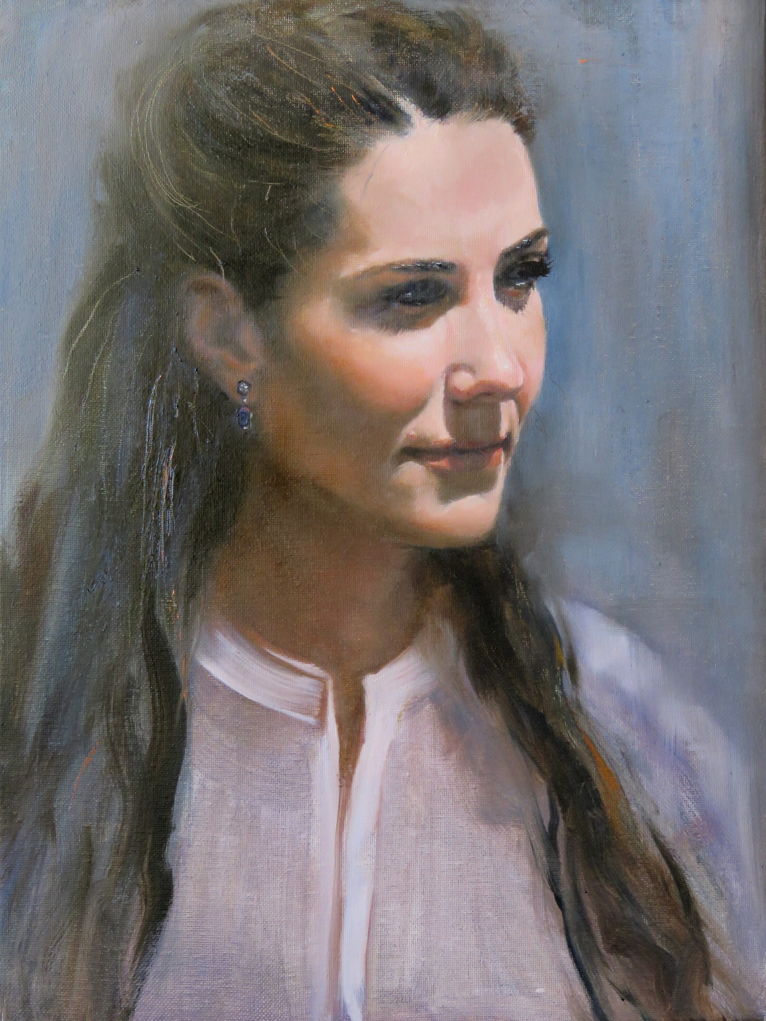
Vezina Self Portrait
And I thought I knew what I looked like!  After all, I see this face in the mirror everyday (well at least most days:)).  So why does it seem difficult to objectively assess if the likeness on my canvas hits the mark?    If you know what I look like, you will quickly realize that the painted image is the reverse, since I used one mirror, not two mirrors.  Perhaps years from now when - or should I say if? - this is hanging in one of my children's houses, they will know to wedge it in a hall corner next to a mirror!


Sunday, July 26, 2015

Sailing at Pleasure Bay

Sailing at Castle Island - Side-by-side view
Today's paint-out was at Castle Island in South Boston, MA, where there is something for everyone - eating, walking, biking, fishing, jet watching, sightseeing - something or nothing - your choice!

I set up facing northwest which placed the tallest Boston buildings, the Prudential and John Hancock in the distant background.    Within the scene coming forward were: the tree-lined access road to the Island, Pleasure Bay (a.k.a. the lagoon) the McDonough Sailing Program docks (jam-packed with kids), the backs of people in their beach chairs and finally the grassy area right in front of me.    There were people everywhere - on the docks, in the water and in the sailboats.   Bright summer sherbet colors dotted the scene, and as a color junky, I couldn't wait to get to dig into those piles of color.  


Sailing at Pleasure Bay
This is a very busy painting, and as such, I was trying to place the most focus on the sailing lessons (ie. using the most vivid color, strong contrast, and sharp edges).  That meant de-emphasizing the other vertical planes as needed  (ie. muted colors, softer edges).    In an exceptionally busy scene, there should be an order of priority to the painting elements.  Otherwise, there may be too many items competing for attention, throwing off the balance.     Despite these observations - it's still too busy of a painting!  What do you think?


Saturday, February 14, 2015

In Good Hands

In Good Hands
I loved this family photograph from Christmas so I decided to paint it.   It was a candid shot of my Grand-nephew being held by his Dad while they opened his Christmas gift bag.   Baby was more interested in watching all the activity in the room while chomping on his chubby little fist.    He is so cute and I am not just saying it!  

Sometimes a painting flows and this was one of them.   Although it was done from a photograph instead of "from life"  the structural likenesses were important.   I tried to approach the sketch in exactly the same way as I would if I had the figures physically present.    I think I got off to a good start by establishing a strong geometric rendering which yielded the correct perspectives.

If you like the painting, you can help my "like" count by clicking this link.

To see a video of intermittent stages of this painting's development, you can go to the blog directly and click on the video link.  It's less than five minutes long.


You can also watch via YouTube:

https://www.youtube.com/watch?v=z_AP_3k1_o4


Thursday, November 6, 2014

Clutching Gold

Renoir Bathers Snippet through Viewfinder
It was the second week of my workshop with Eli Cedrone.   The plan was to use the same ideas from last week's still life abstract, but apply them to a figure.     That process was to design the painting in black and white with a charcoal thumbnail, to do a line drawing that would flatten the planes, then to develop the abstract version into our desired level of realism. 

Thumbnail Design
I chose a painting of Renoir's bathers as inspiration for this one.   I used my viewfinder to frame two small portions of the (very large) painting.   I then did a thumbnail in charcoal of each to decide which one I would paint on my 9x12 canvas.    I liked both thumbnails so I decided (too ambitiously as it turns out) that I would just paint both.   The mission was to keep it loose and free, so I thought there would be time for both - ha, not true! 

As the face and hand came together I decided that this looked like a sleeping goddess.   I refined the closed eyes and adjusted the mouth to be slightly drawn down as in sleep, dreaming even.

Tuesday, December 31, 2013

Terracotta, Alabaster or Bust

Meet my new model.   I recently found her sitting outside a collector/secondhand shop in Billerica, Massachusettss. I spotted her while eating across the street at Mikey's Roast Beef on Routh 3A. (The Roast Beef part is really a misnomer, because they have the best haddock sandwich you'll ever eat and the bonus it that it is an easy, informal sub shop type atmosphere.)  Anyway, while eating in and staring out the plate glass windows, her head was visible amid a chaotic jumble of other secondhand junk - or should I say - treasure.
Freshly Painted

Twenty-five dollars and a lengthy promotional speech later about what a good deal this was by the shop owner, and we were placing her - in all her heftiness - in the back seat for the ride to her new home.   I have been googling her description as well as the numbers on the bottom of the cast bottom base, but haven't found any information as to an original statue that may have been the inspiration.  Further, I'm not sure what she is made of.  She is very heavy.  The color looks like terracotta, but the fact that she was out in the elements without sustaining chips, or crumbling made me think it was something stronger.   (I know nothing about sculpting and related materials).   The only drawback for my purposes was that she had streaked and irregular coloring from sun exposure.
Ailbhe Back to Mirror - Stage One

Well now she is painted white and I am very happy with how she came out.   The sun streaks are gone and although she isn't a high end bust that can run quite a bit of money, she has nice even coloring and is perfect for my studio use.   She's not from money; she's just a regular gal.

I thought about naming her Terri, but she is probably not terracotta, and has since undergone a change in color.

I thought about Blanche, but she doesn't look like a Blanche to me.  (That name brings to mind Blanche on the Golden Girls).

Alabaster, the translucent gypsum material, made me consider Ali.  In this, the year of exploring my Irish roots, I decided on "Ailbhe," an Irish Gaelic name meaning "white."

I used the academic realist technique to produce an accurate drawing looking down at the bust which was also reflected in the studio mirror.   I started with the paper folding technique that I learned from Dianne Paranelli Miller, but instead of using multiple strips for length and width, I put my own spin on measuring with a single piece of paper.   I repeatedly measured until my light and dark areas were line drawn.  I used a thin mix of tranparent oxide brown and ultramarine blue to fil in all the darks.   With a paper towel, I then worked to wipe out all the light areas until it was accurate again.  I did three subsequent sessions of perfeting the light/dark rendering and still to this point the light areas were "no-paint" zones and the dark areas were transparent washes.

I decided to leave the transparent dark areas thin and dark and mixed up opaque flesh color for the lightest lights which were very cool.   As the planes turned away from the light, I warmed the color - within the lightest value.   The darkest skin values were warm darks and at first probably too dark.   

I've painted the lights again in subsequent painting sessions.   Since I have cool light on her, and wanted to add color, I mixed up cool pink and cool green for her hair.   For the flesh, I used my lightest flesh color (naples yellow, cadmium red and flake white), then warm tones for the darks using warm greens and burnt sienna.

I darkened the background and painted in over the figure on the dark sides so as to lose those edges.  

When I view the photo of this painting as a thumbnail, I feel like I want the left shoulder and its reflection to merge in value.   What does everyone else think?

Ailbhe Back to Mirror - Stage Two

Ailbhe in the Mirror


Friday, December 20, 2013

Accordion Color

Full Color Accordian
Ennis, County Clare, Ireland was the first of many stops in Ireland.   Ennis was on the itinerary because it was here we would rest up from flying and get acclimated (time zone, driving on the left, etc.).    We used it as a hub for the western coastline attractions such as the Cliffs of Moher and The Burren.    We were happily surprised to learn that Ennis was attractive and historic in its own right.  It had a small but colorful village atmosphere, including plenty of shops, restaurants and cafes.  There were flower planters everywhere.

The fine fellow playing the accordion in this painting was a fixture on the main street.   He seemed to play continuously and probably the third or fourth time we passed him, he proudly posed for a photo.

I liked the contrast between the vivid colors all around and the musician's drab clothing and somewhat pasty complexion and I pulled some of the bright color into the sleeves and hat.   Does the bright color work?   I like it because it reminds me of the splendid floral displays, but a part of me wants to tone it down.   Comments?

Wednesday, December 11, 2013

Harpist at Cliffs of Moher

While in Ireland, we visited the Cliffs of Moher along the western coastline.  The cliffs tower 600-700 feet above the ocean, an unforgettable sight.   I posted a painting of the cliffs in an earlier blog, and I didn't want to forget about this scene as well.   A harp player was set up on the approach to the cliff paths.  Her music filled the air with its sweet sound, and it provided a dreamy backdrop (as if the sight of the cliffs was not incredible enough.)
Irish Harpist

It was a bit chilly and windy, and the harpist was dressed in layers.   She wore long black fingerless gloves, a black sweater with pleated bell sleeves, a fitted, short, dark plum-colored jacket with matching billowy full skirt.  And finally, as a top layer, she wore a dramatic full length red satin lined black cape.  The outfit seemed a perfect match for both the place and instrument.

For the painting to work, I tried to be conscious of the weighting of the composition.  The armature's flow started down in the lower left corner and made a diagonal up to the harpist's chin.    The curved top of the harp swung down and then up to her face as well.   With the lines converging on the face, I was conflicted about which element should be the center of interest.  The positioning of the fingers was what I really liked best.   They looked prominent, strong and nimble.   I thought they ought to take precedence even over her face.    At this almost-finished point, I welcome any comments on these
two areas of interest (face and fingers), or anything else for that matter.