Monday, January 30, 2012

Color

My usual palette violates the rules that most experienced painters recommend.   The collective wisdom of artists much more accomplished than me is that a limited palette results in a more harmonious painting.   They say you only need six or eight colors to achieve the variety that you need.   I have done whole paintings with limited palettes and I agree they are harmonious.    Gradually I have added colors to my palette, the result of various classes and workshops with a variety of teachers.   They have their favorites and teach how they use the color.   Along the way, if I liked a particular color as a result of the class, I add it.   This is what my palette looks like these days.
It includes:
  1. Titanium White
  2. Naples Yellow
  3. Yellow Ochre
  4. Raw Sienna
  5. Lemon Yellow
  6. Cadmium Yellow Deep
  7. Cadmium Red Light
  8. Alizarin Crimson
  9. Permanent Rose
  10. Cadmium Orange
  11. Viridian Green
  12. Sap Green
  13. Cadmium Green Light
  14. Permanent Green
  15. Cerulean Blue
  16. Ultramarine Blue Deep
  17. Prussian Blue
  18. Pthallo Blue
  19. Dioxine Purple
  20. Burnt Sienna
  21. Van Dyke Brown
  22. Raw Umber
  23. Greenish Umber

The fact of the matter is, I don't care what the rules are.   I have experimented with every one of these colors and I know what I like to use them for - and I want them ALL.  So there - master of my own artistic universe.

So imagine the fright when my Friday morning teacher, Jody Regan, explained the exercise for the day.   The challenge was to stay within the muted, least chromatic third of the color wheel.   We were to create a low chroma still life set up, identify the highest color note, establish that note on the canvas, then complete the painting keeping every other stroke at a "sub-chroma" level to the initial color note.

Given what I described above about me and color, maybe you get an idea of how difficult this was.   I declare this the hardest class exercise I have ever done.

Another classmate had brought some fresh eggs from his chickens, that happened to be very pale shades of pink or green, beautiful and perfect for the challenge.   A pale yellow-green vase was placed behind the three eggs.   To me, the vase was the highest chroma, so I applied a stripe of yellow, which was to become my chroma level baseline for the rest of the painting.   I decided on an ochre-purple gray as my dominant mixing color throughout the rest of the painting.  
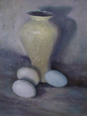
 I found by forcing a limit on the brightness, I expanded my range of color into an area that I wasn't intuitively apt to use.   I immediately have reaped a benefit from the exercise as I am working on two enormous snowscapes.   I'll talk about those another day.

I recommend this exercise for those painters - like me - who tend to pump up the color.   Ironically, it is an expansion of my color roster, a gray for mostly of the twenty three colors listed above.  The more colors, the better.

Saturday, January 21, 2012

Chocolate

There are people who don't like chocolate and there are people who love it and every level in between.   Then there is me.   I am off the chart. 

If I was stuck on a desert island with limited choices for food, chocolate would be one of them.  Chocolate syrup goes in my morning and afternoon coffee.  When I travel, I pack cans of chocolate syrup.  My automatic dessert preference is chocolate.  

Several aspects of chocolate make it so appealing including its taste, texture and endomorphinic rush.   I stop short and worry when I hear a health news story regarding chocolate.   To date, they have only reassured me, thankfully, that chocolate continues be shown to have health benefits (probably not sugar as binder).    I really ought to offer myself up to the medical world as the person to study for the effects from large amounts of chocolate and save lab mice from their tortured little worlds.

Block In

Drug of Choice 9x12 inch
It is fitting then that chocolate should be elevated beyond the kitchen shelf and honor it with an oil painting.   This larger-than-life homage to chocolate was started at Christmas when the house was fully stocked with chocolate in several different formats, syrup, cocoa powder, bon bons and chocolate kisses. 

Monday, January 16, 2012

Grey Cloud at Second

In 2011, one of my New Year's resolutions was to buy local whenever possible.  If local sources aren't an option, at least I try to buy American.   I've found cheaper prices online and from distant catalog companies, but I've convinced myself that in the long run, I'm contributing to a healthier economy, including my own personal economy by supporting my local or American businesses.  This includes being steady customers at the Farmers' Market, the locally owned gas station down the street and our nearby general stores in 2011 and will continue in 2012.   I'm really not that political, but I feel strongly about supporting our own people.

This extends to art supplies too.  I've started to obtain frames from the Frame Center in Hanover rather than the big chains or online suppliers.  Now that I am consuming a lot more oil painting supplies these days,  I have also become a loyal customer of Gamblin Oil Colors which are developed and manufactured in the US, specifically Portland, Oregon.   I really love the texture, strength and quality of these paints.  Waiting for their sales makes the prices more competitive.

Buy American and you experience the spirit of American innovation which is alive and well at Gamblin.  Their website has information about color, mediums and evolving green products. They have a complete description of various whites and blacks, and the properties of each. 

Also on their website, look for the "Torrit Grey" link.  There is an interesting description of artist and company founder Robert Gamblin's philosophies on many things, one of which is minimizing waste.  Mr. Gamblin's legacy of being thoughtful about the environment has led to the development of "Torrit Grey,"  the color that results when all of the factory pigment dust is collected and bound to a medium.  The rest of the story can be found at the following link:

http://www.gamblincolors.com/torrit.grey/index.html

Is this post really leading to something related to Vezina Art?  Well yes.   Gamblin Oil Colors Company runs an annual Torrit Grey competition.  In 2011 I entered it with the painting to the left.   Submissions were limited to white, black and torrit grey.  The idea for Grey Cloud at Second was fine-tuned thanks to a Summer discussion with my son and two of his friends all of whom are twenty-two years old, and hardcore sports fans.  I was excited that they got interested in helping me decide on this action frame of a speedy Jacoby Ellsbury sliding into second.  I was assured by these college seniors that if I was to make a "to-scale" version of this painting, there would be strong public demand for such a wall decoration for guys like them.

No, it was no winner, but Gamblin has posted all the fascinating submissions at the following link:

http://gamblincolors.com/contest-2011/gallery.php

One last note, and I have no affiliation with Gamblin, but they sent me 3 tubes of their new "Fastmatte" oil color as a thank you for participating in the Torrit Grey contest.   I have already tried the ultramarine Fastmatte, and true to their claims, it dries overnight with no shine.  Great for pushing a dark background further back.

Sunday, January 15, 2012

Storm on the Sea of Galilee

The Isabella Stewart Gardner Museum in Boston is reopening tomorrow for members!   The Gardner Museum has been closed since November 15, 2011  During this period, the museum has been completing the final stages of construction and preservation work—including the restoration of the Tapestry Room and a decade-long upgrade of lighting in the historic galleries. Museum staff have also moved a number of visitor-related and administrative functions to the new building and have installed three opening exhibitions. The closure period for the public will end on Thursday, January 19, 2012 when the museum opens the Renzo Piano wing and refreshed historic galleries to the public.  
http://www.buildingproject.gardnermuseum.org/

El Jaleo Reproduction
Even if the weather and busy schedules don't permit frequent in-person visits, the Gardner has one of the best websites I have ever seen.  Their "Explore" function allows a room by room virtual walk through.  Zoom in and out for the most amazing look at minute details of your favorite paintings, and their entire collection.   I wish I had known about the Explore feature when I was tried to create the following reproduction of John Singer Sargent's "El Jaleo,"  my favorite painting.

Storm on the Sea of Galilee
For many the Gardner Museum is best known as the site of one of the world's most famous unrecovered art thefts.   The Storm on the Sea of Galilee was painted by Rembrandt during the 1630's.  It is considered by many to be his most dramatic work, and his only known seascape.   The work is oil on canvas measuring 62.5 inches by 49.6 inches.   The twenty seven year old Rembrandt depicts Christ and his disciples aboard the small boat during an intense and violent storm.

The watercolor below is a practice sketch for a future oil reproduction that I would like to attempt.  What better way to study and appreciate the masterful genius of Sargent and Rembrandt than to paint every last detail of their work for yourself.   The lowly result cannot compare to the original, but I found it thoroughly enjoyable to paint and will continue to do it.

Reproduction Sketch of Storm on the Sea of Galilee
I'll be at the Gardner this week to explore the old and the new!


Sunday, January 8, 2012

Gotta Get Gardening

We live in an ideal ocean location, the only (very minor) drawback is the modest size of our property.  Each year we convert a little more footage into garden space or plant another container of lettuce or herbs.  I'm certain that my ancestors were farmers.   Then again, wasn't every one's?   Lack of acreage is not going to squelch my inborn need to grow things, and I love working out in the garden.   Gardening is a distant second to painting, and since this still life combines two of my passions, it was particularly enjoyable to create. 

The night before an extra long class session, I assembled a few gardening essentials and set up my spotlight.   I was tempted to simplify the set-up, swapping items in and out. I knew that I would have extra painters' eyes on it from fellow students, as well as advice from my teacher the next day.  I decided to go for all of it.   If it bombed, I could always simplify it or just try again.   I consulted with my composition expert (my husband).   He tweaked it and blessed it.  I took a picture and printed it so that I would remember how to set it up.

The next day I arrived for the long class with my favorite objects.  I replicated my composition on a high side table.   A fellow classmate was attracted to my set up as well.  I invited her to paint it along with me.    She obviously would have no way of knowing that I had done an elaborate walk up to get this collection of what looked like casually placed objects to their very particular placements.   She began shifting the items around; I began shifting from foot to foot.    She wisely noted that it was pretty complicated and simple is usually better.   I finally - and I'm sure awkwardly - confessed that I intended to paint it exactly how I had set it up because it was kind of complicated, and given that the setting was a classroom.   We discussed the possibility that she might crop her view of the set up.  Cropping had been a recent class lesson.  In the end, she decided on another set up, which I might add, was simple, fresh and beautiful.

My goal was to make sure that the gloves were most prominent painting element.   The form of my hands and the hours they spent leathered in them produced an imperfect but realistic cast. I liked the way the spotlight picked up just the edges of the fingers.  I had to continue to reassess as the painting emerged.  It seemed like each item I worked on would take its turn jumping into the spotlight, before it had to be subjugated to the gloves.  My fellow students and teacher, as I had hoped, pointed out some critical errors.  One of the seed packets looked like a "bandaide," and was too distracting.   The red handled clippers placed in the back would add some height on the right.  The long format class was so engrossing that I didn't break much.  

Gotta Get Gardening

The following week I added the twine, an important and much used gardening item.  The twine winds from one side of the painting to the other.   I started with a somewhat deep value, placing dots indicating where the twine would go. I gradually brought up the light level in certain places.  I used a dryish brush to denote a few stray fibers that were picking up light.

Lots of success with this painting, including being a finalist in The Artist Magazine Annual Competition.   It is still available!

BUY NOW