 |
| Apple Tree |
Showing posts with label color. Show all posts
Showing posts with label color. Show all posts
Thursday, October 24, 2019
Hanging Under the Apple Tree
Thursday, June 6, 2019
Roses and Baby's Breath
 |
| Pink Roses and Baby's Breath |
These roses were whitish at the base and edged with pretty salmony-pink. Looking straight down into the throat of the blossom, no white was visible at all, just dark reddish pink. The baby's breath accented the blooms and the whole bouquet sat in a cute little mason jar.
I could paint a hundred roses and I don't think I would be happy with them on the first go. I usually have to go back at it and adjust, putting any spontaneity and freshness at risk. With this small painting, the blooms may be too precise, but the leaves, stems and background are more loose. Thank you for the pink roses! Wait, do they look too
red?
Wednesday, February 27, 2019
Flower Vendor - Dublin
 |
| Flower Vendor - Dublin |
In the heart of Dublin, Ireland, an expansive grid of narrow streets was crowded with people. Sightseers often stopped in their tracks to take it all in. People with a purpose and a destination weaved in and around them. We were part of the former group, browsing through block after block of vendors, cafes and pubs. On this street, traffic was limited to business related deliveries so it was fun to wander around and take in the colorful sights and sounds.
In this scene a young woman selling flower bouquets remained watchful as a couple of women scope out the floral sprays. I thought from the minute I saw it that this would make an interesting painting scene. By design, each element of the painting is prioritized by how realistic it is painted. The center of interest is the proprietor, and is the most realistically painted. Next were the black buckets on the brick roadway, then the flower bouquets, and lastly the two figures on the left.
Wednesday, February 20, 2019
Hearts
 |
| All Heart |
It was St. Valentine's Day, a day for wearing pink and red, and/or novelty accessories to mark the occasion. After all, they wait in the dresser drawer all year for their turn. Maybe some years, they don't get selected, but this year, these happy socks got the nod and their annual showing.
Although this painting is realistically rendered, the abstract placement of the subject and neon blue shadows on the square surface is what I liked best about it. Plus there are lots of hearts here, and not just on the socks.
Wednesday, February 6, 2019
Cape Cod Canal Sunset
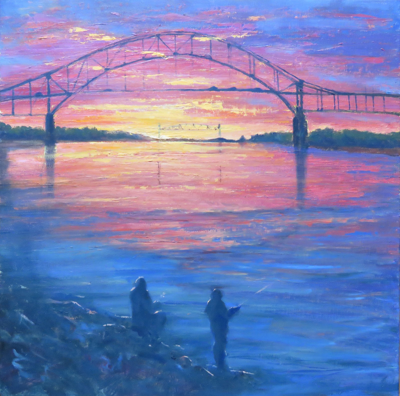 |
| Cape Cod Canal Sunset |
It was a modern day maritime marvel then, and it still is, but land lovers get to enjoy it as well. Access to the shores of the
waterway has never been easier and people can walk, cycle, fish and of course, watch the scenic vistas. This painting depicts an exceptional sunset with the Sagamore Bridge in the foreground and the Cape Cod Canal Railroad Bridge in the distance.
Thursday, July 20, 2017
Neon Water Lilies
 |
| Neon Water Lilies |
Friday, May 12, 2017
Tulips Peaking - Boston Public Garden with Spring Bulbs
 |
| Tulips Peaking - Phase One |
This creation is comprised of two 8x8 squares that were positioned side by side. I used "sight sizing", a technique in which the scene and the painting are developed in duplicate (when standing a particular distance from the canvas) such that the eye can move from subject to canvas and the scene looks identical (in theory:)).
 |
| Maureen Painting at BPG |
It was pleasant and sunny at the start but as the clouds moved in, the light changed, which is as always, a primary challenge of plein air painting. I wanted to be sure that the peaking tulips were included, but as I often do, I didn't get close enough for them to make a big statement in the painting. Instead, the old granite steps, walkers and ducks became the more important elements. The swan boats had just started running so that was a nice backdrop, although they didn't make it into the painting.
 |
| Tulips Peaking |
Well beyond the two hour mark, I checked the time and realized that my parking meter had expired! I packed up and headed for my vehicle. I could see orange tickets on several windshields, including all the adjacent cars!? No ticket for me! Great day all around!!
Tuesday, April 4, 2017
Northern Moon Snail Shell
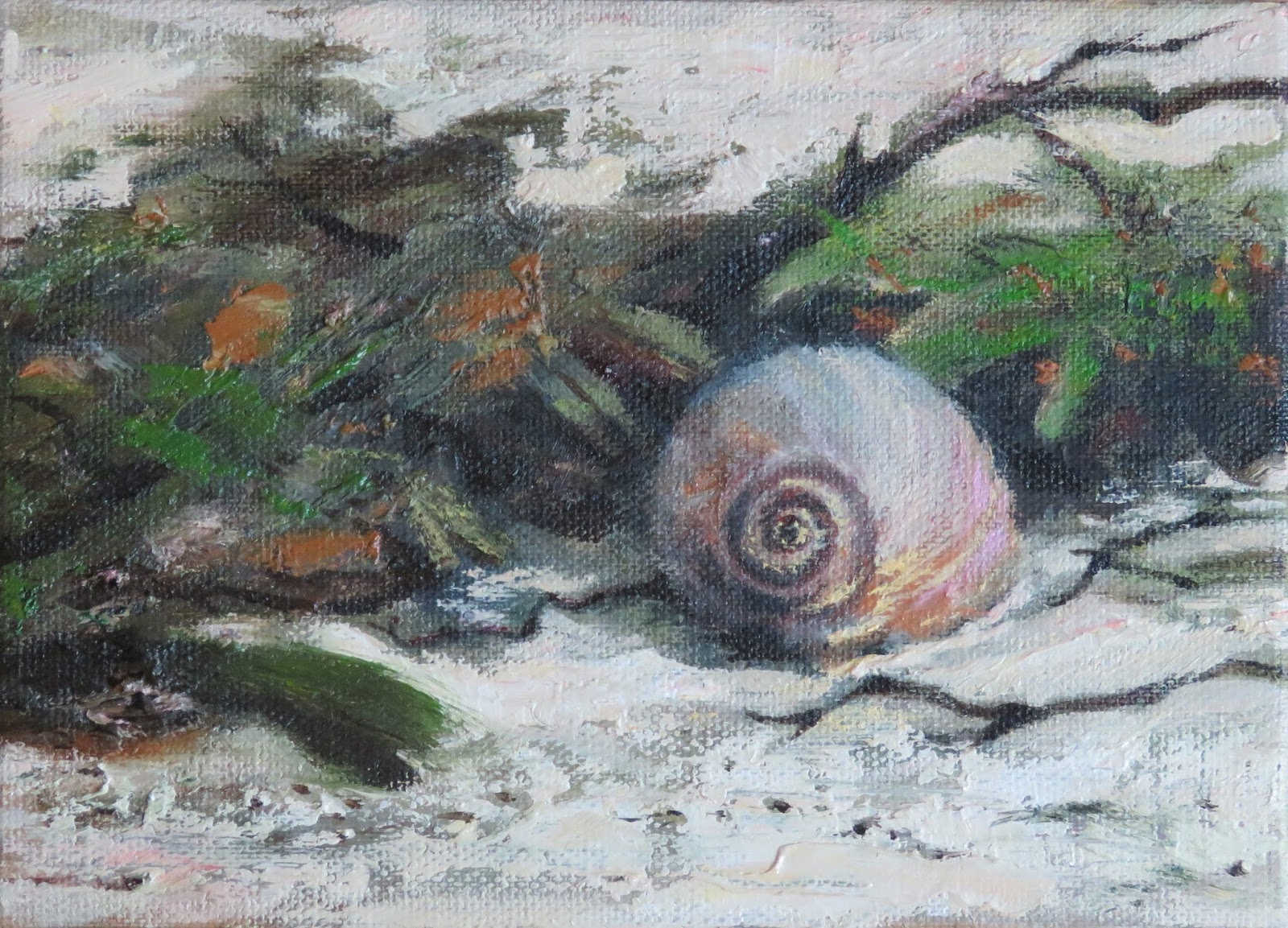 |
| Northern Moon Snail |
Tuesday, March 14, 2017
Painting and Sketching in Tropical Paradise
In the beautiful island country of Jamaica, the delights were many: people, music, balmy breezes, cuisine and most of all, a rainbow of vibrant and colorful scenes. I longed to paint with my oils, but this vacation was designed around the theme of "R&R." Dealing with wet oil paintings in a beautiful hotel setting would have been too scary, and frankly stressful. My fallback was watercolor and sketching, adequate substitutes and actually good for brushing up on different skills.


There were many talented musicians strolling along the beach. They periodically pausing to perform a few songs for tips. They stayed long enough to be captured in pencil, which I share here. Sketching on the fly was good practice, especially for a plein air painter like myself.
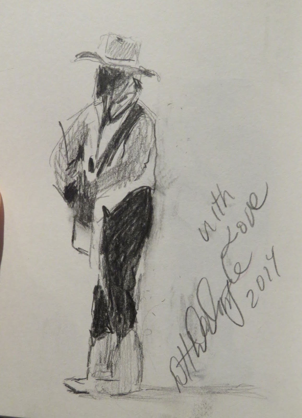
My favorite musician was Donnavan Darymple, who also performed some evenings at the hotel

We snorkeling along a reef about a mile from the hotel with local guides. Back ashore, painting the underwater world with watercolor seemed pretty natural. Although I do find watercolor challenging, letting the wet colors run together was fun, as was playing with the masking fluid.
 |
| Underwater I |
 |
| Underwater II |
 |
| Underwater III |
 |
| Bullfrog |
The frog is a New England "feller" painted from a photograph. I actually painted this one first, as I was getting re-accustomed to watercolor. As you can see, I approached it very much like an oil painting (covering the whole surface, layering, accentuating the darks).
 |
| Under the Shade Tree |
One very nice aspect of the hotel's beach was that it had a large swathe of shade trees. There was no problem shifting our chairs from shade to sunshine and back again. This painting was done from under the tree where I spent most of my vacation.
Last but not least is a painting done by Jamaican Watercolorist Paul Thomas. He and I had a nice conversation at our beach where he was set up selling his beautiful depictions of the local scenes. His hummingbird paintings were amazing - I wish I had taken a photo! I gave him a block of watercolor paper as it had come to my attention that getting supplies on the island was not easy. He most graciously painted the scene shown here. He sure knows how to mix that beautiful turquoise that I was having a hard time achieving! Thank you Paul!
 |
| Watercolor by Paul Thomas |
Sunday, March 20, 2016
Self Portrait
 |
| Black and White Start |
 |
| First Pass at Color |
 |
| Lighting at Easel |
I used the glazing technique for the flesh tones building up many layers of transparent color. My tendency is to make my people too red, thinking ruddy Irish complexions. Careful color comparisons reveal that we often have more greenish, grayish undertones, especially on flesh planes that are perpendicular to the light source.
 |
| Vezina Self Portrait |
Sunday, February 28, 2016
Ocular Migraine
I was driving on the highway on my way to Boston when I noticed a small blurry spot in my field of vision. The spot was slightly to the left and just below my eyes' focal point. As I drove the spot grew into a portrait shaped rectangle with prism-like edges. If I tried to look straight at it, the shape would just move and stay to the lower left of my visual center.
Now I was getting nervous. I couldn't really see with this kaleidoscope area blocking a portion of my vision. I took the next exit and pulled into a gas station. When I closed my eyes, I could still see the confetti colored pattern, but now it had sprouted an arc up and to the left of the original rectangle. There were skinny black triangles and bright white triangles, but there were also slivers of color as well, red, green, blue. I tried blocking one eye at a time and still the pattern was there, and blocking my vision. With both eyes closed the background was black but the colorful prism pattern remained.
Fast forward six hours, I'll spare you the details on that! Something called an ocular migraine was floated as the likely diagnosis. It is known to present itself with exactly this visual phenomenon. Just twenty minutes after it had started, the aura moved to the outer edges of my vision and eventually disappeared.
The doctor, upon discovering that I was a painter, asked me if I could draw what I had experienced (obviously, no one is able to capture it with a camera). I drew a (poor) rendition of it for him with a black pen. He pulled out his iPhone and showed me another artist's rendering of the condition - almost identical! It has an interesting abstract flare to it.
Here is a painting of the three phases of what I remember seeing in full color. Perhaps this can serve as a reference for future victims of this scary phenomenon, which by the way, is not a serious health issue. And, as for the word "migraine" in the title, the condition can occur without a big headache, which was the case with me.
Now I was getting nervous. I couldn't really see with this kaleidoscope area blocking a portion of my vision. I took the next exit and pulled into a gas station. When I closed my eyes, I could still see the confetti colored pattern, but now it had sprouted an arc up and to the left of the original rectangle. There were skinny black triangles and bright white triangles, but there were also slivers of color as well, red, green, blue. I tried blocking one eye at a time and still the pattern was there, and blocking my vision. With both eyes closed the background was black but the colorful prism pattern remained.
Fast forward six hours, I'll spare you the details on that! Something called an ocular migraine was floated as the likely diagnosis. It is known to present itself with exactly this visual phenomenon. Just twenty minutes after it had started, the aura moved to the outer edges of my vision and eventually disappeared.
 |
| Thee Phases of Ocular Migraine |
Here is a painting of the three phases of what I remember seeing in full color. Perhaps this can serve as a reference for future victims of this scary phenomenon, which by the way, is not a serious health issue. And, as for the word "migraine" in the title, the condition can occur without a big headache, which was the case with me.
Sunday, July 26, 2015
Sailing at Pleasure Bay
 |
| Sailing at Castle Island - Side-by-side view |
I set up facing northwest which placed the tallest Boston buildings, the Prudential and John Hancock in the distant background. Within the scene coming forward were: the tree-lined access road to the Island, Pleasure Bay (a.k.a. the lagoon) the McDonough Sailing Program docks (jam-packed with kids), the backs of people in their beach chairs and finally the grassy area right in front of me. There were people everywhere - on the docks, in the water and in the sailboats. Bright summer sherbet colors dotted the scene, and as a color junky, I couldn't wait to get to dig into those piles of color.
 |
| Sailing at Pleasure Bay |
Friday, March 27, 2015
Vieques - Isabel II Mayor's Office from Rivera Plaza
 |
| Mayor's Office - Stage One |
 |
| Mayor's Office - Stage Two |
 |
| Mayor's Office - Isabel II, Vieques, PR |
So sweet and curious...art is a universal language, as we still engaged with less dependence on words.
Here is a 40 second look at the spot from where I painted.
http://youtu.be/Qv5Jlc6oEeQ
Wednesday, March 25, 2015
Vieques Beachchair Under Palm
 |
| Stage One |
 |
| Downpour Coming |
In this painting the sun and southeast facing beach were to my right which made for better color matching. I'm sure that's why there is more pumped up color.
 |
| Beach Chair Under the Palm |
http://youtu.be/II8BuypgpZU
Wednesday, February 4, 2015
The Shallop
 |
| The Shallop |
Being somewhat snowbound this week, I got back to the painting using a photograph. I'm happy to work on this scene because who knows when the Mayflower II will be back on the waterfront. It was put into dry dock for repairs this past fall.
Although the Mayflower is the famous element, it is the "shallop" that is the painting's center of interest. In the 1600s, the word “shallop” referred to an open wooden workboat such as a barge, dory, or rowboat. Shallops were small enough to row but also had one or two sails. This shallop looked like it was about 30 feet long and 8 feet wide and was used to shuttle passengers to shore. The shallop actually sat aboard the Mayflower en route and was even used as sleeping space for some passengers.
My favorite part of the scene was the colorful ripples reflecting the colors of the shallop, the pilings and the pastel sky. I've included a close up of the ripples to the left. I'm wondering if the shallop accompanied the Mayflower to dry dock for repairs or if it will be on display in the Spring.
 |
| Ripples with All the Colors |
Friday, May 9, 2014
Tropical Watercolors - Loose
 |
| View from Mars |
 |
| Yellow Lady Slipper |
This was more like playing around and experimenting, with no expectation of a worthwhile end product. What was worthwhile was more the process and relaxation of staring at swirling color starting to dry under the strong Equator sun.
These few are the "loosest" of the watercolors. A forthcoming post will include some "tighter" watercolors.
 |
| Yellow Flower Spray |
 |
| Sea Monster Emerging at Sunset |
 |
| Tropical Fish |
Wednesday, April 2, 2014
Explosion of Color
 |
| Colorful Still Life |
 |
| Explosion of Color |
Remember color?
BUY NOW
Friday, December 20, 2013
Accordion Color
 |
| Full Color Accordian |
The fine fellow playing the accordion in this painting was a fixture on the main street. He seemed to play continuously and probably the third or fourth time we passed him, he proudly posed for a photo.
I liked the contrast between the vivid colors all around and the musician's drab clothing and somewhat pasty complexion and I pulled some of the bright color into the sleeves and hat. Does the bright color work? I like it because it reminds me of the splendid floral displays, but a part of me wants to tone it down. Comments?
Thursday, December 19, 2013
Snowstorm Moving Away
 |
| Color Study - Winter Sky/Water After Snow |
 |
| Snowstorm Moving Away - Duxbury Beach |
I was treated to the second amazing sky/water/sand color combination of the day. A muted lavender cloud bank was breaking up, and subtle pinkish winter sunshine started to brighten the snowy beach. The blue sky was heading in from the west. The aging seawall looked dark taupe (like the sand) against the ridge of snow. The photo isn't showing it well, but the orange and turquoise in the foreground seawall and sand were some of the colors that made up the taupe.
* Ocean effect snow occurs when moisture from the "warm" ocean water freezes when it hits the frigid air
SOLD
Thursday, July 4, 2013
Silk Spools with Fan
 |
| Silk Spools and Fan Stage 1 |
I don't ordinarily work on a square, although I really like when I see art in this format. For a square, some say that the rule of thirds does not apply. In other words, a composition with the center of interest in the middle should work just fine, balance on either side of a centered axis, both horizontally and vertically. It was fun to play with this size again, since the last time I did one was the Out of the Box event through North River Arts Society last year.
 |
| Silk Spools and Fan Stage 2 |
 |
| Silk Spools and Fan Final |
I'll let this sit a few days and decide if there are any other changes needed. (maybe the blue spool is looking too flat?). Let me know what you think too.
Subscribe to:
Posts (Atom)