|
| Red Grapes and Jar Still Life |
I was in Session One of a workshop with one of my favorite artists from the New England region,
Eli Cedrone. She had sent out a lesson plan in advance of the class which included some interesting YouTube links for reference.
 |
| Abstracted Thumbnail |
American Artist
Richard Diebenkorn was influenced by the work of Paul Cezanne and Henri Matisse. He was drawn to their bold palette, the flattening of the picture plane and the minimal blending of color. He was interested in the geometry of a space – be it a still life, a field seen from above or an interior with figure. It is that convergence of lines and angles, forms distilled to their primary shapes, that connects his figurative paintings to his abstractions.
Eli challenged us to incorporate our twist on Diebenkorn's simplification and abstraction. The mission was to render a non-representational depiction of our chosen still life set ups and to come up with a more striking and interesting composition.
 |
| A Jar and Grapes - In Progress |
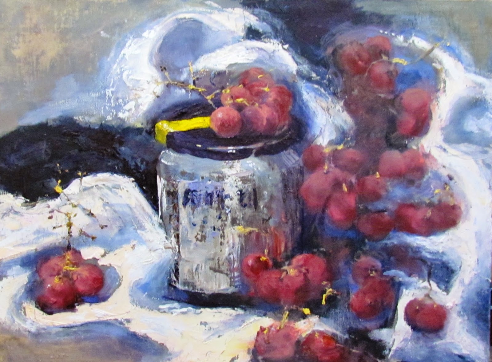
As always, I love an art challenge and Eli's creative lesson plan challenged my status quo. With a 12x16 canvas staring at me, I started thinking that a few red grapes and a jar of Ikea pickled herring (my lunch) would be a weak and less-than-thrilling painting. However, the objective of
designing the painting instead of
painting the subject exactly as designed, saved the day.
I decided to "split" the canvas into three zones. Using the viewfinder I made three independent views of the grapes and jar set up. I was trying to make a black and white abstract that had nice variation, without yet thinking about how this would become a red grape and jar still life. (Important: The composition makes or breaks the painting) We next did a flat line drawing of the design. By the time paint was applied, the three vertical zones were interleaved. At this point, the actual set up in front of me was only for color and shadow reference, because my black and white thumbnail was my composition blueprint.
Here is the end product; more loud and loose than usual.
BUY NOW