Showing posts with label value study. Show all posts

Thursday, May 9, 2019

White Sun Hats

Sunhats
I always loved this photo of my fellow painters in our "Figures in the Landscape" painting class.    It was June and everyone was "top-lit," most especially their hats, all of which looked bright white.    Everyone seemed totally consumed by their creative works-in-progress.    You might think with this many people in close proximity that there would be plenty of conversation, but typically the opposite was true.   Maybe with the (creative) right side of their brain hard at work, the left (verbal controlling) side was on "mute."

The under-painting for this piece was roughed in with five values, all monochromatic shades of pinkish-brown.  The subdued palette for the initial sketch in paint was pretty and I should have taken a picture to show you.  I forgot - and launched straight into colorizing it.    I intentionally kept the colors on the softer side though.  I'm sensing a color trend starting with this more subdued palette - again.

Saturday, October 3, 2015

Workshop Studies

Cataumet Cove
This week I was one of the lucky painters who participated in a workshop with contemporary realist painter Joseph McGurl.     The workshop was information rich - covering everything from composition to paint application to framing and even today's challenging art market.   If you are ever given the chance to participate, jump at it!

Seagull on Boulder

Despite the - almost - constant mist and rain, we got four painting studies done using some of the techniques, tips and strategies that this amazing artist uses.    It is always a bit unnerving to try new methods (custom view finder, acrylic underpainting, atmospheric glazes), but in the spirit of breaking out of our comfort zones, Joe challenged us to do just that.     He circled through the group offering assistance several times during each painting session, keeping us moving along on our paintings - what was working and what aspects needed attention.
Cataumet PO 02534
My favorite part of the workshop were the demonstrations. I was absolutely mesmerized during both the plein air and studio work.   I remember sitting at one point staring at his illuminated canvas and thinking how fortunate I was and that it was a gift to be able to see this painting in-progress (soon to be on display in New York for international audiences to appreciate.)   His approach and methodology are uniquely his own.   I don't think it was shared so that they would be precisely emulated, but rather to be considered within our own signature styles.  New tools for the toolbox.

Misty Garden Cherub
I've included my four painting sketches, Marsh Cove in Cataumet, Big Boulder, Cataumet PO 02534, Misty Garden Cherub.  All four need work, but here are the post paint-out versions.


Tuesday, December 16, 2014

Opie

Opie
The subject of this painting is my son's beloved dog, Opie.   Opie spends his every waking moment in one of two states, either looking/waiting for my son's return, or following him around.  It seems that he never takes his eyes off of his master.   Even when he starts to doze off, any perceived movement causes him to wake and double check that his man is still there.  

Opie's devotion has certainly earned him portrait status.  This painting will be a Christmas gift for my son.   I used a photo of Opie to render the likeness and
I'm reminded by his pose that there is probably only one thing on his mind.   Where is my guy?

Monday, August 25, 2014

Black and White and Torrit Grey 2014

Comerant
Perched on High
My favorite oil color manufacturer is Gamblin and each year they run a contest challenging participants to create a painting using only black, white and Gamblin's custom color, Torrit Gray.     Torrit Gray is a free giveaway color produced from collecting all the factory pigment that would ordinarily end up in the trash.   Rather than discard the pigment, an annual Torrit Gray blend is created, tubed, and then given away with Gamblin purchases as a customer bonus and environmental initiative.  I have entered the competition for the past two years, and this year I entered again.

Barnyard
If you paint, you may want to consider entering.   It is really interesting to see what people come up with when they are color-limited.   All the entries are posted on the Gamblin website and the company has been very generous in sending a free gift to participants.  I really love Gamblin - for many reasons - and the paint is manufactured in Oregon.

My strategy when brainstorming my entries was to hunt through my digital photo archive for a photo that would make a strong black and white painting.   A strong dark/light tonalism usually means added strength for the composition.  Obviously things that don't have much color or are already black and white were things to consider.  

Maybe you could try it too!

Wednesday, June 25, 2014

West Harwich Riverview

Artist Eli Cedrone at Herring River
If you aren't familiar with painter Eli Cedrone, you haven't seen the beautiful work of one of the most talented artists in our area.   Her work is in local galleries, and across the country.    I was fortunate to have attended a "pop-up" workshop on Cape Cod with her recently.

The weather cooperated and the location Eli had picked was a gorgeous spot along the Herring River in West Harwich, Massachusetts.

She began her demonstration with small thumbnails done in pencil.   She explained that this step helps to work out the design of the painting.  She emphasized the importance of first designing the scene in black and white to come up with a strong composition.  She encouraged us to use nature as the reference but liberally move elements as necessary to support a better painting.

For the second stage, she used the upper half of her canvas board to paint the scene in three values.   This value study and the thumbnails would serve as the blueprint for the actual color painting.  

My Value Study

Finally, she produced the color rendition of the same scene which was created on the lower half of the board.   I liked using this disciplined approach and I've used it in the past, so I soon got started on my own painting.

Two rustic red dinghies tempted me while scoping out my composition, but I would have been looking in a southerly direction  - and into the glare.   My eyes just can't take that much light.  I don't wear sunglasses while applying color as they change both the values and the colors.   I turned my back on the sun and looked downstream instead.  There was a steady stream of both moving water and colorfully clad kayakers.

Per our process, this poor photo (why is it checkered like that??) is the value study done in quick dry paint.   I toured all the other participants' easels while it dried.   It is always amazing to see the variation in the paintings when most were of the same scene.

The fun part was the color.   Using the now dry value study, I applied color right on top of it, expressly trying to stay true to the monochrome lights and darks.   While on site, I decided that I liked a pair of twin red umbrellas off to the left in the distance and as the most chromatic element, they called for attention. Back in the studio though, I decided to add the kayakers in the distance in the same general area as the umbrellas and I liked the misty look of cruising the river.

Herring Riverview - West Harwich


Wednesday, February 27, 2013

Irish Step Dancers

Irish Step Duo Underpainting
Although I never took Irish step dancing as a child, I was always an Irish Step Dancer wannabe.  In fact, if I'm at a wedding or party and I hear upbeat Irish Jig music, I'm the first one up looking for anyone else who is willing to pretend they know how to do a jig or a reel with me.  


Photoshopped Layout Mounted on Black Paper
As for those who really know Irish Step, I admire their amazing, intricate footwork.   Like accomplished athletes, they seem to defy gravity.   The dancers keep their trunks vertical and rigid, and unless they are spinning, their colorful and heavily ornamented dresses seem to barely move.  In contrast, their feet and curly locks are a blur.


Sketch of Light Pattern


This painting features two young Irish Step Dancers.    I began with a photo of one girl which I pulled into Photoshop.   I created a second dancer by flipping the original photo horizontally and downsizing it.   I then printed the two images and mounted them on a piece of black paper positioning the dancers such that they overlapped one another looking as if they were right in synch.    I then did a 5x7 value study sketch to confirm the light pattern (since the light of the reversed image would be incorrect as a reference).

Irish Step Duo - Stage 1


After establishing the background, I thought it was too boring and unrealistic.   Occasions that would warrant the pageantry of these dresses are shows and competitions that would include people, color and lights.   I didn't want to detract from the girls as the center of interest by including the audience, but decided to include just the essence of some spotlights.


Irish Step Duo - Stage 2
This painting experience was an exercise in painting design which was a lot of fun.  The only static element was the initial photo.   Everything else after that was designed, specifically, the second dancer (sized and reversed), the figure placements, the value pattern, the dress colors, the Celtic patterns and  the spotlights.


The painting is almost complete.  The one thing that I still may address is the pattern of shadows on the floor.   Since all the feet are off the floor, the shadows will be softer and scattered away from the feet.   I welcome suggestions.


Irish Stepdancers Stage 3 - Nearly Complete


Saturday, February 16, 2013

Yellow Beachwear

Yellow Beachwear
I am putting my recent Figure Workshop learnings to good use.    I chose this scene from our collection of vacation photos because I thought it had a very strong composition.  Credit for the photo goes to my husband.

What made it a good composition?   I think the primary pluses were  1) the extreme value contrast between the shadows and bright tropical sun, 2) the variety of shapes (rectangular beach chair, pointy palm reeds and the curved figure, and, 3) the figure has all the color and automatically draws the eye - appropriately - as the center of interest.

I painted a three value study of  the photo, black, white and grey.   I forgot to take a picture of it at that point which is too bad because it would have demonstrated how this underpainting really provided a clear blueprint for the finished painting. I let the value study dry completely and then painted over it, sticking strictly to the black, white, and grey values when adding the color.   I added the reflected light from the sand that shines up on the face and under the chin.   Right now it may be a little too light.   I will wait a week and take another critical look.

You may have guessed that this is me.   I'm returning to my chaise with two cups of salt water for painting my tropical watercolors.  There has been a suggestion that I add a paintbrush in my teeth.   I like the idea and I still may do that.  The question is would it add to the painting or take away?

Friday, February 8, 2013

Figure Workshop Day Two

Thumbnails


On Day Two of my recent figure workshop, we were fortunate enough to have a live model.   The young lady, who was a high school student was very striking with strong classical facial features.  The instructor "dressed her up" by draping a warm red swatch of fabric over her lap as a skirt.  She also found a widebrimmed straw hat which she positioned forward enough to cast a sharp dark shadow over the model's eyes, accentuating her classic profile.


Black and White Study


We developed some thumbnail sketches, connecting the darks so that these accents would combine in a strong compositional design.  After the charcoal sketch we repeated the composition in black, gray and white.  Finally we painting the composition in color.


Live Model Color Study

Wednesday, February 6, 2013

Figure Workshop Day One

Charcoal Study
On Day One of this figure workshop our challenge was to practice designing our painting space with strong values and connect the lights and darks.   We chose a photo from which we executed:

  • thumbnail(s),
  • a charcoal study,
  • a black, gray and white painting
  • a color painting.   

Going to such lengths and repeating the composition multiple times before getting to a final color painting resulted in a true familiarity with the subject.   It also provided multiple opportunities to fine-tune the composition.


Charcoal Sketch


I began with a photo I had taken in Aruba.   A couple in bathing suits had stopped along the shoreline to look at a huge jellyfish.   The woman was taking a photo of it while the man looked on. 

The woman was blond with a fair complexion and the man was darker with a reddish tanned skintone.  Their different complexions coupled with the fact that the left shadowed side of the man stood out against the woman's right sunlit flesh gave maximum contrast.


The black and white study and the color study were painted side by side on a 12 x 16 inch canvas.  See the progression from the top.

This last photo shows the result at the end of the day.   If ever I was prepared to execute a final painting, this is it!  

Tuesday, October 2, 2012

Sand that Glows in Black and White and Torrit Grey

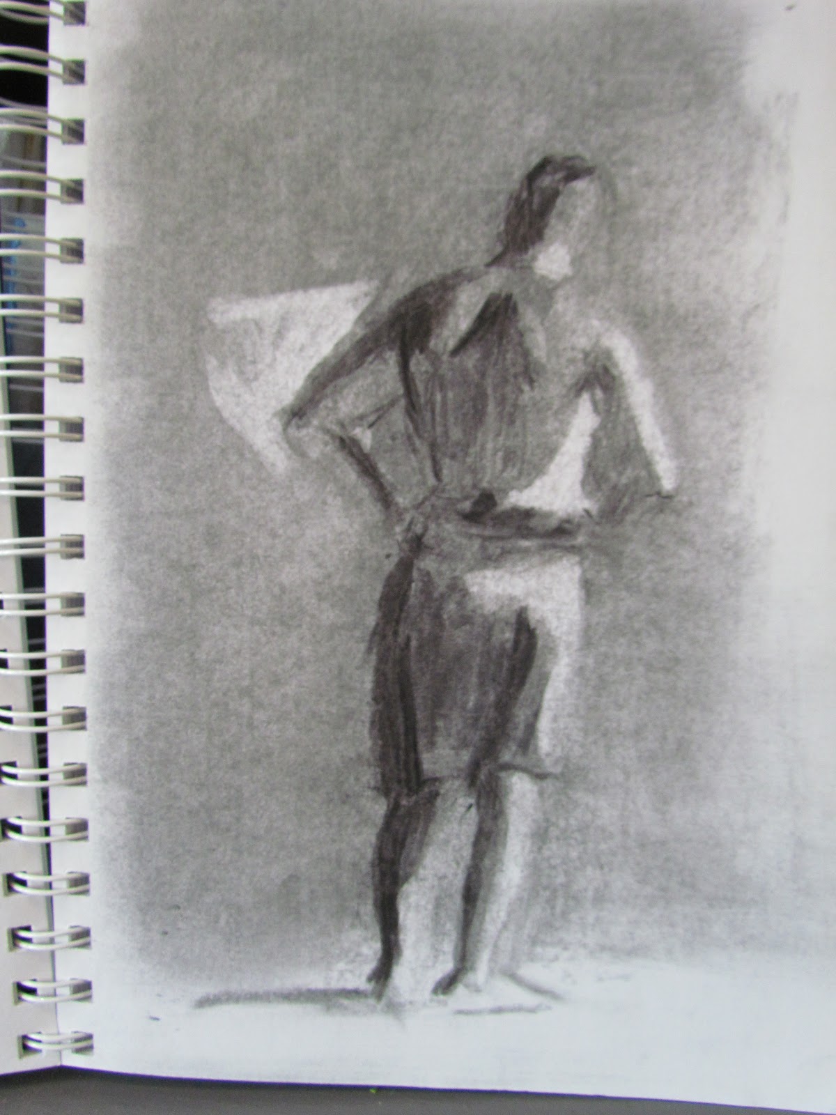
My Torrit Gray Palette - White, Torrit Gray and Black
The Gamblin Artist's Oil Colors company is an industry leader in the manufacture of oil colors.   There are many reasons that I like these paints so much.   They are buttery, true to color and are made in the USA.   If I have a question about mediums or the characteristics of paint, I consult their website, http://www.gamblincolors.com/.   

Gamblin demonstrates their environmental conscience by running an annual art contest revolving around the color "torrit gray."

From their website:

If you took all the pigments in the color spectrum and mixed them together, what color would you make?

Every spring, Gamblin Artists Colors collects a wealth of pigments from our Torit® Air Filtration system. We filter the air around the areas where we handle dry pigments so that our workers are not exposed to pigment dust. Rather than sending any of our high quality, expensive pigments into the landfill, Gamblin paint makers recycle them into "Gamblin Torrit Grey".

"Pigment dust should not go into the earth, water or landfill, but into paint," says Robert Gamblin.


Gamblin Torrit Grey on CopperThe mix of pigments is different every year, so Torrit Grey is always unique and will never be repeated. Torrit Grey tends to have a greenish tinge because of the great strength of the Phthalo Green pigment, which is a dark bluish green. Torrit Grey varies from a medium dove grey to a dark earthy grey.

They are now dating the tubes, so artists can collect them from year to year and enjoy the unique qualities of each edition.

The Torrit Grey store promotion, which runs each year through the end of April in celebration of Earth Day, not only recycles pigment dust into paint but focuses artists on the importance of recycling, studio and environmental safety. Complimentary 37ml tubes of Torrit Grey are distributed to those who purchase $20 worth of Gamblin oil colors.   Last year, they distributed more than 11,000 tubes of Torrit Grey!  It was remarkable what artists can achieve with a color palette limited to white, or black and Torrit Grey.

The Torrit Grey Painting Competition, conducted annually in the Fall, attracts more entries every year. Artists make a value based painting using only Torrit Grey and any black or white oil paint. The competition is judged by Robert Gamblin and the winners receive a supply of Gamblin Artists' materials.

After the winners were selected, all the entries were posted on their website and a few weeks after that, three tubes of Gamblin Fastmatte oil paint arrived in the mail as a participation gift.

You can see the winning entries from the previous contest at Torrit Grey Winners.   My entry this year is a monochromatic version of a painting I did a few months ago of the wet sand reflecting the beach houses.

Sand that Glows in Black and White and Torrit Grey