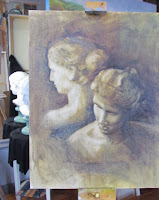
 Meet my new model. I recently found her sitting outside a collector/secondhand shop in Billerica, Massachusettss. I spotted her while eating across the street at Mikey's Roast Beef on Routh 3A. (The Roast Beef part is really a misnomer, because they have the best haddock sandwich you'll ever eat and the bonus it that it is an easy, informal sub shop type atmosphere.) Anyway, while eating in and staring out the plate glass windows, her head was visible amid a chaotic jumble of other secondhand junk - or should I say - treasure.
 |
| Freshly Painted |
Twenty-five dollars and a lengthy promotional speech later about what a good deal this was by the shop owner, and we were placing her - in all her heftiness - in the back seat for the ride to her new home. I have been googling her description as well as the numbers on the bottom of the cast bottom base, but haven't found any information as to an original statue that may have been the inspiration. Further, I'm not sure what she is made of. She is very heavy. The color looks like terracotta, but the fact that she was out in the elements without sustaining chips, or crumbling made me think it was something stronger. (I know nothing about sculpting and related materials). The only drawback for my purposes was that she had streaked and irregular coloring from sun exposure.
 |
| Ailbhe Back to Mirror - Stage One |
Well now she is painted white and I am very happy with how she came out. The sun streaks are gone and although she isn't a high end bust that can run quite a bit of money, she has nice even coloring and is perfect for my studio use. She's not from money; she's just a regular gal.
I thought about naming her Terri, but she is probably not terracotta, and has since undergone a change in color.
I thought about Blanche, but she doesn't look like a Blanche to me. (That name brings to mind Blanche on the Golden Girls).
Alabaster, the translucent gypsum material, made me consider Ali. In this, the year of exploring my Irish roots, I decided on "Ailbhe," an Irish Gaelic name meaning "white."
I used the academic realist technique to produce an accurate drawing looking down at the bust which was also reflected in the studio mirror. I started with the paper folding technique that I learned from Dianne Paranelli Miller, but instead of using multiple strips for length and width, I put my own spin on measuring with a single piece of paper. I repeatedly measured until my light and dark areas were line drawn. I used a thin mix of tranparent oxide brown and ultramarine blue to fil in all the darks. With a paper towel, I then worked to wipe out all the light areas until it was accurate again. I did three subsequent sessions of perfeting the light/dark rendering and still to this point the light areas were "no-paint" zones and the dark areas were transparent washes.
I decided to leave the transparent dark areas thin and dark and mixed up opaque flesh color for the lightest lights which were very cool. As the planes turned away from the light, I warmed the color - within the lightest value. The darkest skin values were warm darks and at first probably too dark.
I've painted the lights again in subsequent painting sessions. Since I have cool light on her, and wanted to add color, I mixed up cool pink and cool green for her hair. For the flesh, I used my lightest flesh color (naples yellow, cadmium red and flake white), then warm tones for the darks using warm greens and burnt sienna.
I darkened the background and painted in over the figure on the dark sides so as to lose those edges.
When I view the photo of this painting as a thumbnail, I feel like I want the left shoulder and its reflection to merge in value. What does everyone else think?


.JPG)
.JPG)


