Thursday, June 28, 2012

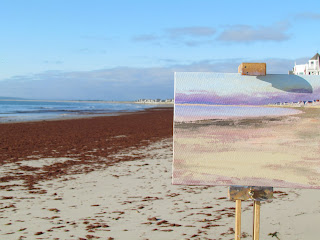
Green Harbor Beach - 6AM

I usually walk first thing in the morning, as early as possible, and each day I think, I should be painting this stunning scene.  On this day, I put painting ahead of my morning walk.    It was just before 6 AM and the sun had been up for 40 minutes already.  I needed to walk further down toward Burke's Beach because the area across from me was covered in decomposing red seaweed - not so pleasant.
Ease Set Up Green Harbor 6AM
It was June and sunrise was at its most northern relative point.   This meant if I wanted to paint Duxbury Beach in the distance, the sun would be on my canvas, something I have always avoided, sometimes using an umbrella.  

A nugget from Richard Schmid popped into my head.    "You want the same light on your subject, your palette, and your canvas."    If that is true, (how could it not be if Richard Schmid said it?) and I shaded my canvas, my canvas would not be in sync with palette and scene.   Happy to have rationalized this, I decided I didn't have to trudge back to the house and get a sun umbrella.

Actually looking at the photo to the right where the top clamp is shading the canvas, the color looks very different, couple of values darker and almost greenish blue.

Often in the morning there is a lavender bank of clouds that sits at the horizon line like in this scene.  It was low tide such that more sand was exposed and receiving full sun on the further edges of Duxbury Beach, so it needed to be painted more brightly.   The blue hill in the distance beyond the beach was Plymouth.   In surveying the scene, I was thinking that the red seaweed looked kind of pretty, providing sharper contrast. I had initially decided that I wouldn't include it because of how terrible it looks and smells in person.  I might change my mind yet.  For now, this is what I painted at the beach that day.

Green Harbor Red Seaweed
It's one week later.   The seaweed on the beach is now rancid and the town has responded to resident complains by bringing in heavy machinery to remove it.   We have never seen the seaweed so bad for so long.  The problem was even covered on the local Boston evening news.  I decided that I would honor reality and paint it in.

So what is my center of interest?  I'm supposed to know that from the start (I didn't) and highlight it (I didn't) using sharper edges, more intense color, leading in - some technique like that.   I haven't decided yet.   It's still a work in progress.    Although there may be no salvaging this one.

Any suggestions?

Monday, June 25, 2012

Seaglass Landscape


Seaglass Landscape
I have always enjoyed scanning the beach for seaglass and since moving to Green Harbor we have collected thousands of pieces.   First we filled small containers, then we bought bigger containers and filled them as well.   Finally we got an eight inch round clear glass vase that is about 24 inches tall and combined it all.   The point is, we have a lot of seaglass.    In order to make use of it, I have made seaglass jewelry and have garnished glassware with it.   That used up about  .0001 percent of it.

How about a landscape painting with it?   I sifted through and chose some pretty landscape colors.    My plan was to do this landscape as a dry run for an 8 x 8 inch square for the North River Arts Society 2012 Out of the Box Event.   Once I saw this result, I decided against it since it looks kind of tacky.   I confess that I do kind of like it though.

Saturday, June 23, 2012

Harvard Ave in Humarock

Painting outside as often as I have been means that my painting gear needs to be ready at a moment's notice.   When I was only occasionally painting outside, it seemed like a large effort to pack up.  This was an illusion.   Now the car always has an easel or two, extra clothing layers, paper towels, my sun umbrella and a little fold up table; I consider those "should haves."   As I head out the door. I check for the three essentials, the "have-to-haves" - brushes, palette, and a canvas.

On this day, I met a painting friend in Humarock,  a section of Scituate, Massachusetts.  We pulled into the parking lot just over the bridge from the Bridgewaye Inn and Restaurant.    The last house on Harvard Ave at the river had a large raspberry tree that provided some shade.   I had never heard or seen a raspberry tree before, and it actually had thousands of black raspberries on it.  The owner said that we were welcome to paint there and to also help ourselves to the raspberries.

The temperatures were going to be in the mid-90's, and it was already 82 degrees at 9:30 AM.   My friend set up facing the river and a pretty boathouse on the other side.   I set up facing east looking straight down Harvard Ave toward the beach.  

The dark rust and blue-green cedars on the left made the bright yellow wild daisies really stand out.  The sky was bright and hazy white; I only added a small amount of cobalt blue for top of sky gradually adding a small amount of alizarin crimson to the whitish mixture.  I liked the pair of beach houses at the end of the street.  The one on the left was getting southern light.  The house on the right was a darker greyish brown, plus it was shaded.  The desired flow of my eye was down the telephone wires and up the street to the end, where the red cabana overlooked the beach. 

I got all the greens blocked in and was about to sketch in the houses at the end of the street when the owner pulled an SUV down to a shaded spot that precisely blocked the area I was about to paint.  I took that as a sign to finish up.   I needed to go buy a new hot water heater anyway and it was now 89 degrees. 

I painted in the houses from a photo in my studio.   I don't think that was too bad since their neutral colors wouldn't be adversely affected by the camera.

Thursday, June 21, 2012

Beach at Newport Harbor


King Park Newport
It was an overcast day at home, but a mere fifty miles southwest of home, in Newport, RI, it was a perfect "10."   The warm sunny skies had us thinking "beach" and after driving the scenic twelve mile ocean drive, we settled at a spot on Wellington Ave called King Park.  

A bright yellow catamaran rental down at the end of the beach had to be my center of interest.  So pretty! The closer shoreline led to the stack of rentals from bottom right to middle left.   The boulders of the jetty also seemed to point to the sailboat rentals.    Beyond the jetty the inner harbor was dotted with colorful sails and kayaks.

In the distance was a grassy cliff with trees, which was the grounds of Fort Adams.    The fort is not actually in view, but was just off to the right.
As always, I think plein air color is the best color, and beats studio efforts every time.

Tuesday, June 19, 2012

A Key Workshop Experience - Days Three and Four

The third and fourth days of the Daniel Keys oil painting 
Teacups, Fruit and Flowers
workshop focussed on still life.     Antique teacups and fruit were added to the floral displays from day two.    Daniel set up a large canvas, 16x20 inches, and painted a beautiful composition of teacups, begonias, yellow pansies and fruit.   The lighting scheme was cool light and warm shadows and he worked it with clean, bright color over the two days.

For me, having painted the purple and yellow pansies on the previous painting, they were much easier this time around.     I nudged a pansy down into the left teacup to create a shadow inside.  Daniel thought it was a neat idea and did the same to his set up.

I tried to stay in step with his painting by executing the floral elements and greenery first. The values contrast of the pink impatiens light and shadow is a definite improvement over my past florals.   We also worked on painting the negative spaces around certain leaves and stems. The dahlia may be too dominant from a composition perspective, but it was good practice setting in each row of petals from outer to inner.  

The teacups that Daniel painted had gold leaf trim.   My teacups didn't have gold, but I liked it so much that I added it.   The gold on the darker sides of the cup was made from cad lemon, terra rosa and light green.   The gold highlight was cad lemon and cad yellow deep.

I can see that I will have to come back to this painting for a few details, like the shine on the middle apple and the cup handles and any other comments that I get from readers.

What a worthwhile experience!   I have lots of notes on techniques and color that I will be trying in the near future.  It was a week packed with learning and I have an even greater admiration for a rising star in the art world in Daniel, and I met great group of new friends who paint.

Monday, June 18, 2012

A Key Workshop Experience - Day Two

The agenda for Day Two of the Daniel Keys oil painting workshop was painting a morning Cape Cod location, breaking for lunch, then painting a different location in the afternoon.     Rain squelched this plan so Plan B was enacted.   A large local studio became our shelter for the next three days.   A trip to a local garden center produced an assortment of local plants and flowers for grouping into a simulated greenhouse landscape. 


Yellow Pansies
Daniel demonstrated his technique by painting a lovely purple and white bearded iris.     How dark are white petals in shadow?   Probably a lot darker than I would initially paint them.   It was so valuable to observe the methodology for applying clean, clear color to achieve a fresh and beautiful result.  This means getting the right color at the right value and applying it correctly the first time.  Subsequent application of paint can only make it muddy.

My station's set up had magenta dahlias and purple trimmed yellow pansies.   The first challenge was mixing the shadow color for what looked like very light yellow pansies.   I used my green mixture (viridian and cad yellow deep) and my purple mixture (cobalt blue and permanent rose) to get a greenish gray.     I trimmed the petals with a purple that was initially too dark...I resolved this problem once I realized that anywhere the yellow petals were lightest, the purple trim had to be its lightest too.   So obvious, right?   Not always when I'm in the moment.


Sunday, June 17, 2012

A Key Workshop Experience - Day One

I attended a four-day, thoroughly enjoyable - workshop this week with a masterful young artist, Daniel Keys.    Not only is Daniel producing incredibly beautiful art, but he has a natural talent for teaching, sharing information in clear and understandable terms.    On the previous weekend, living legend, artist Richard Schmid dubbed Daniel the artist to watch.  I consider myself very lucky to have had this opportunity to learn from and paint with this remarkably accomplished phenom.

Click here to get a closer look at Daniel's art.
http://danielkeysfineart.com/

My Easel at Beach Rose Inn Side Garden
The first two days were to be focussed on the Cape Cod landscape.   The charming Beach Rose Inn in West Falmouth was a perfect backdrop for capturing on canvas a gorgeous June day on Cape Cod.   The roses, shasta daisies, and peonies were in full bloom decorating the grounds, and providing a variety of floral subjects.    Other choices were a koi pond with lily pads (and yes, the frog sitting on a lily pad), rustic cottages with flower boxes, and centuries old cedars.


Planter, Lantern and Spring Greens
The multitude of Spring greens, a blue speckled pottery planter and wrought iron path lantern were the elements present in the scene I chose.  On my palette I had introduced some colors that were new to me, like Transparent Oxide Brown.   It was a bit arduous - but rewarding - to not only try the new colors, but to adhere to the discipline of applying color shapes in the methodical process that Daniel had demonstrated in the morning.     The warm undertones of the transparent brown are still visible.   Using a nice clean blue has resulted in a pot that is a bit too blue.   I'll most likely tone it down with a glaze in a few days.   Here is my painting from day one of the workshop.

Saturday, June 16, 2012

Schmid and Keys Cape Cod Demo

A remarkable, once-in-a-lifetime event occurred this past Sunday.    This rare opportunity presented itself in the form of a painting demonstration with a living legend and a young phenom.  Seventy-five lucky people gathered in a small West Falmouth library to see this special demonstration.


Richard Schmid and Daniel Keys painted their respective still life painting on either side of a centered floral display, watched by a mesmerized audience.       Richard Schmid, looking strong and fit at 78 years old was absolutely magnificent.   He shared some techniques, some stories, and by example, his philosophy on mentorship in art.   He in no uncertain terms stated that the young man next to him, his mentee, Daniel Keys, was the person to watch in art today and declared him a premier artist.

Daniel Keys, a mere 26 years old, appropriately deferential to the master, showed a level of talent and discipline that was truly remarkable.  It was both fun and amazing to see their paintings develop.   They seemed to thoroughly enjoy each other's company, fondly exchanging smiles and comments, so confident in their abilities, that they seemed to hardly notice that a crowd of observers were watching.

For a sampling of their beautiful work, use these links:


Richard Schmid and Daniel Keys Painting Side-by-side Demo

Saturday, June 9, 2012

Winslow House


The historic 1699 Winslow House, located on Careswell Street in Marshfield is the ancestral
home of the founding family of Marshfield.   It was built in 1699 by Judge Isaac Winslow,
grandson of Mayflower passenger and three-time governor of Plymouth Colony Edward Winslow.

Edward Winslow
Judge Isaac Winslow
Over the centuries it was occupied by the Winslow family of governors,
generals, doctors, lawyers and judges who helped to shape Marshfield
and the South Shore.   Experts say it is a well preserved example of how
well-to-do landed gentry, particularly those loyal to the King, lived in the
years prior to the American Revolutionary War.

A tour of the home shows antiques and architecture from the Winslow
 period. The house remained in the Winslow family until 1822, and wa
s later owned by Daniel Webster. It was restored and opened to the public
 in 1920.

Winslow House Stage 1 - Initial Values
The beautifully maintained grounds and mansion are often used for social events both
 community and private.     It's easy to forget its historic significance as I drive by the
 familiar structure every day.   I pulled into the rear parking area recently and walked all
 the way around the mansion looking for a scene to paint.   There are plenty of potential
paintings; what I started with today is a rear door that faces southwest.  The roof of the
main house can bee seen in the background.


Winslow House - Stage 2
It was early in the morning with partly sunny
 skies.   Once I sketched in the scene I needed
 to decide if I would depict the scene as cloudy,
 and not worry so much about shadows, or
depict the scene as sunny and commit to a
shadow pattern that was present when I first
set up.  I decide on the latter and paint all the
dark masses of the bushes and house.  The
 A-frame face of the structure was in full
 sun except for some tree shadows behind
 the shrubs.   The large shiny boxwood
shrubs appeared to be reflecting the blue and
 white sky.   The deeper shadow areas wer
e warm darks.  The grass was amazingly
 green - you know, that intense green that
 screams new growth.  Reluctantly, I chose cadmium green light straight out of the tube and it
looks like a pretty close match.   I say reluctantly because it seemed too brash and gaudy. 


There is an old smoke tree to the left of the door and window.  I'm no arborist, but judging
by the size and twisted habit of the trunk, this tree could be as old as the the house.   I painted
 in just a few leaves and a few of the clouds of airy smoky pink flowers.


In the photo to the right, the sun is one hour higher, changing the values and shadows.
 It took some brainpower to stay locked in to the original plan.   It was time to pack up and go
 before I started overpainting the previous two hours' work.


  I welcome comments.

Friday, June 8, 2012

Feeding the Seagulls

I'll warn you right away that this is a long post.   I have been writing it for a couple of weeks since there were multiple painting sessions associated with this painting.    It was late May when I began to work on it.   The extra high angle of the sun, long days and beautiful weather had me wanting to paint light and bright.   I tried a paler palette than I usually use - more of a "high key" palette.
Toddler Watching Seagulls Stage 1
Similar to the painting I did a few weeks ago called, "Chasing Butterflies," I developed the midday sky with a combination of white, cerulean and cobalt.    Toward the horizon, the blue sky was gradually lightened with more white and a touch of alizarin crimson.  The summery clouds were painted with titanium white, yellow ochre and a tinge of violet on their underside

The vantage point for the painting was sitting on the beach, looking straight out at the water.    The Stage 1 picture shows the figures sketched in for placement and the horizon line toward the bottom third of the canvas.   A young woman was helping her little boy feed the seagulls.  The horizon line intersects the toddler's shoulders by design.   I was hoping to bring the viewers' attention to him first.    He was fascinated with the seagulls' mid-air gymnastics and near collisions.  Mom was more fascinated with her boy's fearlessness and energy, and everything about him for that matter.

At Stage 1 of the painting the gulls weren't actually in yet.   They play a central role in the painting's theme and their placement couldn't be arbitrary.   The plan was for the viewer to look at the boy and then naturally look to see what the boy is looking at, and his face is turned upward.   I was imagining my picture fulcrum; in Stage 1 the right side was heavily weighted with both figures.    The seagulls needed to provide the balance without stealing the spotlight from the toddler.  I broke away from the painting for a couple of days.

Seagull silhouette cut outs
In my next session with this painting, I first wanted to determine the placement for the seagulls. I cut three seagull shapes out of a gray paint chip card. I moved them around on my canvas to experiment.    I forgot to take a picture of these shapes on my Stage 1 canvas, but here they are on a piece of paper similar to what I did.    I wanted the gulls big enough and close enough to the figures - and each other - to give the impression of how aggressive they were that day. 


Toddler Feeding Seagulls Stage 2
Before I actually painted the gulls in, I took a critical look at Stage 1.  My best objective assessment revealed a few background issues I wanted to correct before going any further with foreground subjects.  The clouds were too yellow at this point, evidently caused by too much yellow ochre.   Also, the horizon line was too pronounced so I decided that it should be softened.     The wind was from the west which caused the breakwater to get propelled up and back away from the beach.   I worked on softening the spray and giving definition to the foam that was rolling onto the sand by drawing a soft medium value shadow under it.

The Stage 2 picture to the right shows those corrections and the initial seagull sketch in.   I'm not completely happy with the way the two gulls in the middle are vertically aligned, but decide that when I tone down the top gull's feet, they may read better.

Toddler Feeding Seagulls Stage 3
Stage 3 began by painting over the boy's right arm and repainting it down by his side.   I wanted to him to look somewhat tense and excited and thought the right hand down would make him appear a little nervous.   I don't have a picture of that stage of the painting, but I didn't like it.   I decided to restore his arm to an outstretched position as if he had just thrown a piece of bread.   I also added a red striped plastic bread bag to his left hand.   I worked on the skin tones and shadows of both figures.    Here is the result after the third painting session today.


The "final" stage is shown below.   More fine tuning, expecially on the shadows and the boy's face.   To be honest, I painted that little boy's face at least six times.  He went from looking too angry, to too old, too alien, too chubby, etc..  The picture below has a crooked horizon line - that is from my photo cropping, so if you spot that, good job.

 I love the subject of this painting.  It reminds me of my sister-in-law with nephews Sean and Ryan when they were blond and little, and running around the beach in Harwich.

I wanted to complete the post to get comments, but there is one last thing that I will do prior to framing and that it to give the whole painting a glaze tinted ever so slightly with white, so that there is the feeling of beachy atmosphere.   It will have to be thoroughly dry before I apply such a glaze.

Toddler Feeding Seagulls Stage 4

Tuesday, June 5, 2012

Yellow Roses and Hydrangeas

A dreary, rainy few days have taken a toll on the newly blossoming yellow roses and hydrandeas.   Early on in the storm I took some clippings.  I used a florist water tube to preserve a yellow rose for a couple of days laying horizontally on the shelf.  I also put some yellow daisies, blue hydrangeas and yellow roses in a blue and copper speckled pottery vase.    I set up the still life in my studio with low angled spotlight.    I did the following sketches to practice mixing the floral colors.
Really Bad Yellow Rose
Two Bad Yellow Roses


Blue Hydrangea Still Life - Portrait
Hydrangeas have always been difficult for me, but the only way to go is up after the bad yellow roses.    I positioned my canvas portrait style because of the extra tall vase.  In the picture to the left, the painting hydrangeas look very blue compared to the actual set up.  


Blue Hydrangea Still Life - Landscape
Below I set up another canvas, this time landscape style.   Although the hydrangeas do not look so bad to me, the yellow rose is still not to my liking.   I do like the yellow daisy.


Blue Hydrangea with Yellow Roses

This was a good practice day with the rain and all.  The next time I paint my hydrangeas and yellow roses though, I'm hoping I am outside with them.


Sunday, June 3, 2012

Weekday Beach Day

Weekday Beach Day
Many seasoned beachgoers around southern Massachusetts and Cape Cod area believe that weekdays in June at the ocean are best.   For the most part, I agree. (Once we are in September, I may be singing a different tune as month nine is great too).    June sunrises creep back to five o'clock and earlier and the sun takes its highest angle in the sky.     Great light and the extra daylight maximizes opportunities to paint. 

On this day, I set up at the beach with my wooden tripod easel.   I have come to like this easel better than my French easel which is so much heavier.   I filled a plastic bag with sand and used a bungy cord to weight the easel down. 

What a beautiful, peaceful day!   I chatted briefly with a neighbor, Katelyn, who was getting some time in the sun after dutifully assisting in family graduation preparations.   I decided to paint, yet again, this beautiful beach.   Since Katelyn was the only person closeby, she became my center of interest.  

This year's winter was relatively storm free, allowing the sand to build up nicely.  One bad Nor'easter and five feet of vertical sand can disappear in a couple of days, but the opposite has occured.    For light colored sand, I have been using a color called "Buff Titanium" that I picked up in a clearance bin at ACMoore for three dollars.   I really like this shade and when I touch a dot of ochre or rose to it I can drag out a sandy surface with some embedded strains of color with my palette knife.   The boulders in the foreground are almost covered with sand which is why they appear like long strips of contrast.  
This was a perfect plein air day.     I didn't stay long.  The sun was drying my palette quickly and I felt like I was getting too much sun so I tried to cut it short, which is probably why I think the color is fresh and not overworked.  

Does it need more work?

Friday, June 1, 2012

Beach Crowd


Green Harbor Beach Crowd
The weather is heating up and the beach crowd is multiplying.   I saw a top ten list of New England beaches this week and my beach was not on it.   At first I felt sort of indignant.   I contend that Green Harbor and Duxbury Beach rival the best of beaches, local or not.   On second thought, I was glad that it wasn't highlighted so as to attract even more people to the beach as shown in this small beach painting.

The afternoon brought some big puffy clouds that threatened rain, but never actually delivered.