Showing posts with label children. Show all posts

Tuesday, May 12, 2020

Little Dolls

Little Dolls

What is sweeter than a little toddler fresh out of the bath in her new pajamas and robe?   The day was a busy one for all the baby dolls and it was time to relax with a big book. 

I purposely subdued the colors and supporting elements (doll and carriage) which gave it a serene, tonalist feel.   Have you ever checked out tonalism?   The restful feel of the tonalist palette is a way of communicating emotion in a two dimensional painting.  

Wednesday, January 16, 2019

Dapper

Boy in the Tweed Cap (aka.- Dapper)


The light and shadow pattern from this young boy's stylish cap over his face made me think this shot had the makings of an interesting portrait.  It seemed like he was about eight or nine and still had the chubby cheeks of childhood.  No doubt about it, this is a dapper look!

Friday, March 16, 2018

Biking to the Scoop

Painting at Brant Rock Esplanade

It is so nice to drive or bike to The Scoop or The Hop for summer treats.   I'm imagining those days again and hope it warms up soon.   I set up for this paint-out the day before the recent rash of storms.  The ocean was so churned up that it threw sand, wood, debris, and of course, sea water onto the Brant Rock Esplanade.

You would never know it by looking at this depiction of the that the bike family shown in the painting would be up to their waists in ocean water.   I have used artists' license and inserted this family into the painting and in additionally, I am declaring it July! 
Biking to the Scoop
.

Friday, August 18, 2017

Celebrating July 4th on July 3rd

Sparklers
Each year as we celebrate our great nation's birthday, Green Harbor really comes alive.   Summer holiday revelers pour into Marshfield, MA, especially the areas where land meets ocean.    It is a local tradition to have the fireworks extravaganza on July 3rd rather than July 4, a nice warm up for the Fourth. Words simply cannot describe this spectacle, nor can a simple 6x6 inch painting.   This annual party has to be experienced live and in person to digest the full, old-fashion experience.   This painting is merely a sliver of the scene, but one that I liked because of the greenish white glow of the handheld sparklers.   The figures are in a semi circle mezmerized by their sparklers.  Others are sitting on the seawall watching the non-stop fireworks.

Friday, August 4, 2017

Jumping Off the Beach St Bridge

High Tide Beach Street Bridge
One of the most popular activities of summer in Green Harbor involves an old concrete bridge, a high tide and enough gumption to submit to a cold, salty, and swift current.     I have no idea what age is typically "old enough" to take the plunge at the Beach St Bridge.   I do know that I've seen smallish tykes standing there, as if frozen, deciding if this is the day they will have come of age.  I have seen adults similarly frozen, standing on the conduit pipe deciding if this item on their bucket list is worth it!

In the painting, the span of water is wide is because the scene is literally at sea level - from a kayak.   No I'm not painting from within the kayak but from a photo I took.   This vantage has a view all the way through to the Cut River and marsh on the inlet side.   The dark bobbing heads are shaded by the bridge.  Often there will be a Mom or Dad standing off to the side taking a photo of the moment of truth, when perhaps they are probably there to supervise.  At least that would have been my story to my kids.

Sunday, December 21, 2014

Christmas Still Life with Antique Key, Mister and Holly

This year at the Duxbury Art Association Craft Showcase, I participated by both shopping (great merchandise) and painting.   My favorite booth was that of Marlene, an expert in handknits.  I could not resist her selection of adorable children's sweater sets.   She is a master at her craft!

I did settle down and concentrate on my painting demonstration.  I had been tempted to paint something from a photograph; it would have been much lighter and less bulky than bringing all the items needed for a still life set up.    My good painting conscious saved me and I assembled, packed and hauled the necessary gear.     That list included a spotlight, fabric, assorted ceramic, holly leaves, holly berries, ribbon, and antique key.  Yes, painting from life always yields a better result so it was worth a little extra effort.

I had numerous visitors, young and old, curious about the paint, the painting, and the process.    One four year old boy (actually he clarified that he was "four and three-quarters") insisted to his Dad that he didn't want to leave this spot, and wanted to watch me paint.    He suggested to me that instead of red holly berries, I should paint blueberries, since blue was his favorite color.  I obliged, of course..who could resist this adorable little guy.

It is interesting that the easel and paint draw some children like a strong magnet.   Little children are still attuned to what they really want and like - years before their natural tendencies are - perhaps -realigned. taking on the parental "ought to" slant.

Here is the 2014 Christmas Still Life antique key, purple plant mister, pine cones, holly leaves/berries and teacups with red ribbon woven through.

Merry Christmas to All!

Thursday, November 20, 2014

Sandbox Play

I have always found it fascinating to watch children engaged in free play.    Pail and shovel, sand and water....that's as good as it gets for a little tike, right?   (I hoping so, given the rash of babies playing with PDA's that I have observed lately.  :))  


Sandbox Play
This painting depicts three little people who were busy with sand, cups and buckets while Dad did his own digging.

Painting design was on my mind for this scene because this canvas measured 12x24 inches.    The center of interest was the group of children who were placed to the left of the center line.   As soon as they were added, the horizontal balance was off, automatically weighed to the left.   Once Dad was inserted, he not only added to the story, but he balanced the total composition.  As a background "element" however, he would have to be smaller and less defined.  Further, his placement would have to balance the group of children.    I was imagining a fulcrum between the children and the Dad that would equalize their weight as it related to the whole canvas.

I don't like that my warm transparent darks were contaminated with opaque tones....Before I post this to the shop, I'll have to fix it.   Any other comments?


Saturday, July 19, 2014

Fishing from the Jetty

The jetties that trim the mouth of the Green Harbor River are both picturesque and functional.   They are meant to preserve boat access from the inner harbor to the ocean by keeping sand and silt from clogging the mouth of the river.    The huge boulders are fitted together to form a wave barrier during harsh ocean storms that hit the area each year.   Although the jetties are initially set in place on a level, straight configuration, powerful storms gradually shift even the largest boulders into nature's configuration, and that is not straight and level.   It is deceiving just how huge these boulders are, and it is truly amazing that powerful Nor'easters can toss them about, such that a few of them change position from year to year.

The jetties also function as fishing piers and are very popular for teens and children who like to traverse the rip-rap style surface.   The two children in this scene were fishing from the furthest end of the jetty where the boulders were strewn about.  I was thinking that judging from their body language, these two children were brother and sister.  They had one rod between them and the girl who was older seemed to be in charge.   The little brother was squatting against a rock waiting, somewhat hopelessly, for his turn.


Fishing Off the Jetty
There are many things I like about this scene.    First of all, it includes figures which continue to be a favorite of mine to paint.  Another thing I like about it is that the subject of fishing is universal and timeless.   The scene could be any locale and it very well could be 1940, 1980 or 2014.   The composition itself was also varied and interesting. The angular forms of the rocks really appealed to me.   Hints of red and gold rocks looked stunning against the blue water and sky, and their dark values seemed to ground the children.


Wednesday, July 16, 2014

Sailing Lessons

Summer at the marina means watching people have fun on the water.   These middle schoolers were returning from an early morning sailing lesson when I arrived at Jones River Landing.      I snapped a few pictures of the kids furling the sails and tying up.   I was glad I did because within 20 minutes they had left and all was quiet.  

I roughed in the composition working

Sailing Lesson
from top to bottom on the canvas.   I matched the colors of the far shore trees which were all in shadow.   Immediately in front of the trees was a strip of marsh grasses in shadow which looked very blue. Next were the same marsh grasses which were in sunlight - warm and bright gold/green.  I used emerald green and cad yellow deep to get that bright warm green.  I darkened that gold/green mixture with some blue for the water which was reflecting mostly the dark trees.   I chose to eliminate the boats on the far side of the dock only including the small sailboats and their reflections.   Finally I painted the foreground water which was reflecting the sky overhead.   I probably worked the foreground water and reflections on three separate passes with my large house painting brush.   This gives a nice soft and blurred look to the water and reflections.


Friday, May 16, 2014

One Word and A Twenty Inch Square

Canvas Stretched onto Cradleboard
This year's challenge for the North River Arts Society event is to transform a twenty inch wooden cradle board into a work of art - and - somehow integrate a word into the creation.  Signing up for these challenges is exciting because it really makes one push out creations that otherwise would never have been conceived.

Staring at this nice cradleboard square of sturdy wood, it did cross my mind that it could serve as the base for a three dimensional creation.   3D has never been part of my repertoire - and call me cautious - but I didn't want to risk doing failed experiment with a creation that would benefit the organization.  So my first step was to cover it with gesso'd canvas.

Thumbnail charcoal
I don't typically work on squares and every time I do, I really enjoy it.   Composition "rules" that are generally followed for rectangular canvases, aren't necessarily in play for squares.   For example the widely accepted guidance of not placing the center of interest in the middle of a rectangular canvas, can usually be ignored for squares.   Symmetry works just fine on a square.


Once Upon a Storybook - Stage One
In the spirit of the "people" work I've been concentrating on lately, I sketched out some scenes with small children playing.  I have been experimenting with unusual head placement/angles and one of my latest favorites is the head down angle. I composed a scene in which small children are gathered around a checkerboard - see thumbnail to left.    


After completing stage one, I swapped out the checkerboard for a large picture book - with, of course, a word.

I first positioned their heads within a circle drawn within the square.   Additionally I roughed in two tangents, the calf/shoe of the boy on the left, and the arm/hand of the boy on the right.   The book forms a strong quadrilateral shape to balance the square and circle.

Important:   If you are interested in the painting, it will be auctioned off Memorial Day Weekend at the North River Arts Society Festival of the Arts in Marshfield Hills, MA.


Once Upon a Storybook

Friday, January 24, 2014

Sunny Day at the Beach

Wet Sandy Beach
This painting was done on a beautiful day last April.   For some reason, I didn't finish it at that time, nor did I publish the blog post.   I pulled the painting out this week and gave it a critique.   I tweaked it a bit, and here is the blog.  I think I am longing for a day like this, given it is 3 degrees outside right now.

What a glorious April day!   I wore my long down coat even still - just to be sure I was warm enough, but it was very pleasant.   The tide was dead low and the glossy wet sand stretched a long distance out to the shoreline at Burke's Beach in Green Harbor

My set up in the wet sand - or should I say - quick sand - was a challenge.  I had filled a plastic bag with wet sand and used a bungy to weight down the easel because of the strong wind.   The extra weight caused the easel legs to sink into the wet sand.   I countered that problem by placing flat rocks under each leg which slowed down the sinking.   Plein air on a wet and windy beach has its challenges!

I had quite a few visitors, others who were also enjoying the early Spring teaser.   A surprising number of grandparents with children came by.   Children playing nearby provided some figure ideas, and I even included them, but then wiped them off a couple of times.    A ten year old girl was spinning and spinning to make herself dizzy.  The littlest boy was digging happily, not really seeming to be looking for anything in particular, but rather just to have the wet sand oozing through his little hands.

In the end, I elected to include some rocks, yes, just rocks.  The Duxbury Beach shoreline is far in the distance, Plymouth Hills beyond that, as well as the (barely visible) Gurnet Lighthouse.

Monday, October 28, 2013

Little Person Perspective

Little Person Perspective
I love artwork that depicts little children or babies (because I love little children and babies!).  Unfortunately it is very difficult to capture the beautifully-formed, young faces well.    I include myself on the list of painters who has struggled to create a rendering that is sweet and innocent, versus, odd and somewhat alien-looking:. Whereas adults mostly have prominent, sharp features and at least a few wrinkles that make it easier to define the face and achieve a good likeness, children and babies have features that are soft and subtle - perfect really.  The slightest asymmetry or flaw seems much more pronounced and certainly unacceptable.

I would love to be painting cherubs regularly, but for the aforementioned reasons (excuses?), I have not.  So that sets the stage for the painting described in this post.  I challenged myself with this effort to not just include a little one but to make her face the center of interest.  The rest of the painting is intentionally underdeveloped and subordinate to the perfect toddler expression.   She is looking up in all her cuteness at the people who tower over her at a large family party.   The viewers' line of sight in the painting was designed to be eye level with the toddler.   I welcome comments....
Little Person Perspective Stage Two


Saturday, June 29, 2013

June at Nantasket Beach

Nantasket Beach Stage 1
This day was a "10" by my standards and I can't imagine anyone disagreeing. Although our beautiful beach is closeby here in Green Harbor, I drove north on Route 3A for some different scenery.  I decided to return to the same painting spot I used last year at Nantasket Beach.   There is a large, sturdy overhang that casts good shade along the boardwalk.  And, once again - I am so lucky when it comes to finding parking spots.   I scored a dream spot on a day when the $10-to-park lot was filling up quickly just across the street.


Nantasket Beach Stage 2
Nantasket Beach Stage 3
 The beach was dotted with people of all shapes and sizes.   I love the colorful dabs of color all along the shore - bright umbrellas, beach bags, bathing suits and towels.   I started the painting by trying to match sky and water color.   Once I had this background in, I added the bright green seagrasses immediately in front of me.   Finally I selected the people and added them one-by-one.   I was discussing the addition of the people with a man had stopped to watch the painting progress.  We agreed that one particular little toddler who had a bright turquoise outfit and yellow pail and shovel, would be good, but he had been running around so much that I had hesitated.   Just as I started dabbing him in, what do you know, he stayed still for at least two or three minutes.   This was long enough to get him roughed in.


What a fun outing, and yes I know how lucky I am.  After stufio refinements, it will be posted on my website.

Added bonus:  I took advantage of the fact I was only a few blocks from "To Dine For," a restaurant that specializes in delicious Syrian cuisine.   The starving artists' dinner this evening consisted of meat pies, stuffed grape leaves and award winning black bean soup - worth the trip to Hull, with or without the paint-out!


Thursday, August 16, 2012

A Backyard that Gets Used

My Grandpuppy, Opie was staying with me for a few days and the pick-up logistics resulted in a delay.   Luckily, my complete obsession with painting had driven me to be ready for such an opportunity and that morning and I had packed my paints just in case.  I was glad I did.

Wooded Hillside Backyard
The multi-family structure where my son lives is situated at the base of a large steep wooded hill.   A three foot retaining wall forms the back barrier against the woods.   I was struck by the family friendly, lived-in look of this shared backyard.   A collection of grills, chairs, bikes, and trikes were scattered across a nice grassy lawn.  It was mostly shaded, but where the light filtered through the trees on the hill, a lacy pattern of light decorated the grass and bikes.    Missing were all the children and people that go with these items.  It was a weekday though and all was quiet.  


My observation was that all the dark areas of the woods seemed warm and more brown than blue or purple.   Also the brightly lit grassy areas on the slope were almost "white green."   These two observations told me that I had a cool light, warm shadow scheme.    I am learning that if I establish this at the outset and stay true to it though the end, I will have a harmonious painting.

I was just about done with my painting session when it was time to take Opie home with me.   He was a good boy!  

As always I came back to the painting a week later for touch-ups using a photo I had taken.    The trap here was being tempted to use the photo to adjust color temperature to a blue shadow scheme, which is typical of photos.   I stuck with the cool light, warm shadow.   Here it is for comment.

Friday, June 8, 2012

Feeding the Seagulls

I'll warn you right away that this is a long post.   I have been writing it for a couple of weeks since there were multiple painting sessions associated with this painting.    It was late May when I began to work on it.   The extra high angle of the sun, long days and beautiful weather had me wanting to paint light and bright.   I tried a paler palette than I usually use - more of a "high key" palette.
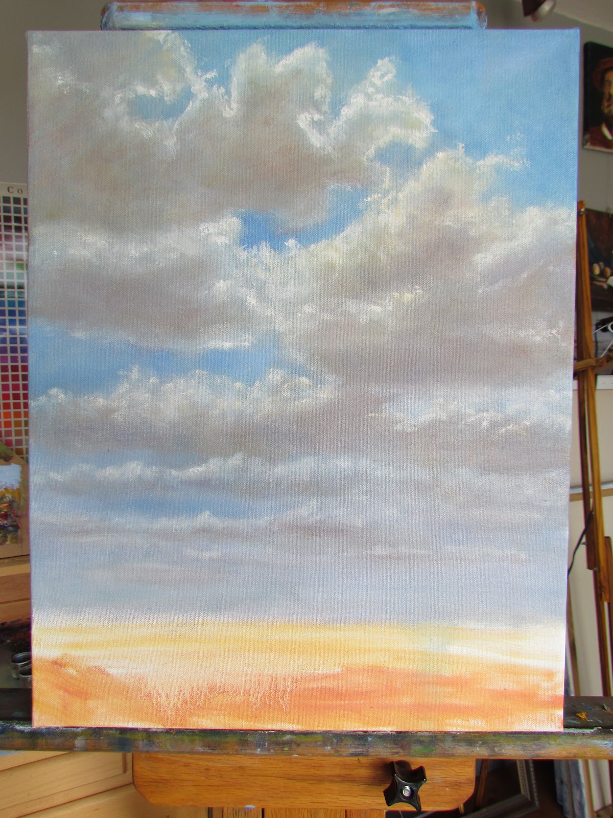
Toddler Watching Seagulls Stage 1
Similar to the painting I did a few weeks ago called, "Chasing Butterflies," I developed the midday sky with a combination of white, cerulean and cobalt.    Toward the horizon, the blue sky was gradually lightened with more white and a touch of alizarin crimson.  The summery clouds were painted with titanium white, yellow ochre and a tinge of violet on their underside

The vantage point for the painting was sitting on the beach, looking straight out at the water.    The Stage 1 picture shows the figures sketched in for placement and the horizon line toward the bottom third of the canvas.   A young woman was helping her little boy feed the seagulls.  The horizon line intersects the toddler's shoulders by design.   I was hoping to bring the viewers' attention to him first.    He was fascinated with the seagulls' mid-air gymnastics and near collisions.  Mom was more fascinated with her boy's fearlessness and energy, and everything about him for that matter.

At Stage 1 of the painting the gulls weren't actually in yet.   They play a central role in the painting's theme and their placement couldn't be arbitrary.   The plan was for the viewer to look at the boy and then naturally look to see what the boy is looking at, and his face is turned upward.   I was imagining my picture fulcrum; in Stage 1 the right side was heavily weighted with both figures.    The seagulls needed to provide the balance without stealing the spotlight from the toddler.  I broke away from the painting for a couple of days.

Seagull silhouette cut outs
In my next session with this painting, I first wanted to determine the placement for the seagulls. I cut three seagull shapes out of a gray paint chip card. I moved them around on my canvas to experiment.    I forgot to take a picture of these shapes on my Stage 1 canvas, but here they are on a piece of paper similar to what I did.    I wanted the gulls big enough and close enough to the figures - and each other - to give the impression of how aggressive they were that day. 


Toddler Feeding Seagulls Stage 2
Before I actually painted the gulls in, I took a critical look at Stage 1.  My best objective assessment revealed a few background issues I wanted to correct before going any further with foreground subjects.  The clouds were too yellow at this point, evidently caused by too much yellow ochre.   Also, the horizon line was too pronounced so I decided that it should be softened.     The wind was from the west which caused the breakwater to get propelled up and back away from the beach.   I worked on softening the spray and giving definition to the foam that was rolling onto the sand by drawing a soft medium value shadow under it.

The Stage 2 picture to the right shows those corrections and the initial seagull sketch in.   I'm not completely happy with the way the two gulls in the middle are vertically aligned, but decide that when I tone down the top gull's feet, they may read better.

Toddler Feeding Seagulls Stage 3
Stage 3 began by painting over the boy's right arm and repainting it down by his side.   I wanted to him to look somewhat tense and excited and thought the right hand down would make him appear a little nervous.   I don't have a picture of that stage of the painting, but I didn't like it.   I decided to restore his arm to an outstretched position as if he had just thrown a piece of bread.   I also added a red striped plastic bread bag to his left hand.   I worked on the skin tones and shadows of both figures.    Here is the result after the third painting session today.


The "final" stage is shown below.   More fine tuning, expecially on the shadows and the boy's face.   To be honest, I painted that little boy's face at least six times.  He went from looking too angry, to too old, too alien, too chubby, etc..  The picture below has a crooked horizon line - that is from my photo cropping, so if you spot that, good job.

 I love the subject of this painting.  It reminds me of my sister-in-law with nephews Sean and Ryan when they were blond and little, and running around the beach in Harwich.

I wanted to complete the post to get comments, but there is one last thing that I will do prior to framing and that it to give the whole painting a glaze tinted ever so slightly with white, so that there is the feeling of beachy atmosphere.   It will have to be thoroughly dry before I apply such a glaze.

Toddler Feeding Seagulls Stage 4

Thursday, May 17, 2012

The Face a Mother Loves

From the time my children were small, I would insert the latest portrait or school picture in their dedicated frames in front of the previous photos.   By the time high school came, there were so many photos stacked, that I no longer needed the extra piece of cardboard that pushed the photos tight against the glass.  I would perform an annual perusal through all of the pictures whenever I added a new photo. With each passing year, my enjoyment of the youngest pictures would grow.   There were always certain photos that I loved best, specifically, the one that perfectly captured a familiar expression - a grin or twinkle that a mother knows and loves more than anyone in this world.  

The photo that I painted this portrait from is a favorite of mine.   I estimate that my son is about eight, dressed in a shirt and tie.  It is as if his reluctant smile is saying to me, "Mum - another picture?  Hurry up and take it already!"


Stephen Age Eight

I measured precisely from the photo, sketching in the outline with a raw sienna wash.   I used extra care in spacing out the features accurately, starting with the eyes.  I discovered after my first pass of paint that my sketch was not so perfect, despite carefully placing the features.    The image was distorted.  How did that happen? 


I repeated the measurements.    All of the features were okay except for the nose.  The rhinoplastic correction was a matter of shifting it up.    I find that most of my drawing errors in my paintings stem from my inadequate perception of space vertically.   It seems easier to measure horizontally, but up and down is more difficut for me.  I still struggle with portraits, so it will be a matter of continuing to practice.

I loved working on this painting.   This is no perfect portrait, but it was not the fault of the perfect photo of the perfect face.  As it became more refined, it was almost like staring face to face with my little boy again. 


Friday, May 4, 2012

Tropical Bliss


Brother and Sister Digging in Sand

Some evenings we lingering at the beach, enjoying the colors of dusk after a long, hot day in the sun.  As the light waned adults and children continued to enjoy the warm water temperatures and sandy shore. 

This beach scene reminded me of beach vacations when my children were small.    With none of their own friends around, they played with one another.   This boy and his "older" sister worked at digging a hole that they hoped would fill with water as the tide came in.   It was a good size hole before the girl declared that the water didn't seem to be coming in or going out.  I just verified her statement.  Near the equator, the difference between high tide and low tide is small, compared to other latitudes.  Details of the shape of the beach, coastline, coastline depth and prevailing ocean currents can cause water level variation, but our location seemed immune to those factors.

This small watercolor now resides with a nice, young lady from Massachusetts who was watching it develop from the cabana behind us.  She said it reminded her of playing in the sand with her little brother on vacation.   I'm so glad it will provide a memory for her and her Mom.


Tuesday, April 3, 2012

Chasing Butterflies Under Midday Clouds

Clouds at dawn and dusk are wonderful sights to behold.   They often have spectacular color, contrast and limitless shapes, making them one of my favorites.  The wide open nature of the coastline allows a panoramic view, light that dances off watery ripples and reflections of atmospheric yellows, pinks and even pale greens.    As much as I love dawn and dusk, it is much more likely that my painting session takes place during the day.

Painting at mid-day is sometimes maligned because light at overhead angles can cast harshly on subjects; shadows are shorter and darker.   Photographers greatly prefer the softer light of early morning or late afternoon, along with the dramatic, long shadows.

On a beautiful Spring day however, large puffy clouds with the sun overhead are particularly beautiful.   I decided to let the sky predominate in this canvas while minimizing the amount of canvas devoted to the actual subject and terrain - those presumed victims of the unflattering light.

I grab my two inch wide brush with the extra long handle and roughed in some shapes I liked by painting the negative, or sky blue spaces around my clouds-to-be.   I was using a mixture of cerulean blue and white.   As I moved toward the horizon, I gradually added a little more white and a very small amount of red to give the feeling of atmosphere and distance.

Backdrop - Clouds at Midday
I start back up at the top to work on the body of the clouds.   The closest clouds - and the biggest - that were overhead were placed at the top of the canvas.  To my sky blue mixture, I add a little cobalt and cadmium red light, which resulted in the medium gray needed for the body of the clouds.  Clouds change so quickly!     By now the original reference clouds are long gone, but I've locked in the shapes and will stick with them to the end.   I continued to scale down the size of the underside of the clouds as I worked down the canvas, closest clouds to furthest - top to bottom.    I made this grey mixture slightly lighter and bluer to help these clouds recede.  Next, I mixed yellow ochre, white and cadmium red to apply on the "flat" underside of the clouds, a warm reflection of the earth below.  

The next part of the clouds is the reward, painting the lacy lit edges around them.   I couldn't see the top of the biggest cloud above.    I could only see its underside and all the bright edges.   I gave this big cloud its frilly edges of light, but feathered the lit edges toward the center of the cloud, and keeping the outside edges more defined.   I continued edging the clouds, smaller, less distinct, and bluer all the way to the horizon.

The view of the clouds that were further away was more like a cross section, or side view.   I could see the narrow underside of bluish grey, the wispy sides, and the sunlit tops.


Now that I had a canvas with a bright, wide open sky, I continue the theme of space looking up a flowery hillside.  
With a one inch bristle house painting brush, I roughed in the green grasses with cadmium green, cadmium yellow deep, lemon yellow.   I then used the same brush to pick up some raw sienna and yellow ochre for dry grassy reeds over the green.


A group of children with butterfly nets raced across the wildgrasses to the patch of clover seeking butterflies I didn't see.  This boy reminded me of the thin, graceful and intense athleticism of my own boys at that age.