Thursday, November 27, 2014

November Dunes and Beach Houses

Beachhouses Dunes and Fencing - Stage One
I returned to Burkes Beach in Green Harbor on a mild November day and this time instead of facing the ocean, I faced north.   The scene included dunes to my left, snow fencing, the jetty, and beach houses on the far side of the Green Harbor River.  This painting developed fast because I decided to use mostly palette knife applying lots of thick, juicy paint.   I used a small straight edge brush to paint the beach houses.  Even though the goal was to be loose, my psyche would never allow "non-plumb"architectural verticals.   So extra care was given to the squareness of houses, their little porches and shuttered windows.


Beachhouses Dunes and Fencing
Here is a quick summary on how I painted the snow fences.   First I blocked in the sand dunes with a light, but thin, warm sand color.  I let the brush strokes imply the slope of the dunes.    I then determined the color and value of the cool shadows of the fence post and slats.  I painted those shadows in next so that the shadows sat on top of the dunes.   Next I added the fence slats starting each stroke at the base of its shadow and drawing the brush up as if emerging from its shadow..    In a couple of cases I came back over some choice slats with a thick palette knife stroke.

November days like this one are every bit as pleasant as a summer to me, maybe even more so!

Tuesday, November 25, 2014

Isle of Doagh, Donegal

Linen Sheet
Donegal Gray
I still have such vivid and wonderful memories of our epic trip to Ireland last year.   I have sold some of the paintings I created when I returned.  These were paintings that I probably should have kept, but I would tell myself, I can paint another!

For the two paintings in this post, I revisited - via photograph - a highlight of the trip.   Our amazing adventure took us to the northernmost region of Ireland to Cuill, Isle of Dough, County Donegal. This was the location of the ancestral home of my paternal great grandparents and their children.  Sadly, the parents died within a few weeks of each other in 1899, resulting in the subsequent emigration of their children (ages 11 through 23) to America, specifically Boston, Massachusetts.

Knowing the familial connection to this land made it special, and no painting or photograph could come close to capturing the breathtaking beauty of this region.    The moist, imposing clouds sat low over us as we hiked an old farm path (Fegart Road) to the top of a hill on the Isle of Doagh.

Isle of Dough - Donegal
Whenever the sun (or at least rays of sunshine) broke through, the light was truly amazing!    It was at those moments that the distant countryside emitted the iconic emerald green that Ireland is known for.   Being on an island with water all around, the gray clouds became lavender, pink, blue and pale yellow.

My goal in these two 8x10 inch paintings was to capture those fleeting, sunlit moments.  One painting includes an old stone farm (more decrepit in person than they may appear in the painting).   The other painting depicts a simple meadow with the Irish Sea and neck of land in the distance

I hope you can see the magic that I felt while I was there; if not, you must go and see/feel it in person!


Thursday, November 20, 2014

Sandbox Play

I have always found it fascinating to watch children engaged in free play.    Pail and shovel, sand and water....that's as good as it gets for a little tike, right?   (I hoping so, given the rash of babies playing with PDA's that I have observed lately.  :))  


Sandbox Play
This painting depicts three little people who were busy with sand, cups and buckets while Dad did his own digging.

Painting design was on my mind for this scene because this canvas measured 12x24 inches.    The center of interest was the group of children who were placed to the left of the center line.   As soon as they were added, the horizontal balance was off, automatically weighed to the left.   Once Dad was inserted, he not only added to the story, but he balanced the total composition.  As a background "element" however, he would have to be smaller and less defined.  Further, his placement would have to balance the group of children.    I was imagining a fulcrum between the children and the Dad that would equalize their weight as it related to the whole canvas.

I don't like that my warm transparent darks were contaminated with opaque tones....Before I post this to the shop, I'll have to fix it.   Any other comments?


Sunday, November 16, 2014

Columbia Point from Day Boulevard


Columbia Point Vantage

Columbia Point from Day Boulevard
I had just over an hour before I was due to pick up my aunt for lunch.    I exited the Southeast Expressway and rounded the circle in South Boston and started down Day Boulevard.   After passing the Massachusetts State Police Station, I got ready to make a turn into one of the beach parking lots.

I was lucky to snag the first spot which had a clear view of the Kennedy Library, the fishing pier and old stone gazebo.   This spot is known as "Mothers' Rest", one of many scenic vantages along the Harborwalk.   It was a very gray day, so there was neither dramatic sunlight or defining shadows.  There was still plenty of fall color in the distant trees.

Columbia Point from Day Boulevard
There was a mixture of runners, walkers and UMass Boston students passing by and only a handful of people stopped to talk.   That was probably good because I was tight on time.

The last thing I did was to use my "scrape off" rubber tool to carve the shape of the sign through the thick sky paint.   This pulled off the thick paint and gave me the right sign location allowing me to finish it back in the studio.  I do like the freshness of this one - no doubt because of the lack of time, ie no fussing over detail and reworking. 

Wednesday, November 12, 2014

My First Persimmon

It was class number three (of four) with painter and teacher Eli Cedrone and I arrived a little late and unprepared.   I hadn't brought any objects for a still life painting.   (Now that I am older and wiser, I was not sweating it however -  I knew that between my painting bag and my car, I would be able to come up with some objects.)

Persimmon and Tomato Set Up
As it turned out, my classmate had extra fruits and vegetables, and she invited me to help myself in creating my still life.    Had it not been for her generousity, I would not have gotten a chance to study my first persimmon. 

What is a persimmon?   It's a golden yellow oval fruit with a flavorful, smooth texture.  It's a healthy delicacy native to China and is used in cookies, cakes, muffins, puddings, salads and as a topping in breakfast cereal.   At this writing, I still haven't tried one yet.

Persimmon and Tomato
I placed a persimmon and a tomato on my fabric (my sweatshirt) trying to have them overlap and throw shadows that would make a pleasing abstract pattern.

The warm orange and red of the fruit picked up lots of light and even cast light and color on each other.   Although I didn't see their colors reflected on the fabric, I pretended it did and spread some of the color into the neutral gray for more excitment.

I bought my own persimmon on the ride home and am waiting for it to ripen on the counter.    I'm hoping I like it...I'll let you know!


Monday, November 10, 2014

November Beach - Green Harbor

November Beach - In Progress
Sunny Beach in November
The sun was shining and the wind was blowing from the west making it a fine day to paint on our east facing beach. I've painted from this spot on Burkes's Beach on numerous occasions, but it is never the same, and it never gets old.  

It was a low angle midday sun, which actually produces more reflected sunlight than a higher angle sun, and still quite bright.  The temperatures were warm enough for both my personal comfort and oil paint viscosity.   We've already had a couple of strong ocean storms which had deposited plenty of seaweed along the multi-tiered shoreline.  Most of it was now a dark, dried-out, maroon color.   On the water, the few lobster boats that did enter the channel were stacked with traps, and I'm assuming they have been pulled out of the water for the winter.  

Sunny November Beach
Once my easel was set up, the next decision was where on the canvas the horizon line would be.  Two things convinced me that it would be toward the bottom, the first of which was the beautiful, shimmery sky of wispy high clouds.  The second factor was that the tide was coming in, covering more and more of the jetty.  I didn't want to place a lot of attention on skinny slivers of visible rocks.  So then, the sky would be the starring element, and the basic compositional decision of the landscape was made.   As for the water, the northern (left) section of the horizon was dark ultramarine blue in contrast with the (sunnier) eastern (right) section was much lighter blue, almost a cerulean hue.  

So here it is after the paint out.  The inner painter is telling me to add a lobster boat entering the channel.   Should I listen(?), is the question!


Thursday, November 6, 2014

Clutching Gold

Renoir Bathers Snippet through Viewfinder
It was the second week of my workshop with Eli Cedrone.   The plan was to use the same ideas from last week's still life abstract, but apply them to a figure.     That process was to design the painting in black and white with a charcoal thumbnail, to do a line drawing that would flatten the planes, then to develop the abstract version into our desired level of realism. 

Thumbnail Design
I chose a painting of Renoir's bathers as inspiration for this one.   I used my viewfinder to frame two small portions of the (very large) painting.   I then did a thumbnail in charcoal of each to decide which one I would paint on my 9x12 canvas.    I liked both thumbnails so I decided (too ambitiously as it turns out) that I would just paint both.   The mission was to keep it loose and free, so I thought there would be time for both - ha, not true! 

As the face and hand came together I decided that this looked like a sleeping goddess.   I refined the closed eyes and adjusted the mouth to be slightly drawn down as in sleep, dreaming even.

Wednesday, November 5, 2014

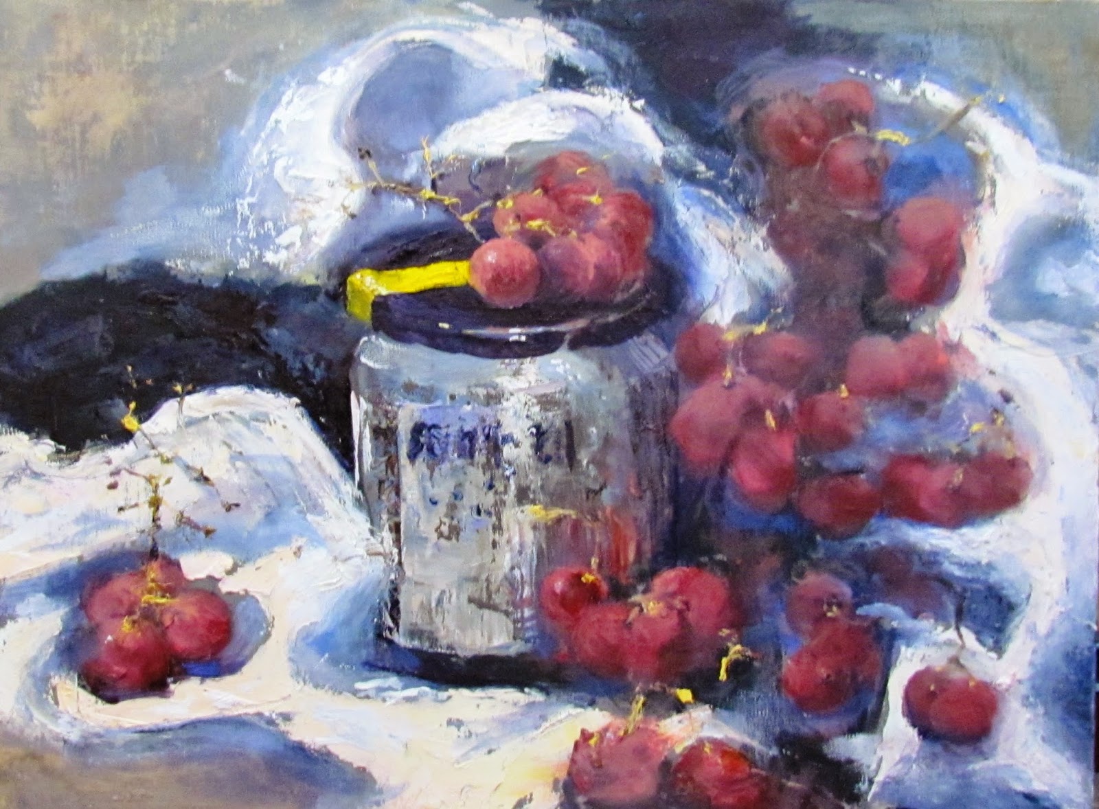
A Jar and Grapes

Red Grapes and Jar Still Life
I was in Session One of a workshop with one of my favorite artists from the New England region, Eli Cedrone.   She had sent out a lesson plan in advance of the class which included some interesting YouTube links for reference. 

Abstracted Thumbnail
American Artist Richard Diebenkorn was influenced by the work of Paul Cezanne and Henri Matisse.   He was drawn to their bold palette, the flattening of the picture plane and the minimal blending of color. He was interested in the geometry of a space – be it a still life, a field seen from above or an interior with figure. It is that convergence of lines and angles, forms distilled to their primary shapes, that connects his figurative paintings to his abstractions.

Eli challenged us to incorporate our twist on Diebenkorn's simplification and abstraction.  The mission was to render a non-representational depiction of our chosen still life set ups and to come up with a more striking and interesting composition. 


A Jar and Grapes - In Progress
As always, I love an art challenge and Eli's creative lesson plan challenged my status quo. With a 12x16 canvas staring at me, I started thinking that a few red grapes and a jar of Ikea pickled herring (my lunch) would be a weak and less-than-thrilling painting.   However, the objective of designing the painting instead of painting the subject exactly as designed, saved the day.

I decided to "split" the canvas into three zones.  Using the viewfinder I made three independent views of the grapes and jar set up.   I was trying to make a black and white abstract that had nice variation, without yet thinking about how this would become a red grape and jar still life.   (Important:  The composition makes or breaks the painting)   We next did a flat line drawing of the design.  By the time paint was applied, the three vertical zones were interleaved.   At this point, the actual set up in front of me was only for color and shadow reference, because my black and white thumbnail was my composition blueprint.


A Jar and Grapes - Loud and Loose
Here is the end product;  more loud and loose than usual.

BUY NOW